Finding landing page examples is easy. The hard part is understanding why a page works, so you can copy its logic instead of its looks. Plenty of people clone a landing page that looks impressive, then wonder why it converts nobody. The problem is rarely the colors or the font. It is the elements: a headline that answers the visitor's question, proof that calms their doubts, and one unmistakable call to action.
In this article we break down 15 landing page examples by business type and goal, element by element. For each one you get the structure: what goes at the top, what proof to use, and what kind of CTA makes sense. At the end, there is a short guide to building your own version, even if you have never touched a design tool in your life.
What actually makes a landing page convert
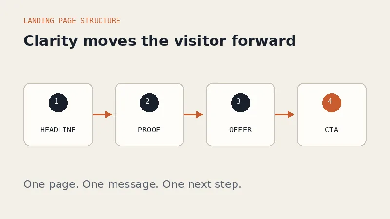
Before the list, let's agree on the definition. A landing page is a page with one job: turning a visitor into a buyer, a signup, or a lead. It is not a showcase of everything your business does. One page, one message, one ask.
From there, almost every landing page that converts shares the same skeleton:
- A specific headline. It answers "what is this and who is it for" in one line. "Daily office lunch catering in downtown Austin" beats "Culinary solutions for the modern workplace".
- A clarifying subheadline. One or two sentences that spell out the result the visitor gets.
- Proof. Testimonials, customer counts, photos of real work, or client names. Something showing that other people trusted you first.
- Objection handling. Sections that answer "what if it doesn't fit", "how long does it take", "what does it cost" before anyone has to ask.
- One CTA, repeated. The same button or form appears at the top, in the middle, and at the bottom.
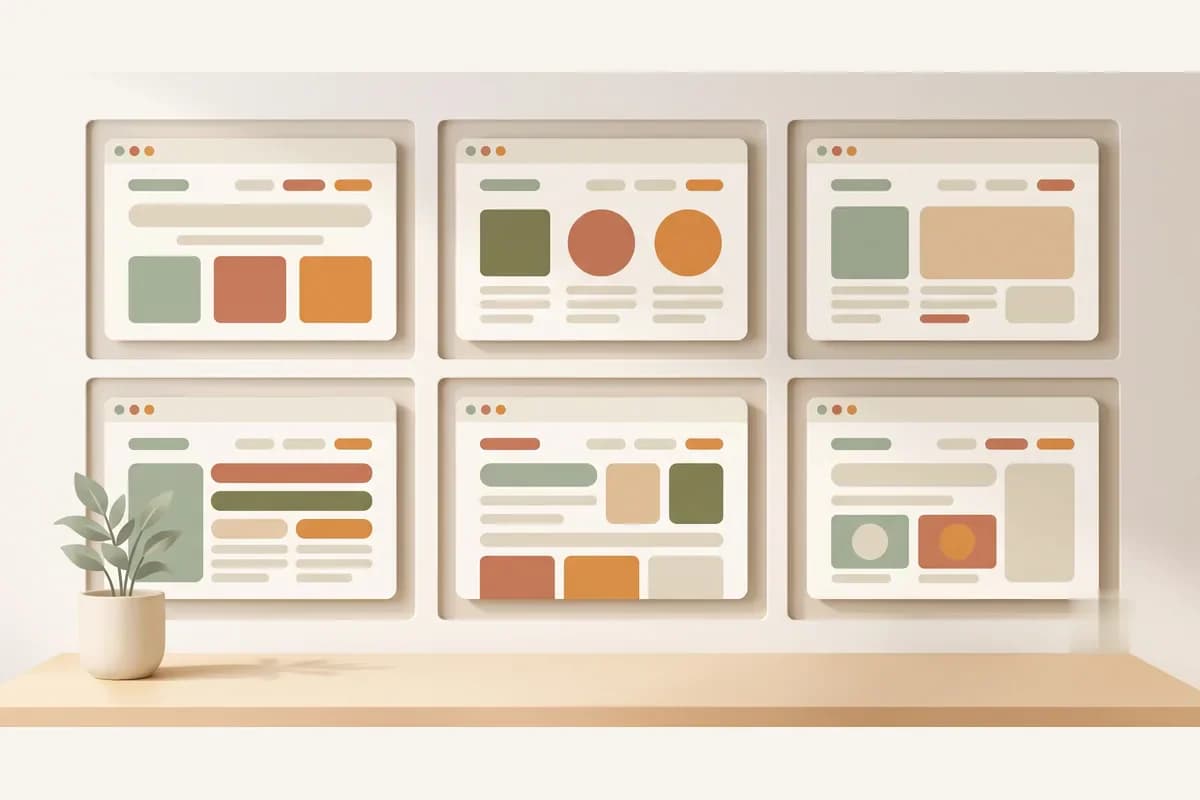
Every example below is a variation on that skeleton, tuned to the type of business and the weight of the buying decision.
15 landing page examples that actually convert
These are the patterns that keep working in the real world, with small business contexts so they are easy to picture.
1. Physical product landing page. Example: a small-batch candle brand. The hero shows the product, a headline about scent and craft, and a buy button. Below: how it is made, marketplace reviews, and a shipping FAQ. The rule is one product per page; never dump the whole catalog here.
2. Pre-order landing page. Example: an apparel brand opening a production batch. The differentiating element is an honest production and shipping timeline, plus a real order deadline. Clarity about the wait is itself a conversion tool, because it removes the anxiety of the unknown.
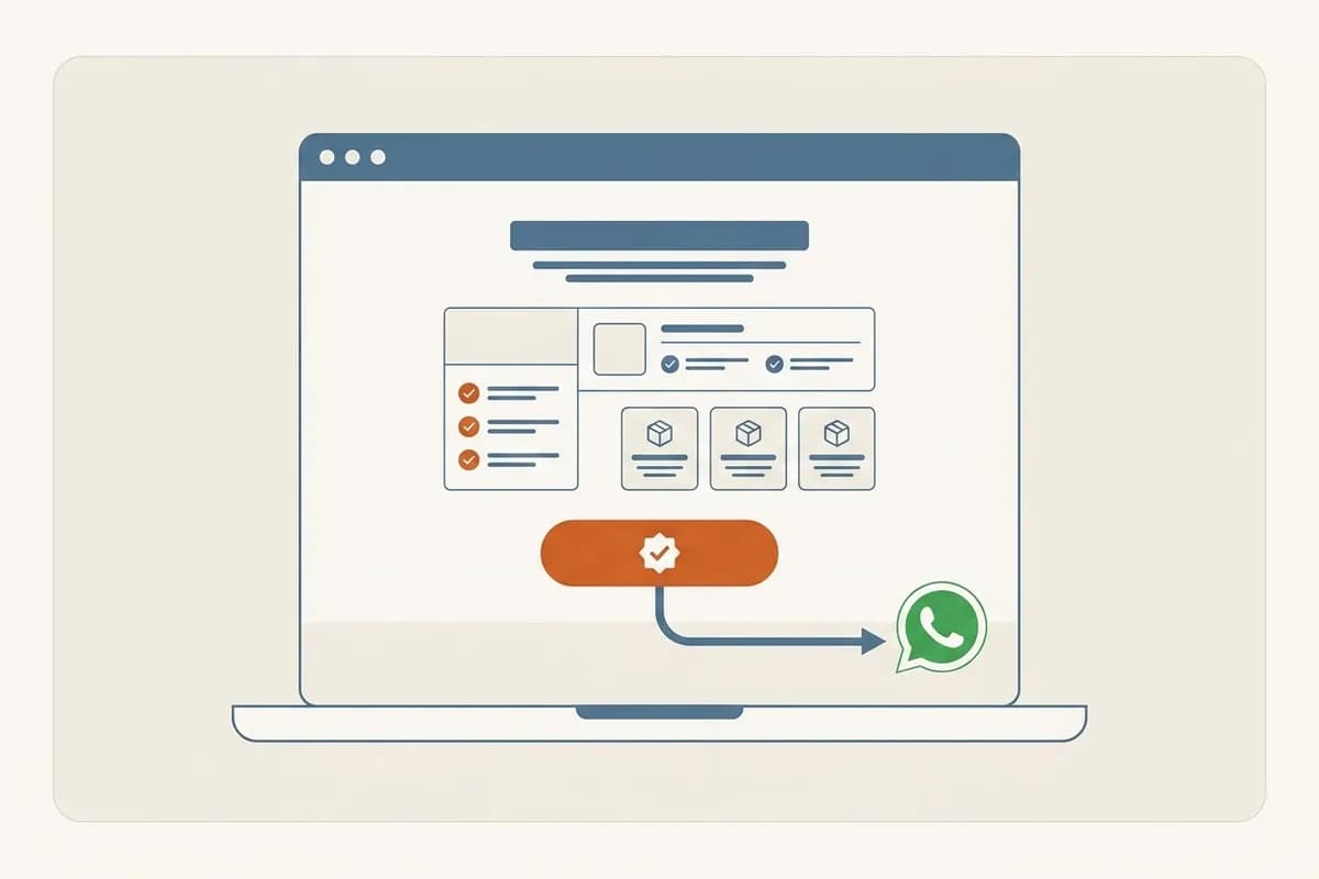
3. Local service landing page. Example: an emergency plumber. The headline names the service area explicitly, pricing starts from a clear number, and the primary CTA is a direct message channel. For service businesses, a form that routes visitors straight to WhatsApp or your phone almost always beats an email form.
4. Online course landing page. Key elements: a curriculum visible before payment, an instructor bio with real credentials, and student outcomes. The biggest doubt is "can I actually keep up", so a "who this course is for" section is mandatory.
5. Webinar or event landing page. The focus is date, time, speakers, and what attendees walk away with. The registration form is short: name, email or phone, done. Every extra field is another reason to procrastinate.
6. Catering landing page. Sample menus with per-head pricing, minimum orders, delivery area, and photos of real food, not stock imagery. The CTA is "request a quote", because catering orders almost always start with a conversation.
7. Tour operator landing page. A big decision, so the page runs long: full itinerary, hotels, what is included and excluded, licensing and insurance details, departure dates, and traveler testimonials. Displaying credentials prominently is not decoration; it is the number one objection handler in travel.
8. Real estate landing page. One development or listing per page. Floor plans, specs, financing examples, and location. The CTA is not "buy now" but "book a viewing" or "get the brochure", because nobody purchases a home from a single web page.
9. Clinic landing page. Example: a dental practice. Key elements: a list of treatments with price ranges, genuine photos of the practice, dentist profiles, and an appointment booking button. Price transparency is rare in healthcare, so the clinics that dare to show it stand out.
10. SaaS or app landing page. Example: a point-of-sale app for small retailers. A headline about the problem it solves, a short walkthrough of how it works, monthly pricing, and a free trial CTA. The lower the initial commitment, the shorter the page can be.
11. Creative portfolio landing page. Example: a wedding photographer. Here the work is the proof, so a gallery of real projects dominates the page. The copy is short but sharp: style, investment range, and how to start the conversation.
12. Lead magnet landing page. It offers something free, like a template or a guide, in exchange for contact details. The page is short: what is inside, who it is for, a minimal form. The value has to feel bigger than the "cost" of handing over an email address.
13. Seasonal promo landing page. Black Friday, back to school, end of year. The differentiating elements are a real deadline and honest strikethrough pricing. Fake urgency that keeps getting extended trains customers to never believe your deadlines again.
14. Donation or community landing page. A specific story about one beneficiary works far better than a general appeal. Include a report on how previous funds were used and concrete suggested amounts.
15. Idea validation landing page. A "coming soon" page with an interest form. This is my favorite example precisely because the business does not exist yet: you pitch the idea, measure how many people sign up, then decide whether it deserves to be built. The investment is one afternoon.
Tip: Do not try to imitate all 15 patterns at once. Pick the one closest to your business, build a simple version, publish it, then improve it based on the questions real visitors send you.
Elements every high-converting landing page example shares
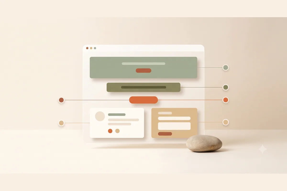
Melt those 15 examples down and six elements keep surfacing. This table sums up what each one does and how to tell it is failing.
| Element | Its job | Sign it is failing |
|---|---|---|
| Headline | Explain "what this is, who it's for" in 5 seconds | Visitors scroll past without reading on |
| Subheadline | Promise a specific outcome | It sounds like a slogan, not a promise |
| Social proof | Borrow other people's trust | Generic praise with no names or context |
| Offer | Make the first step feel small | A "contact us" CTA with no reason why |
| Objection handling | Answer questions before they're asked | Inquiries full of the same basic questions |
| Repeated CTA | Always give a path to action | One lonely button hidden at the very bottom |
Notice that "beautiful design" is not in the table. Here is an opinion that may not be popular: the prettiest landing page usually loses to the ugly one that is clear. Aesthetics help trust, but clarity closes the sale. If you have to choose, choose clear first and pretty second.
Note: Specific social proof beats abundant social proof. One named testimonial with a concrete result ("my catering orders doubled after I switched to package menus") is more convincing than ten anonymous five-star blurbs.
Product vs service landing page examples: where they differ
This question comes up constantly, and the answer shapes the entire page.
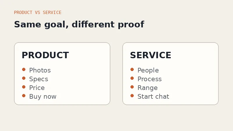
Product landing page examples lean on the thing itself: photos from every angle, specs, an exact price, and a buy button that can be acted on immediately. The decision is fast, so the page can be short. The biggest friction points are shipping and trust in the store, which is why a shipping FAQ and proof of past orders matter so much.
Service landing pages lean on the people: who does the work, results for previous clients, and what the process looks like. Pricing is often a range, and the CTA is a conversation, not a checkout. That is why direct chat buttons work so well for services; the prospect wants to ask questions first, and you want those questions arriving somewhere you actually reply.
The classic mistake is treating a service like a product: slapping a "book now" button on a five-figure engagement with no room to ask anything. The page looks decisive and produces nothing.
The mistakes that most often wreck conversions
Across the many pages we have watched people build, the same errors repeat:
- Too many messages. A page promoting three services at once converts worse than three separate pages, each with a single focus.
- A CTA that asks for too much. "Fill in this 10-field form for a consultation" loses to "message us" nearly every time.
- Slow on mobile. Most of your visitors arrive on a phone over a cellular connection. A heavy page loses them before the headline even renders.
- No follow-through after the click. A visitor submits the form and nothing happens for two days. Conversion is not just the page; your response speed is part of the offer.
- Ignoring search entirely. A short-lived promo page can skip SEO, but a permanent service page should follow the basics like proper titles and heading structure. The fundamentals are in our guide to website SEO basics.
Tip: Test your page with one question to someone who knows nothing about your business: "from this page alone, do you understand what I sell and what you should do next?" If they hesitate, fix the headline and the CTA before touching anything else.
How to build your own page from these examples
The old options were hiring a designer or wrestling with a page builder for weeks. Today the whole process compresses into minutes.
With Forgelo, you describe your business in one sentence, for example "daily office lunch catering in downtown Austin with a rotating weekly menu", and the AI generates a complete page in a few minutes: headline, section structure, copy, and a contact form that sends leads straight to your WhatsApp. From there you edit by typing changes: "make the headline more casual", "add a pricing section with three packages", "move the testimonials up".
The workflow looks like this:
- Pick the one pattern from the 15 examples above that best matches your business.
- Write a one-sentence description naming your audience and your offer.
- Generate the page, then sharpen the headline and CTA through prompts.
- Publish on a free subdomain first, or connect your own domain right away.
- Share it, watch what questions come in, and improve the page based on them.
Plans start at $9 per month with unlimited edits included, so you can experiment without fearing a revision invoice. The details are on the pricing page. And if you are still weighing the broader question of how to get a site live at all, our walkthrough on how to make a website without coding covers the full journey.
The bottom line
The best landing page examples are not the most beautiful ones. They are the ones that answer three questions with total clarity: what is this, why should I trust you, and what do I do next. All 15 patterns above are just variations on those three questions, tuned for different businesses and different sizes of decision.
Do not stop at admiring examples. Pick one pattern, build your first version today, and let real visitors tell you what to fix. A simple page that is live always beats a perfect page that is still a plan.