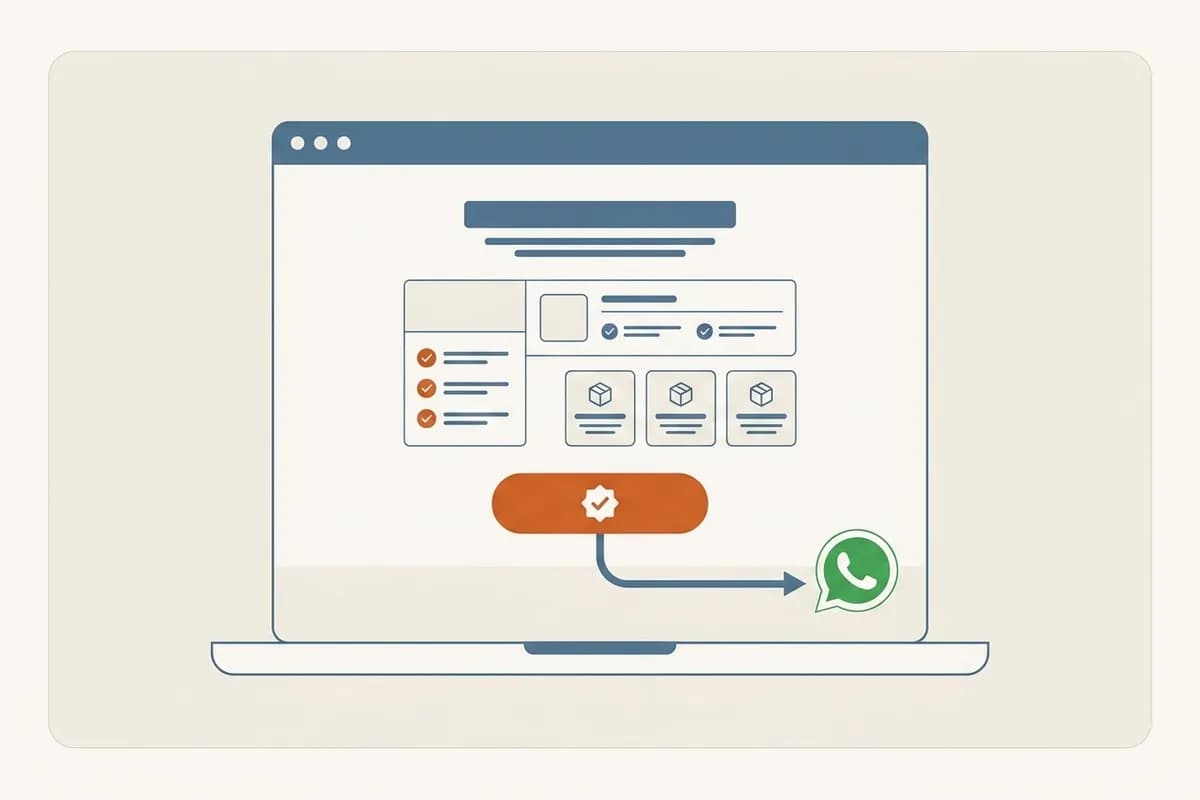
To build a landing page that converts without coding, the core is simple: make one page with one goal, write a headline that answers what the visitor wants, show one clear offer, and end with one button to WhatsApp. You never write code. The fastest route is to describe your offer in one sentence to an AI website builder, let it assemble the full page in a few minutes, then refine each part just by typing the change you want.
This guide explains what actually makes a landing page generate leads, which elements are non-negotiable, and how to build one from scratch without a developer. By the end you will know the exact steps and the mistakes that most often keep a page from converting.
If the offer is subscription software, choose the signup or demo journey before arranging sections. Our SaaS landing-page structure checklist adds product evidence, pricing context, and clear limits to the usual landing-page framework. Test the actual registration destination, not just the appearance of the button.
What a landing page is and why it differs from a normal website
A landing page is a single page built for a single action. It is not there to explain your whole business, not there to hold a blog, and not there to list every service. Its job is one thing: get the visitor to do one thing, such as fill in a form, tap a WhatsApp button, or buy one product.
The difference from a normal website is focus. A company profile invites visitors to explore: there is a menu, many pages, many exits. Every extra exit is a chance for the visitor to drift off and leave. A landing page closes those exits instead. No tempting menu, no links that carry people away from the main button. Everything on the page points to one decision.
That is why landing pages fit specific situations: an Instagram or Google ad that points to one offer, a discount campaign, a webinar sign-up, or a product launch. If you run paid ads and send people to a homepage full of menus, part of that ad budget is wasted because visitors are not sure what to click. If you need a full multi-page site instead, our guide on what every small business website needs covers that route separately.
The anatomy of a converting landing page
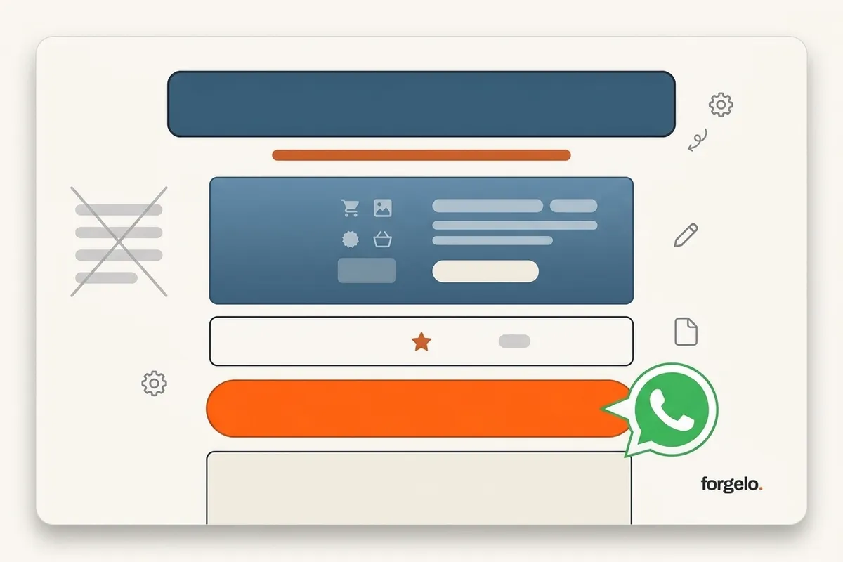
A landing page that generates leads almost always follows the same order. Not because it is rigid, but because that order matches how people read and decide. Here are the parts that should always be there, top to bottom.
- A headline that answers one desire. The first line the visitor reads. It should state the result they get, not your brand name. "Digital invitations ready in a day" is stronger than "Welcome to our service."
- A supporting subheadline. One line under the headline that explains how or for whom. It adds clarity without adding confusion.
- One clear offer. Exactly what you offer and what the visitor gets. Avoid long lists. One firm offer beats five vague options.
- Brief proof. A one or two line testimonial, a customer count, client logos, or a photo of the result. Proof lowers doubt right before someone decides.
- One call to action. One button or one form, repeated two or three times down the page. For small businesses, a button that opens WhatsApp directly tends to work best, because that is where people actually close.
- Removing distractions. No full navigation menu, no unnecessary outbound links. Any element that does not support the single goal is better cut.
Notice that fancy design is not on this required list. A clean page with a strong headline and one clear button beats a beautiful page that confuses. If you want to go deeper on trust elements, our piece on turning visitors into WhatsApp leads covers how to place buttons and forms so people actually tap them.
How to build a landing page without coding: 5 steps
Here is a path you can follow today with no technical skill. Five steps, from the first sentence to a live page.
First, decide on one goal. Before touching any tool, pick the single action you want the visitor to take. Collect a WhatsApp number? Sell one package? Register for an event? One page, one goal. If you name three goals at once, your page pushes in three directions and goes nowhere.
Second, write your offer in one sentence. Phrase what you offer in the customer's language, not your internal terms. For example: "I sell digital wedding invitations that you can send over WhatsApp, ready in a day." That sentence becomes the fuel for your headline and the whole page.
Third, assemble the page without code. This is where an AI website builder removes the heaviest work. You paste that offer sentence, and in a few minutes a full landing page appears: a headline, an offer section, space for proof, and a call-to-action button. You start from something real, not a blank page that leaves you stuck. If you want to compare every no-code route, our guide on making a website without coding lays out the three main paths honestly.
Fourth, edit each part until it feels like yours. Replace the placeholder text with your own words. Sharpen the headline, clarify the offer, and make sure the button points to the right WhatsApp number. In Forgelo, you change any section just by typing the change, for example asking for the proof section to become three customer testimonials, and only that section is rebuilt. You do not move elements one by one and you never touch code.
Fifth, check it on a phone, then publish. More than half of visitors arrive on a phone, especially when the page is shared through Instagram ads or WhatsApp status. Open it on your own phone, make sure the button is large enough and the text does not overflow, then publish. Most builders give you a free subdomain, so you can start free to test the idea before connecting your own domain.
Copywriting that gets clicks
No tool, however fast, can save a weak message. The part that most decides conversion is not the button color but the words around it. Three spots matter most.
The headline is your biggest bet. It has to pass the three-second test: at a glance, does the visitor know this is for them and what they get? The safest move is to name the result, not the feature. "An online store ready to take orders over WhatsApp" speaks about a result. "An integrated digital solution" says nothing.
The offer should feel concrete and low risk. State what they get, how long it takes, and any guarantee. Specific numbers and promises sound more credible than adjectives. "Ready in 24 hours, two revisions included" is more convincing than "a fast and satisfying process."
The call to action should describe the action, not just say "submit". "Chat us on WhatsApp now" or "Grab a slot this month" moves people more than a button that reads "Submit." Repeat that button a few times on a long page, because people are ready to click at different moments. Keep the language plain and avoid the em dash that makes a sentence feel stiff. Plain writing reads more human.
Common mistakes that keep a landing page from converting
Most landing pages that fail to convert fail for the same reasons, and nearly all of them are fixable.
The first mistake is too many goals. One page that asks people to subscribe, buy, and download a brochure ends up convincing no one to do any of them. Pick one and move the rest to other pages.
The second mistake is putting a full navigation menu at the top. That menu gives visitors an exit before they read your offer. On a landing page, reduce or remove the menu so attention stays on one button.
The third mistake is a headline that talks about yourself. "Welcome to our company" wastes the most valuable seconds. Replace it with the result the visitor wants.
The fourth mistake is a page that is slow and heavy on mobile. Large, unoptimized images make the page load late, and ad visitors leave before it finishes. A fast, light page is part of conversion, not a separate technical concern.
The fifth mistake is no proof at all. A page that only praises itself, with no testimonial, number, or photo of the result, asks the visitor to take everything on faith. Yet doubt peaks right before someone taps the button. One honest customer quote or one real photo of your work is often enough to close that doubt. If you run ads, these mistakes are exactly what our piece on common website service mistakes covers, and they apply just as much to landing pages.
From a sentence to a live landing page in a few minutes
The fastest way to a converting landing page is to cut the slow parts: building the structure and designing from scratch. That is where a prompt-based approach differs from an ordinary visual editor.
With Forgelo, you describe your offer in one sentence and get a complete landing page in a few minutes, headline, offer section, proof space, and a button to WhatsApp already in place. What sets it apart from a one-shot generator is what happens next. You are not stuck with the first result and you never rebuild from scratch. You refine the page by talking to it: ask for a sharper headline, ask the pricing to become one package, ask the form to become a WhatsApp button. Each request rebuilds only the section you name.
This is not a drag-and-drop canvas and not a code tool. You do not arrange elements one by one, and there is no line of code to touch. Every site also ships with basic SEO, fast pages, and forms that route straight to WhatsApp, where small businesses actually close. When the page feels right, publish to a free subdomain to test, then connect your own domain when you are ready to look more professional.
To understand how this approach assembles a site section by section, our piece on the AI website builder explains the engine behind it. And if you are weighing building it yourself against hiring out, website services compares the two on cost and speed.
A converting landing page, in the end, is not about how advanced the tool is. It is about how clear your message is and how few obstacles stand between the visitor and one action. Start with one goal, write one clear offer, point to one button, and let the tool handle the rest. You can have your first page live today, without a single line of code.