Here's the good news about how to make a simple website: you don't need a developer team, you don't need to learn code, and you don't have to wait weeks. One clean page that loads fast, explains what you sell, and has a WhatsApp button is enough to start bringing in customers. This guide shows you how to finish it today, from nothing to live, without the technical drama.
Before the steps, one point worth making plainly. A "simple" website is not a cheap version of a good one. For a coffee cart, a dog groomer, a home bakery, or a wedding photographer, a single focused page often works better than a ten-page site that confuses people. So don't feel like you're settling. You're choosing enough, and enough is what sells.
Why one page is often more than enough
This is the part people rarely say out loud. Most small businesses waste time building pages nobody ever reads. The long "About Us" page, the blog that never gets updated, the gallery so heavy it takes forever to open. All of it feels like work while doing nothing to get you contacted.
A prospect who finds your business usually wants three things: what you sell, what it costs, and how to order. If one page answers all three quickly and clearly, that person taps the contact button. If you force them to click around first, some give up halfway. Simple isn't a compromise. Simple is a decision that respects the visitor's time.
Tip: When you're unsure whether a section belongs, ask "does this make it easier for someone to contact me?" If the answer is no, cut it. A shorter, sharper page almost always wins.
How to make a simple website through three options
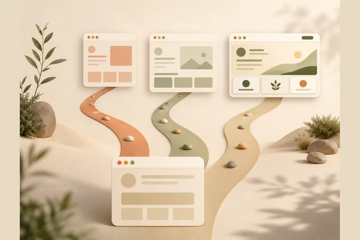
There are three common routes, and each has different consequences for time, cost, and who can edit it later. Here's the honest picture.
| Option | Time to launch | Technical skill needed | Editing it yourself |
|---|---|---|---|
| AI website builder | Minutes to a few hours | None | Just type the change |
| Drag-and-drop template builder | Half a day to a full day | A little, needs getting used to | Yes, through a busy panel |
| Hire a freelancer or code it yourself | Days to weeks | A lot, or pay someone | Often means asking again |
No option automatically wins for everyone. If you value speed and want to change things yourself anytime without depending on anyone, the AI builder route is usually the most comfortable. If you enjoy arranging every pixel and have spare time, a drag-and-drop template is fun. If your needs are very specialized, a freelancer makes sense, but that's no longer "simple."
For this guide, we focus on the fastest path to finished: describe your business and let the tool assemble the page. If you'd rather explore the zero-cost route or start from a blank canvas, our walkthrough on how to make a website from scratch goes deeper.
How to make a simple website step by step
Here's a flow you can follow this afternoon. Say you run a home bakery called Ruby's Kitchen. The principle is the same for any business.
One, prepare five core sentences. Before touching any tool, jot this into your phone notes: what you sell, who it's for, what makes you different, a price range, and how to order. Example: "Fresh home-baked sourdough and pastries for local pickup, made daily, from nine dollars a loaf, order a day ahead by message." These five sentences are the raw material for the whole website.
Two, describe your business to the builder. With Forgelo, you type those core sentences and a full website assembles in a few minutes. You immediately get a page with a headline, an explanation, a pricing section, and a place for photos. It isn't perfect yet, but it's real and you can see it.
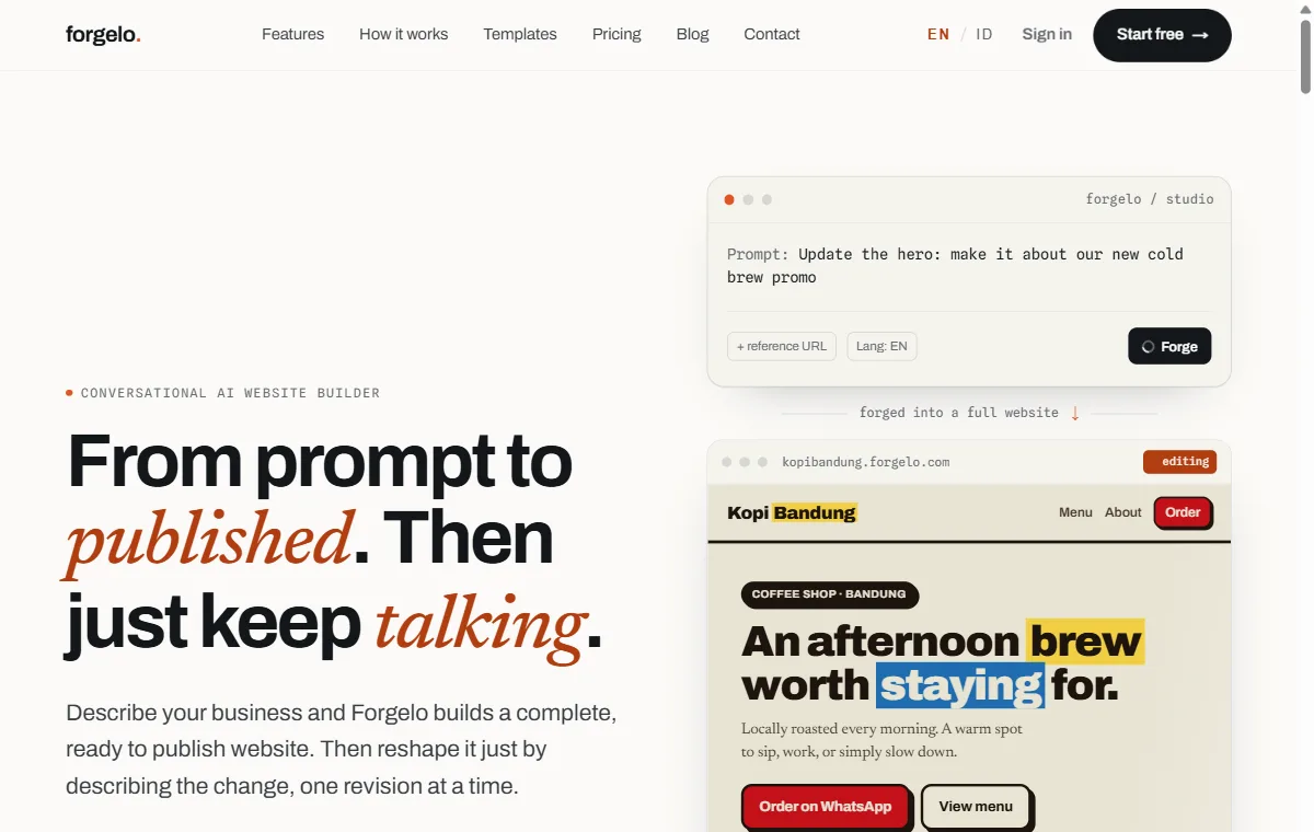
Three, refine by typing changes. This is the part that used to stump people and is now easy. Want a shorter headline? Type "make the headline shorter." Want to add a weekly subscription box? Type "add a weekly bake box section with three options." No design software, no code, no maze of menus. This edit-by-prompt approach is what makes a simple website genuinely finishable in one sitting.
Four, wire up the contact button. Point your form or contact button at WhatsApp so every question lands on the phone you carry all day. Ruby doesn't need to learn an email dashboard; orders arrive right in her chat where she already replies. On Forgelo, WhatsApp lead forms start on the Starter plan. If you want the fuller version of the no-code path, see make a website without coding.
Five, publish. Ship it to a free subdomain first if you want speed, or connect your own custom domain when you're ready to look more established. Done. Your site is live and shareable from your Instagram bio, a WhatsApp status, or a business card.
Note: Don't wait for perfect before you go live. An 80 percent version online today is far more useful than a 100 percent version still sitting in your head next week. You can keep polishing after people start seeing it.
What a genuinely tidy one-page site needs
A simple website still has to be complete where it counts. Here's the minimum that makes one page feel professional rather than thrown together:
- A headline that gets to the point. Not "Welcome to our website," but "Fresh home-baked sourdough for local pickup." A visitor should understand in two seconds.
- A short explanation. A paragraph or two on what you offer and why someone should choose you.
- Proof. A few real photos, or two or three customer testimonials. Proof beats promises.
- Pricing or packages. It doesn't have to be exhaustive, but a number range reduces hesitation and filters serious buyers.
- One clear call to action. A single big "Order via WhatsApp" button. Don't make people hunt for how to reach you.
Notice that all of this fits within one scrollable screen, and every bit of it has to read well on a phone, since most of your visitors arrive on mobile. Built-in SEO from a good builder also helps your page get found on Google without you becoming a technical expert. For a fuller checklist of what small sites should cover, read small business website essentials.
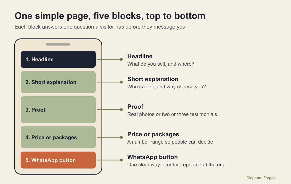
Example: Ruby's Kitchen, block by block
Here's what those five blocks could say for the home bakery from earlier, so you can see how little text a simple page really needs.
- Headline: "Fresh sourdough and pastries, baked daily for local pickup."
- Short explanation: "Small-batch bread made with a slow overnight rise. Order a day ahead and collect it warm the next morning."
- Proof: three real photos of the bread on the counter, plus one line from a regular customer, such as "The only loaf my kids finish."
- Price or packages: "Classic loaf from 9 dollars. Weekend pastry box from 18 dollars. Weekly bake box, three sizes."
- Call to action: a button that reads "Order on WhatsApp," shown under the headline and again at the bottom.
That's roughly 80 words of copy plus photos. It reads in under a minute on a phone, and it answers what, how much, and how to order. When you describe your own business to a builder, this is the level of detail to aim for. Add more only when customers keep asking the same question, then answer it on the page.
What a simple website really costs
Let's be honest about money, because this is what makes people stall. You have a few layers of cost, and some of them can be zero at the start.
With an AI website builder, the cost is an affordable monthly subscription that usually includes hosting and updates. Forgelo, for instance, has paid plans at $9, $19, and $39 per month, with 30, 100, or 300 AI generations and edits per day depending on the plan. You can see the details on the pricing page. For testing, you can even start on the free plan, which gives you one site on a Forgelo subdomain and 5 AI generations and edits per day, without spending anything.
Compare that to hiring out the work. A freelancer quotes per project, and every small change afterward is often billed separately, so a one-page site can easily cost more than a year of a builder subscription. That isn't wrong, but for a truly simple website it feels heavy and slow. Here's my honest opinion: for a one-page site, paying a large one-off fee and waiting weeks rarely pays off. That money and time are better spent on good product photos or a small ad that actually brings orders in.
The mistakes that turn "simple" into a mess
Precisely because simple is easy, plenty of people overshoot. These are the traps I see most often:
- Piling on too many sections. Because adding is easy, people keep adding until the page sprawls and the main message drowns. Hold back.
- A headline that says nothing. "The best solution for you" tells nobody what you sell. Swap it for a concrete sentence.
- A hidden contact button. If someone has to scroll far to find how to order, you lose a share of them. Put the button up top and repeat it lower down.
- Heavy photos that slow the page. A page that loads slowly loses visitors before they see anything. Use compressed images.
- Never launching. This is the costliest one. The best website that's still a plan loses to an ordinary one that's already live.
Tip: Once your site is live, open it on your own phone as if you were a prospect. Try to find the price and the order button within ten seconds. If you struggle, your visitors will too.
A quick check before you hit publish
Run through these five checks in a couple of minutes. Each one catches a problem that costs real inquiries.
- Open the page on your phone. Read it top to bottom with one thumb. If anything needs zooming or sideways scrolling, fix it first.
- Tap the contact button yourself. Make sure it opens WhatsApp to the right number with a sensible first message.
- Read the headline out loud. A stranger should know what you sell and roughly where after one sentence.
- Check every price. An old price on the page creates an awkward conversation in the chat.
- Share the link with one friend. Ask them what they would order and how. If they hesitate, the page needs a clearer next step.
Publish today, tidy up as you go
Making a simple website comes down less to the technical part and more to the decision to go live. The most enjoyable flow: write five core sentences, describe them to the builder, refine by typing changes, connect a contact button, then publish. All of it fits in one afternoon, and once it's online, you can keep improving it anytime without starting over.
What makes this approach work is that you hold full control. There's no depending on someone else just to change a price or add a menu item. Want to start now? Try Forgelo and see for yourself how fast a clean one-page site can be finished and live. The rest of today is enough to send the link to your first customer.