If you are searching for business website examples to get inspired before building your own, what Indonesian searchers call contoh website bisnis, you are making a smart first move. Looking at what already works in your industry beats guessing. The catch is that most people copy the wrong part. They fixate on colors, animations, and slick photos, when the things that actually turn a site into paying customers are the parts that never look impressive.
This article gathers 12 business website examples from different industries, from a neighborhood coffee shop to a dental clinic. For each one, we cover its main focus and a concrete lesson you can copy. Not so your site looks like someone else's, but so you can see which decisions repeat across the sites that genuinely bring in work.
What makes a business website example worth copying
Before the list, it helps to agree on what "good" means. A business website worth copying isn't the prettiest one, it's the clearest one and the fastest at turning a visitor into a contact.
Three things show up in every strong example: a message you understand within the first five seconds, one main action you want visitors to take (call, message, fill a form), and proof that you can be trusted (testimonials, a portfolio, or real numbers). When those three exist, even a plain site is enough to win work.
Note: The winning site is usually boring to a designer and delightful to the owner because the phone keeps ringing. Don't be fooled by looks. Judge it by how quickly a visitor knows what to do next.
12 business website examples across industries
Here are 12 business website examples that represent the common patterns in each industry. Focus on the "lesson" column, that is the part you can actually take home.
| Industry | Website's main focus | Lesson you can copy |
|---|---|---|
| Local coffee shop | Atmosphere, menu, location, hours | Put the address and map near the top, use honest photos of the place, not stock |
| Aesthetic clinic | Trust, results, treatment prices | Show before-and-after and credentials, don't hide the pricing |
| Home renovation contractor | Project portfolio, service area | A gallery of finished work convinces more than any promise |
| Restaurant | Menu, food photos, reservations | The menu must open easily on a phone, with a direct order button |
| Wedding photographer | Portfolio, style, package pricing | Let the work talk, cut the text, add more real examples |
| Fashion online store | Catalog, cart, checkout | Consistent product photos and the shortest possible path to buy |
| Consultant or agency | Credibility, services, case studies | One clear sentence about who you help beats a wall of jargon |
| Car rental | Fleet list, rates, rental terms | Transparent pricing and a booking button cut the "how much?" messages |
| Tutoring center | Programs, schedule, alumni results | A successful student's story beats a list of facilities |
| Catering business | Menu packages, delivery area, minimum order | Ready-made packages help customers decide fast |
| Personal brand | Who you are, your work, how to work with you | A real face and story build connection, not a rigid template |
| Dental clinic | Services, dentists, location, appointments | A clear "book now" button and dentist info build reassurance |
Notice something: nearly every lesson points the same direction, which is making things easier for the visitor. None of them is "add more animation" or "use a more unique design." That is not a coincidence.
Patterns that repeat in business website examples that work
Look across the 12 business website examples above and a few patterns show up again and again, whatever the industry.
First, clarity beats creativity. Businesses whose sites work almost always state their offer in plain language, not a slogan. "Home renovation in Austin, free site visit" beats "Bringing your dream home to life."
Second, one main action stands out. The store points to a buy button, the clinic points to booking, the contractor points to a message. Sites that try to make visitors do ten things at once usually get none of them done.
Third, social proof sits close to the decision. Testimonials, portfolios, and real numbers appear right before the action button, not buried on a separate page. People need a small nudge just before they take a step.
Fourth, everything works on a phone. Most small business visitors arrive on mobile, often while scrolling in a chat app or on Instagram. If your site is a mess on a small screen, the best example you copied is wasted. For the technical basics, our guide to small business website essentials lays out a sensible order.
Tip: Open your favorite example on your phone and ask one thing: within five seconds, do you know what they sell and how to order? If yes, that's the pattern. If no, don't copy that site no matter how good it looks on a desktop.
The mistake that makes a business website look great but sell nothing
Here is the part rarely discussed, and the honest opinion. The prettiest business website is often not the one that makes the most money. Frequently it is the opposite.
Plenty of small businesses burn time and money copying big-brand websites. But big brands have a different goal: they build awareness, not direct conversions. Nike doesn't need a contact button. Your business does. Copying their minimalist look without a clear action button leaves you with a site that looks expensive while quietly losing prospects every day.
The other common mistakes: too many pages, animations that slow the load, generic stock photos, and hiding prices so "people message first." They all feel professional, but they add friction. Every bit of extra friction lowers the number of people who finally reach out.
Take the approach most people won't: start with the simplest version that still explains your business clearly, then add only when you have evidence you need it. One sharp page beats ten tidy but bland ones. If you run a service business, a focused landing page built around a single goal often outperforms a long company profile. Learn the full flow in our step-by-step guide to building a site with AI.
How to copy the right way: take the pattern, not the look
Copying business website examples the right way is about copying decisions, not pixels. Here is how to do it in practice.
- Map the structure, not the colors. Note the order of sections in two or three favorites: what comes first, where testimonials sit, when the action button appears.
- Write your own offer. Don't lift anyone's sentences. Fill that structure with your business language, your advantage, and your proof.
- Match how your customer decides. An online store needs a smooth checkout. A service needs a message button. A clinic needs an appointment button. Pick the main action that truly fits.
- Test on mobile first, then desktop. If it passes on a small screen, it is almost certainly fine on a large one.
If most of your orders come in through chat, our guide on how to turn visitors into messaging leads shows how to connect a site to real conversations without friction.
Build your own version in minutes
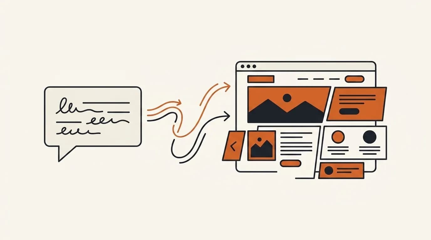
The good news is you don't need to learn design or hire anyone to apply everything above. With Forgelo, you describe your business in one sentence and get a complete, ready-to-publish website in a few minutes, already tidy on mobile and already carrying a structure that is proven to work.
Want to change the headline, add a pricing section, or move the contact form higher? Just type the change, no code. The lead form routes straight to your WhatsApp, so every question lands where you already reply. Basic SEO is built in, and you can publish to a free subdomain or your own custom domain. Check the pricing for the real numbers, starting well below the cost of a one-time website job.
The takeaway
The most useful business website examples aren't the ones that dazzle the eye, they're the ones that explain the offer clearly and make contact easy. Across the 12 industries above, the lesson is consistent: write a message people grasp instantly, pick one main action, show proof, and make sure everything feels comfortable on a phone.
Copy the pattern, not the look. Then start simple and publish today, not next week. A live site that clearly explains your business always beats a perfect one that is still stuck in your head.