If you study small business website ideas across any industry, a strange thing happens: the flashiest ones are rarely the ones making money. The sites that quietly win customers share a handful of simple, repeatable ideas, and almost none of those ideas require a big budget or a design award. This is good news for you, because it means you can copy what works instead of inventing it. Below are twelve of the best small business website patterns worth stealing, each tied to one concrete idea you can apply this week.
I am not going to send you to a gallery of pretty screenshots and call it a day. Anyone can admire a nice homepage. What matters is the underlying move that makes each site convert, and how you lift that move into your own business without spending a fortune.
What makes a top small business website work
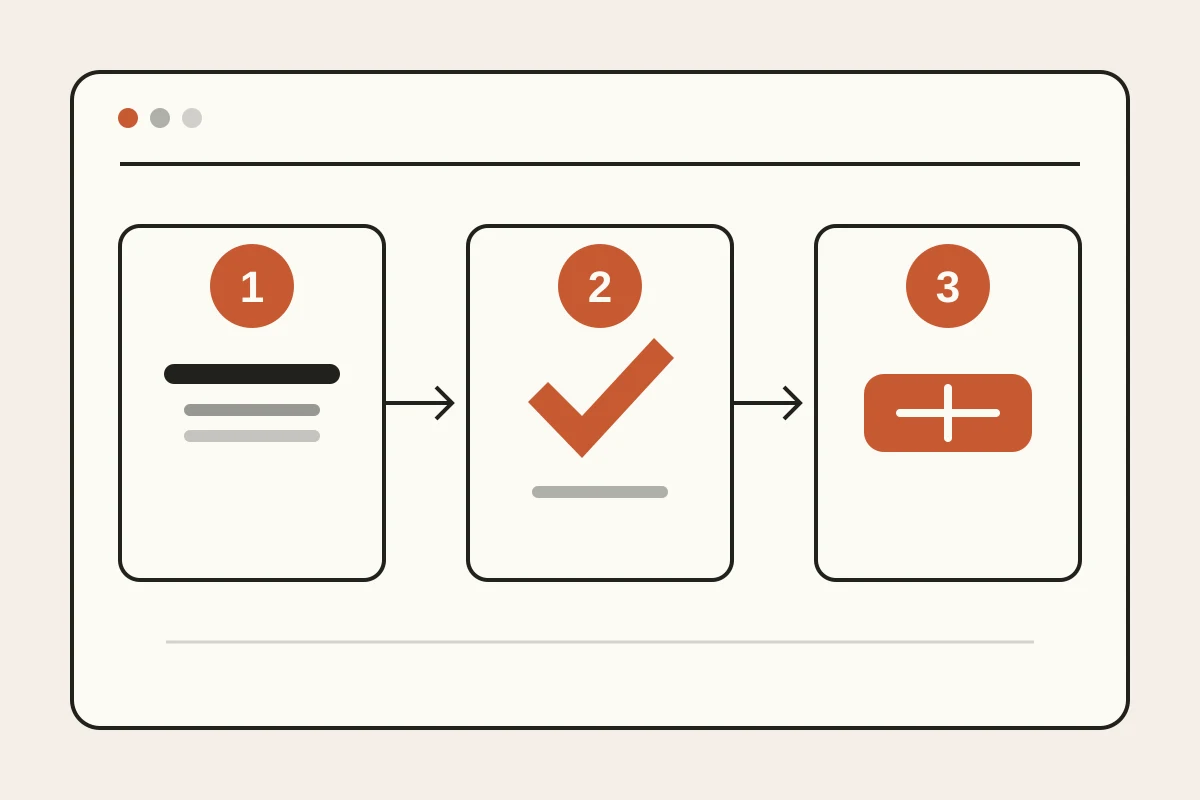
Before the list, one principle ties all twelve together. A top small business website answers three questions fast: what do you do, why should I trust you, and what happens next. Miss any one of those and even a gorgeous site leaks customers.
Note: Speed of comprehension beats depth of information. If a first-time visitor cannot describe your business out loud after five seconds on the page, the design is working against you no matter how polished it looks.
The examples that follow are not ranked by beauty. They are ranked by how cleanly they do that job. Keep that lens on as you read, and you will start seeing your own site differently.
The 12 ideas worth stealing
Here are the twelve patterns, each with the single idea to lift.
The local plumber with a one-line promise. Their headline is not "Welcome to our website." It is "Same-day drain repair in your neighborhood, upfront pricing." Steal this: replace your welcome message with a promise a customer actually cares about.
The cafe that leads with the menu, not the story. The founder's journey lives lower down. The menu and hours sit up top where hungry people look. Steal this: put the thing people came for above the thing you want to say.
The photographer with real work, not stock art. Every image is their own shoot. Trust is instant because you see exactly what you would get. Steal this: swap generic stock photos for real photos of your work, your team, your storefront.
The accountant who shows prices. Most competitors hide behind "contact for a quote." This one lists clear packages. Steal this: publishing even a starting price filters out mismatches and pulls in serious buyers.
The salon with a booking button on every screen. No scrolling to find how to book. The action follows you everywhere. Steal this: repeat your main call to action so it is always one tap away.
The contractor with a before-and-after wall. Nothing sells a renovation like proof of transformation. Steal this: show outcomes, not adjectives. A results grid outperforms a paragraph of promises.
The consultant with three real testimonials. Not a wall of logos, just three named clients saying specific things. Steal this: specificity beats volume. One detailed review outweighs ten vague stars.
The bakery whose site loads instantly. No heavy sliders, no autoplay video. It opens fast on a cheap phone on slow data. Steal this: a fast, light page keeps visitors and helps you rank, as we cover in our guide to website SEO basics.
The tutor with a single clear next step. One button: "Book a free trial lesson." No competing choices. Steal this: give visitors one obvious door, not five half-open ones.
The boutique that routes inquiries to WhatsApp. Questions land where the owner already lives all day. Replies go out in minutes. Steal this: connect your form to chat, which we break down in turn visitors into WhatsApp leads.
The clinic with an FAQ that removes doubt. Insurance, hours, parking, first-visit steps, all answered before anyone has to ask. Steal this: answer the questions that stall a decision.
The freelancer whose whole site is one strong page. No sprawling menu, just a single scroll that does everything. Steal this: for many small businesses, one excellent page beats a maze of thin ones.
None of these needs a design agency. Each is one decision you can make today.
A quick scorecard of the patterns
If you want to see the ideas side by side, here is the pattern, the move, and why it works.
| Business | The idea to steal | Why it works |
|---|---|---|
| Local plumber | A promise, not a welcome | Answers "what do you do" in one line |
| Cafe | Menu above story | Serves the visitor's goal first |
| Photographer | Real photos over stock | Trust you can see |
| Accountant | Visible pricing | Filters and qualifies buyers |
| Salon | Repeated booking button | Action is always one tap away |
| Contractor | Before and after proof | Outcomes beat adjectives |
| Consultant | Three specific reviews | Detail beats volume |
| Bakery | Fast, light page | Keeps visitors, helps ranking |
| Tutor | One clear next step | Removes decision friction |
| Boutique | Form routed to WhatsApp | Replies go out in minutes |
| Clinic | Doubt-removing FAQ | Answers stalls before they happen |
| Freelancer | One strong page | Focus beats sprawl |
Read down the "why it works" column and you will notice something: it is the same short list of jobs, done a dozen different ways. That is the real lesson.
The one thing most sites get wrong
Here is the contrarian take. Most advice tells small businesses to add more: more pages, more features, more sections, more animation. In my experience the opposite is true. The best small business website is usually the one that removed the most.
Tip: Before you add a new section, try deleting an existing one. If nobody misses it and your inquiries hold steady, it was clutter. Sites get better by subtraction far more often than by addition.
A cluttered site is not a sign of effort, it is a sign of no editing. The plumber with one promise and one phone number will out-earn the competitor with a slick nine-page site that buries the phone number in a footer. Restraint is a feature.
How to steal these ideas on a small budget
You do not need to hire anyone to apply the twelve moves above. You need a clear headline, a few real photos, three honest reviews, visible pricing or a starting range, one obvious action, and a fast page. That is the whole recipe, and it fits any trade.
Turn that recipe into a short conversion path rather than a collection of disconnected sections. Start with the visitor's problem and your clearest promise. Follow it with proof that the promise is credible, such as a named review, a real project, or a transparent starting price. Then put one contact action directly after the proof. This order matters because every section answers the next question in the visitor's head: can you help me, can I trust you, and how do I start?
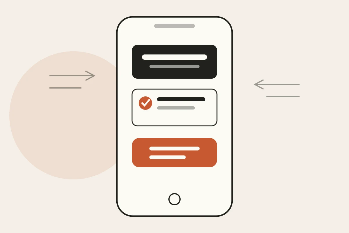
The best small business website ideas also work on a phone before they work on a presentation screen. Keep the headline short enough to scan, make buttons easy to tap, and avoid placing critical details inside decorative graphics. Test the page on mobile data, not only office Wi-Fi. A visitor who can understand the offer and reach you with one thumb is much closer to becoming a lead than someone admiring an elaborate desktop animation.
The old way to get there was a designer and a multi-week timeline, or a template you fight with for a weekend. If you want the fundamentals laid out plainly, our piece on small business website essentials walks through the non-negotiables. If you are comparing modern approaches, see how an AI website builder creates the first draft and why a no-code website builder removes the technical maintenance. And if the price of custom work worries you, our honest breakdown of how much a website costs is worth a read before you commit.
Build your own top small business website in an afternoon
This is where an AI website builder changes the math. Instead of arranging every idea by hand, you describe your business in a sentence and get a working draft in a few minutes. Then you refine by typing plain requests: "make the headline a promise," "put the menu above the story," "add a pricing section," "route the form to WhatsApp." The twelve patterns above stop being aspirations and become quick edits.
With Forgelo, that lead form goes straight to your WhatsApp, your SEO basics come built in, and you publish to a free subdomain or your own custom domain when you are ready. You can copy every idea on this list without a designer, a developer, or a month of waiting. See the pricing if you want the real numbers before you start.
The top small business website in your market is not the prettiest one. It is the clearest one, the fastest one, the one that makes the next step obvious. Those are ideas, not budgets. Steal them, ship something real this week, and let the results tell you what to refine next.