You don't need a designer, an IT team, or a big budget to have an event page that looks genuinely professional. This guide walks through how to make your own invitation website in four practical steps, from gathering the event details to sharing the link in a group chat. If you searched the Indonesian phrase "cara buat undangan website" and landed here, the same steps apply anywhere: weddings, birthdays, baby showers, store openings, workshops, or a small business launch.
A decade ago, making an online invitation meant hiring someone or wrestling with a fiddly template. Not anymore. An AI website builder turns one short description into a full invitation page in a few minutes, and then you refine it by typing. Let's break down the steps, plus when this approach genuinely fits and when it doesn't.
Why an invitation website beats paper (and often beats template apps)
Paper invitations are expensive, slow to print, and unforgiving. Misspell one name and you reprint the batch. An invitation website is the opposite: you can update it anytime, share it with hundreds of guests through a single link for free, and pack it with a location map, a photo gallery, a countdown, and an RSVP form.
Plenty of people jump straight to a ready-made invitation app. There's nothing wrong with that, but read the fine print. Template apps typically charge per event, lock your design inside their choices, stamp their own branding on it, and sometimes let the link expire after a few months. You're renting that page, not owning it.
Note: My honest opinion is that single-use invitation apps are wasteful if you host events even semi-regularly. Pay for a wedding template, then pay again for a birthday, then pay again for a reunion. With your own website, one subscription covers them all, and the page stays yours.
If you want to see the no-cost options first, the guide on free invitation website options lays out several free routes before you commit to anything.
The 4 steps to make an invitation website from scratch
The whole process comes down to four steps. There's no design software to learn and no code to write.
Step 1: Gather all your event details first
Before you touch any tool, jot the information down in your notes app. This saves a lot of time later. Have ready:
- The event name and who's hosting (for example, "Andi and Sari's Wedding")
- The date, day, and start-to-finish times
- The full address plus a Google Maps link
- The running order if there is one (ceremony, reception, entertainment)
- A contact guests can reach
- Dress code or theme, if relevant
- Two or three of your best photos for the gallery
The more complete your notes, the better the result AI produces in the next step. This is the dullest part but the most decisive one.
Step 2: Describe your event to the AI builder
This is where the AI website builder does the heavy lifting. You type a single description, such as: "Make a wedding invitation for Andi and Sari, ceremony October 12 at 9am at Al-Ikhlas Mosque, reception 11am to 2pm, earthy green theme, include a location map and a countdown." From that one sentence, Forgelo assembles a complete, ready-to-publish page in a few minutes.
What you get back isn't a blank canvas but a finished invitation with an opening message, an event details section, room for photos, and a tidy layout. This is the moment most people are surprised, because the part they assumed would be hardest turns out to be the fastest.
Tip: Describe the mood you want, not just the facts. Words like "warm," "minimal and elegant," or "bright and colorful" help the AI pick fitting colors and style. You can always change it later, so there's no wrong first move.
Step 3: Edit by simply typing your changes
The first draft is rarely perfect, and that's fine. The difference is you don't open a design app to fix it. You just type what you want changed, for example:
- "Change the accent color to gold."
- "Add a photo gallery below the event details."
- "Make the opening message more formal."
- "Add a countdown to the ceremony date."
- "Move the RSVP form to the bottom."
Each instruction turns straight into a change on the page. This edit-by-prompt approach is what makes an invitation website feel far lighter than the old tools. If you've never built a site without code, the principle is the same one covered in make a website without coding.
Step 4: Publish and share the link
Once you're happy, hit publish. You can go live on a free subdomain for immediate use, or use your own domain (say andisariwedding.com) so it feels more personal and easy to remember. Copy the link, drop it into the family and friends group chat, and your invitation is officially out.
My favorite part: if you add an RSVP form, every confirmation can land straight in your WhatsApp or inbox. No checking a dashboard over and over. The details of how that works are in route replies straight to WhatsApp.
Comparison: template app vs designer vs building it yourself with AI
To be fair, here are the three most common routes side by side. None wins outright, they each solve a slightly different problem.
| Factor | Template invitation app | Hiring a designer | Build it yourself with AI |
|---|---|---|---|
| Cost | Pay per event | Hundreds to thousands | Monthly plan, many events |
| Time to launch | Fast, fill a template | Days to weeks | Minutes to an afternoon |
| Customization | Limited template choices | Fully custom | Fully custom, by prompt |
| Ownership | Rented, can expire | Yours | Yours, own domain optional |
| RSVP to your phone | Sometimes | Depends on the deal | Built in |
| Changes after launch | Limited | Email the designer, billed | Type it yourself, instant |
The pattern I keep seeing: a template app fits people who need it fast and once, a designer fits people who want something truly distinctive and won't touch anything, and an AI builder fits people who want full control at the most sensible cost.
Features that make your invitation feel alive
A good invitation is more than a name and a date. A few small elements are what keep guests engaged with the page:
- A location map that opens right in Google Maps, so nobody gets lost.
- A countdown to the big day that builds anticipation.
- A photo gallery for a wedding or engagement, or product shots for a store opening.
- An RSVP form so you know the headcount well in advance.
- A wishes section where guests leave a note or a blessing.
- A share button so guests forward the invitation to their partner or family.
You can add all of these just by typing a request. Because basic SEO is built in automatically, a business invitation (like a grand opening or a workshop) is also easier for interested people to find on Google.
How to make an invitation website that reads well on phones
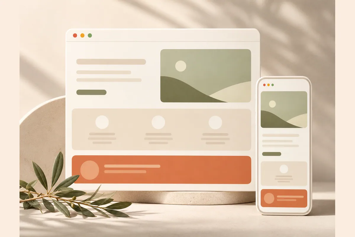
This is the point people ignore most. Almost every guest opens the invitation on a phone screen, not a laptop. So mobile behavior isn't a bonus, it's the main event.
The good news is that a site built with a decent AI builder adapts to small screens automatically. Text doesn't overflow, buttons are large enough to tap, and photos don't stretch. Even so, I always recommend one non-negotiable habit: open your own invitation link on a phone before you share it. Check that names read clearly, that the map button works, and that the RSVP form is easy to fill in with a thumb.
Tip: Ask one or two close friends to open the link on their own phones and give you honest feedback. Fresh eyes often catch things you missed, like a typo in the date or text color that lacks contrast.
Common mistakes that make an invitation look cheap
A few easy traps to avoid once you know them from the start:
- Too much information. An invitation isn't a brochure. Show what matters: who, when, where, and how to confirm. Trim the rest.
- Low-resolution photos. One blurry image can drag down the whole page. Choose sharp photos, even if you only use a few.
- Forgetting to test on a phone. Covered above, but it's the number one mistake, so it's worth repeating.
- Text and background that blend together. If the writing is hard to read, guests close the page. Make sure the contrast is clear.
- No easy way to confirm. If guests have to call you one by one, many won't bother. An RSVP form to your phone solves this.
If you're still torn between hiring help and doing it yourself, the trade-offs are worth weighing before you spend anything.
The takeaway
Making your own invitation website is now genuinely as simple as four steps: gather the event details, describe it to AI, edit by typing, then publish and share. You don't need to be a designer, you don't need to learn code, and you don't need to wait days.
My contrarian take stands: if you host events even occasionally, stop paying for single-use invitation apps. Your own website is cheaper over time, fully under your control, and reusable for the next occasion. The worst option is putting it off until the last minute and overpaying because you're in a rush. Start now, and if you want to see the numbers, check the pricing on offer.