Small business website ideas are useful only when they lead a visitor toward a real business outcome. A beautiful homepage that creates no calls, bookings, sales, or messages is decoration. A simpler page with one clear promise, genuine proof, and an obvious next step can do far more work.
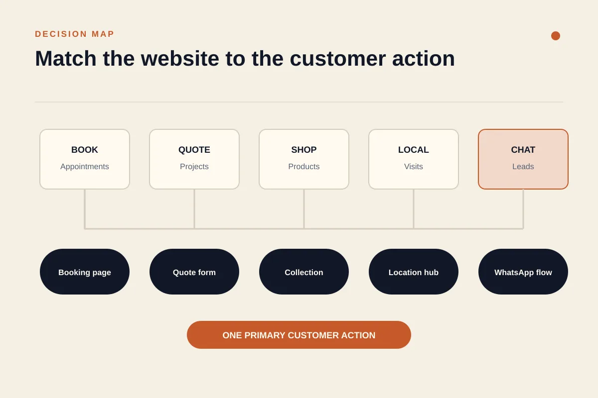
The right idea therefore depends on what your customer needs to do. A salon needs appointment booking. A contractor needs qualified quote requests. A restaurant needs a menu, directions, and reservations. This guide gives you 15 practical patterns, then shows how to turn one of them into a focused website that can actually convert.
What makes a small business website convert?
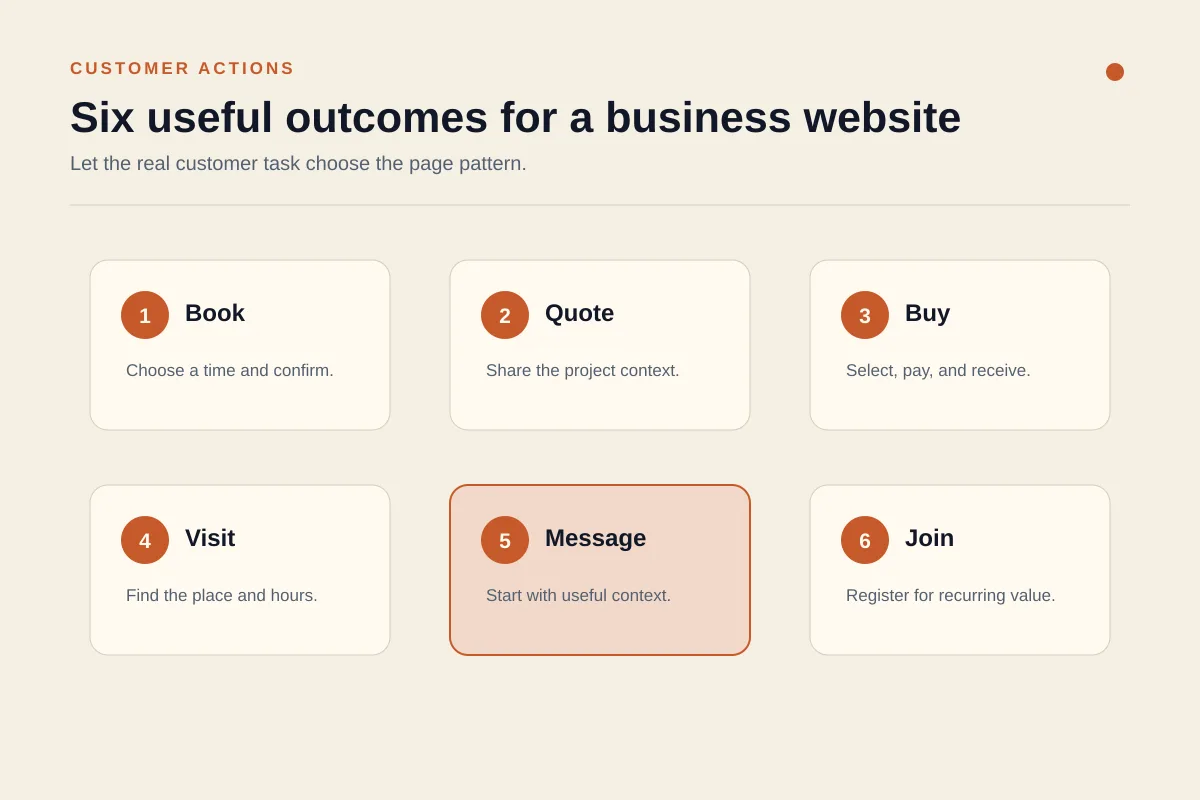
A conversion is the useful action you want a visitor to complete. It might be buying a product, booking a consultation, requesting an estimate, calling the shop, joining a class, or starting a WhatsApp conversation. Define that action before choosing colors, animations, or a template.
In practice, a converting page answers four questions in order. What does this business offer? Is it relevant to me? Why should I trust it? What should I do next? The strongest small business websites answer the first two above the fold, where visitors can see them without scrolling, then provide proof and remove objections as the page continues.
This is why copying the visual style of a fashionable brand often fails. You can copy a large headline or an unusual layout without copying the customer journey underneath it. My preferred test is blunt: hide the logo and ask whether a first-time visitor can name the offer and next action within a few seconds. If not, the design idea is not finished.
Use one primary call to action per page. Secondary links are fine, but they should not compete with the main path. "Book an appointment," "Get a project estimate," and "View today's menu" are more useful than a vague "Learn more." The wording tells people exactly what happens next.
15 small business website ideas organized by goal
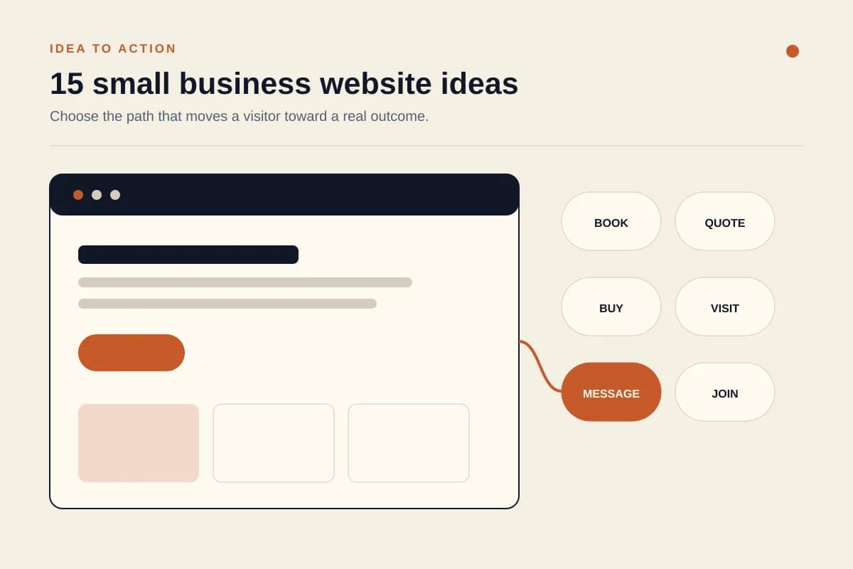
The list below is organized by customer action, not by visual trend. Each idea includes the business types it suits, the primary call to action, and the feature that makes it useful.
1. Booking-first website
Best for salons, clinics, coaches, repair services, and instructors. Put the service, location, availability, and a "Book an appointment" button in the first screen. The key feature is a short booking flow that confirms the chosen time and explains what happens next.
2. Quote-request website
Best for contractors, printers, caterers, and custom manufacturers. Explain the variables that affect price, show relevant work, then ask only for the details needed to estimate. A useful form might request project type, location, timing, and one photo instead of forcing a visitor through fifteen fields.
3. Before-and-after gallery
Best for renovation, cleaning, beauty, landscaping, fitness, and repair businesses. Pair each result with a short description of the original problem and the work completed. The primary action can be "Get a result like this." Proof is stronger when it is specific and used with the customer's permission.
4. Service comparison website
Best for businesses with three or four clear packages. A comparison table helps visitors understand scope, timing, and who each package suits. Keep the choices meaningfully different. Three nearly identical plans create hesitation rather than clarity.
5. Case-study portfolio
Best for consultants, agencies, photographers, architects, and freelancers. Organize work around the client's situation, your approach, and the verified result. If confidential numbers cannot be shared, explain the constraint and focus on the decisions you made. The call to action should connect the example to a discovery conversation.
6. Shoppable product collection
Best for makers, food brands, fashion labels, and specialist retailers. Start with a focused collection instead of displaying every product at once. Good filtering, useful product photos, delivery information, and clear returns policies matter more than decorative motion.
7. Menu and reservation hub
Best for restaurants, cafes, bakeries, and event venues. Show the current menu in readable HTML, not only in a PDF or image. Add hours, dietary information, directions, and a reservation action. A customer on the street should be able to decide and act with one hand on a phone.
8. Event or class calendar
Best for studios, community organizations, tutors, and venues. Let visitors filter by date, level, or topic, then register without searching through social posts. Each event needs a clear time, place, capacity, price, and cancellation rule.
9. Lead-magnet website
Best for advisers, educators, and businesses with a longer sales cycle. Offer a checklist, calculator, sample plan, or short email course that solves one early problem. Ask for the minimum information required and explain what subscribers will receive.
10. Membership or subscription website
Best for recurring services, learning communities, maintenance plans, and product clubs. The page should explain the ongoing value, billing frequency, pause or cancellation process, and what changes between tiers. Recurring revenue is attractive, but unclear renewal terms destroy trust quickly.
11. Location-focused website
Best for shops, clinics, workshops, and service-area businesses. Put the address, phone number, hours, directions, parking, accessibility details, and service area where visitors can find them. Google's guidance says complete and accurate Business Profile information makes a business more likely to appear for relevant local searches, so keep the website and Google Business Profile details consistent.
12. One-page launch site
Best for a new business, a single offer, or a temporary campaign. Use one page with a promise, offer, proof, FAQ, and contact action. A one-page site is not automatically thin. It works when the visitor has one decision to make and every section supports it.
13. FAQ-led sales website
Best for services where customers repeatedly ask about process, safety, eligibility, timing, or price. Turn real sales questions into direct answers, then place a relevant call to action after each topic. Do not write questions only to target keywords. Use the objections people genuinely raise before buying.
14. Product finder or recommendation quiz
Best for businesses with products that differ by use case, size, condition, or preference. Keep the quiz short, explain why each question matters, and provide a recommendation that a customer can still review. It should reduce complexity, not hide the catalog behind a gimmick.
15. WhatsApp lead website
Best for small businesses that already handle sales and support in chat. The website qualifies the visitor with service details, examples, location, and pricing context. The primary action then opens WhatsApp with a useful prefilled message. The visitor avoids a cold conversation, and the business receives enough context to reply well. See our practical guide to turning website visitors into WhatsApp leads for the full flow.
Build a homepage that guides visitors to the next step
A homepage should work like a guided conversation. Start with a benefit-focused hero that names the customer, the offer, and the result. Pair it with one primary action. "Emergency plumbing repairs in Leeds, available every day" is stronger than "Solutions built around you" because a visitor can immediately judge relevance.
Next, show the main services or product categories. Keep this section scannable and link each option to a focused page when more detail is needed. Then explain why the business is different. Specific proof beats adjectives: years operating, a professional license, a delivery area, a documented process, or a clearly stated guarantee can all help when accurate.
Add real work samples, product photography, or a concise case study. Follow with genuine testimonials and answers to the objections that usually delay a decision. The FTC's consumer reviews and testimonials guidance prohibits fake or false reviews, so never invent social proof to fill an empty section. A new business is better off explaining its process honestly.
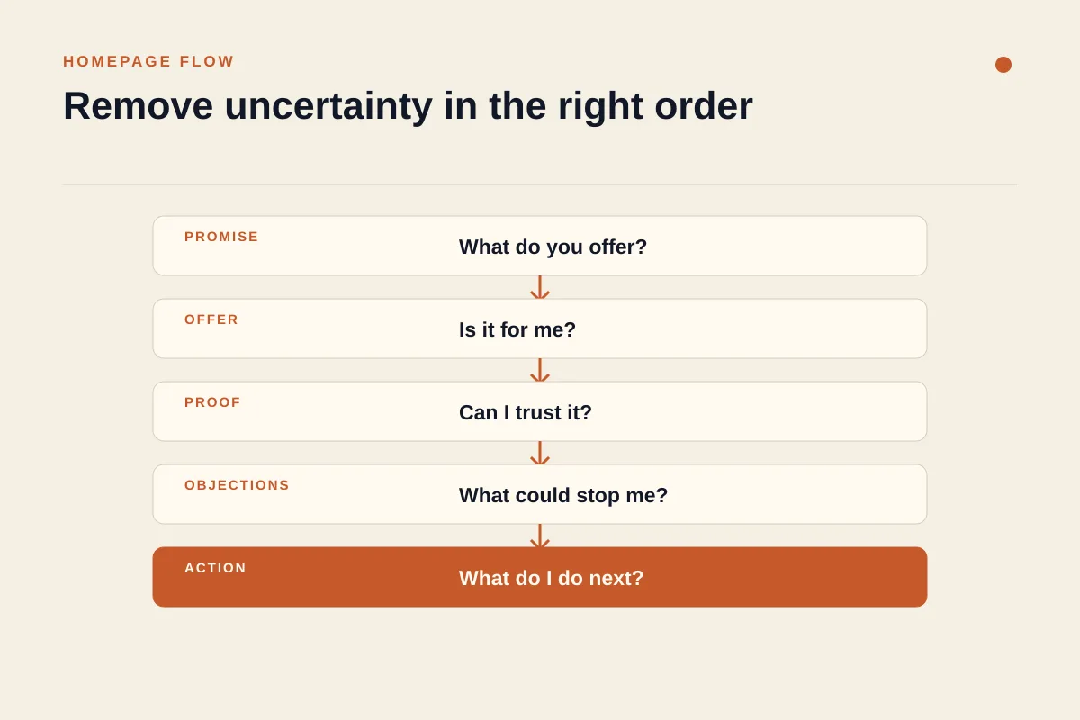
Finish by repeating the primary action and complete contact details. The page now forms a conversion sequence: promise, offer, proof, objections, action. That structure is more durable than a visual trend because it follows how people decide.
Add the pages and features customers actually need
A small business rarely needs dozens of pages at launch. It needs the smallest set that answers customer questions without making the owner look absent or unclear. Begin with a homepage, focused service or product pages, an About page, and a contact page. Add policies for privacy, delivery, returns, cancellations, or warranties where they apply.
Pricing deserves special attention. If fixed prices are impossible, explain how estimates work and what affects the range. "Contact us for pricing" without context creates unnecessary friction. Even a list of project factors or a starting point helps visitors decide whether the business fits.
Forms should be short and understandable. The W3C forms tutorial recommends asking only for information required to complete the process, with clear labels, instructions, validation, error feedback, and completion messages. That is good accessibility and good sales design at the same time.
Do not add a blog, membership area, quiz, or online store because a checklist says every modern website needs one. Each feature adds maintenance. Launch it only when it supports a customer task or a measured acquisition channel. A smaller site that stays accurate is more trustworthy than a large site full of stale sections.
If you want a fuller technical baseline, our guide to the essential elements of a small business website covers contact details, SEO, mobile layout, and lead capture in more depth.
Use trust signals without making the site feel crowded
Trust is not a strip of logos placed under the hero. It is the accumulation of details that reduce perceived risk. Start with accurate contact information, a real business address when customers can visit, clear hours, and an expected response time. Show credentials, licenses, memberships, or insurance only when current and relevant.
Use real photography whenever possible. A clear photo of the shop, team, product, or completed job often communicates more than a generic stock image. Name the context in the caption so the visitor understands what the image proves. For service businesses, a short case story can show how you think without pretending every project produced a spectacular metric.
Testimonials should be genuine, attributed with permission, and representative of real experiences. Transparent policies also carry trust. Explain deposits, revisions, shipping, cancellations, and support before the customer has to ask. Security badges and payment logos are useful only when they describe the actual checkout.
My contrarian view is that a young business should show fewer trust signals, not more. Three verifiable details beat a crowded wall of vague claims. If you do not yet have reviews, publish the founder's relevant experience, a clear process, and a low-risk first step. Honesty is a stronger starting point than manufactured authority.
Make every idea work on mobile, in search, and for more users
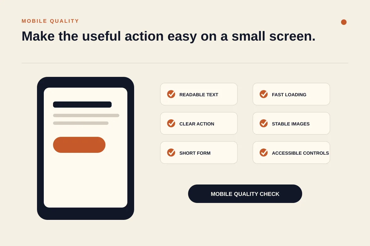
Design the first version at a narrow width. Check that headings wrap cleanly, buttons remain easy to tap, forms fit the screen, tables can scroll, and the main action is not hidden by a floating widget. Google strongly recommends a mobile-friendly site in its mobile-first indexing guidance, but the practical reason is simpler: many local decisions happen on a phone.
Performance matters too. Compress images, limit unnecessary scripts, reserve image dimensions to prevent layout movement, and avoid animation that delays the offer. Google's Core Web Vitals documentation describes the real-world loading, interactivity, and visual-stability metrics worth monitoring. A perfect score is not the goal. A stable page that responds quickly and helps the visitor act is.
Accessibility belongs in the first build, not a later compliance sprint. Use descriptive alternative text for informative images, visible labels for form controls, meaningful link text, sufficient contrast, keyboard-friendly controls, and clear focus states. These choices help people with disabilities and make the interface easier for everyone.
For a physical location, keep the website's name, address, phone, and hours aligned with the Business Profile. Add a focused location page with directions and service details. Google's LocalBusiness structured data guidance explains how eligible businesses can describe locations and hours to search engines, although markup never guarantees a special result.
Finally, use descriptive internal links. Link a phrase to the page that answers it instead of repeating "click here." If you are building without a developer, compare the workflow in our no-code website builder guide and our complete AI website builder guide.
Choose, launch, and improve your website idea
Choose one primary conversion goal and one pattern from this guide. Then list the minimum pages, proof, and features required to support it. This prevents the project from turning into a collection of disconnected ideas.
Build the first version with reusable sections. With Forgelo, you can describe the business in one sentence, generate a working draft, then edit one section at a time by prompt. That matters after launch because the hero, service list, testimonial block, or call to action can change without rebuilding the rest of the site.
Before publishing, test every link, form, phone number, booking flow, checkout, and WhatsApp message. Review the site on a small phone and a wide desktop. Ask someone unfamiliar with the business what it offers and what they would click next. Confusion found in this test is more useful than another hour choosing fonts.
After launch, measure completed actions rather than page views alone. Track bookings, purchases, calls, form submissions, and qualified chats. Change one high-impact element at a time, such as the hero promise or form length, then compare the result over a meaningful period. No layout or button color guarantees growth. Treat each design choice as a hypothesis the business can test.
The best small business website ideas are not the most elaborate ones. They make the offer understandable, the proof credible, and the next action easy. If you want to turn one of these patterns into a working page, start free with Forgelo, describe the business, and shape each section with a prompt until the customer journey is clear.