A company website, or website perusahaan as businesses in Indonesia call it, is not a digital brochure meant to sit and look pretty. It works: it explains who you are in the first ten seconds, builds trust, and points a prospect toward one clear action. The trouble is that most company sites do the opposite, stuffed with pages nobody reads and missing a phone number anyone can actually reach. This guide breaks down the pages that truly matter, plus ten examples you can copy right away.
Before the list of pages, one principle to hold onto: a company site is not the place to show off everything you have ever done. It is a tool to make strangers trust you and get in touch. Any page that does not move toward that is really just weight.
What a company website is and how it differs
A company website is the official representation of a business online. It does two jobs: it establishes credibility and it generates inquiries from prospects. That makes it different from an online store, whose job is to process transactions, and different from a landing page, which has a single campaign goal.
Keep these three straight so you build the right thing. An online store needs a catalog, a cart, and checkout. A landing page needs one message and one button. A company website sits in the middle: it has to tell the full story of who you are while still steering visitors toward an action, usually to contact you or request a quote.
If you serve business clients, the decision often involves several people comparing you with competitors. This is where clean structure earns its keep. Someone arriving from search or from your business card will judge how serious you are by the very first page they open.
The essential pages of a company website
Here is the minimum framework that works for almost any kind of business. Treat the "required" column as the foundation, and the rest as additions as the company grows.
| Page | Main job | Status |
|---|---|---|
| Home | Explain who you are and who you serve, fast | Required |
| About | Build trust through story, credentials, and team | Required |
| Services / Products | Detail what you sell and the result clients get | Required |
| Portfolio / Clients | Prove you have actually done the work | Required |
| Contact | Give the fastest possible way to reach you | Required |
| Blog | Pull in search traffic and show expertise | Optional |
| Careers | Attract talent and signal a growing company | Optional |
| FAQ | Answer objections before a visitor hesitates | Optional |
Notice that the Contact page is not a formality. Plenty of company sites bury it at the very end with a form nobody checks. Yet that is exactly where the highest purchase intent turns into a conversation. Our guide on how to build a website with AI walks through structuring the flow from home to contact in more depth.
Tip: Wire the contact form straight to WhatsApp or your phone, not an inbox you rarely open. Prospects tend to reach out on chat, and every hour you take to reply is an opening for a competitor to catch them first.
10 company website examples worth copying
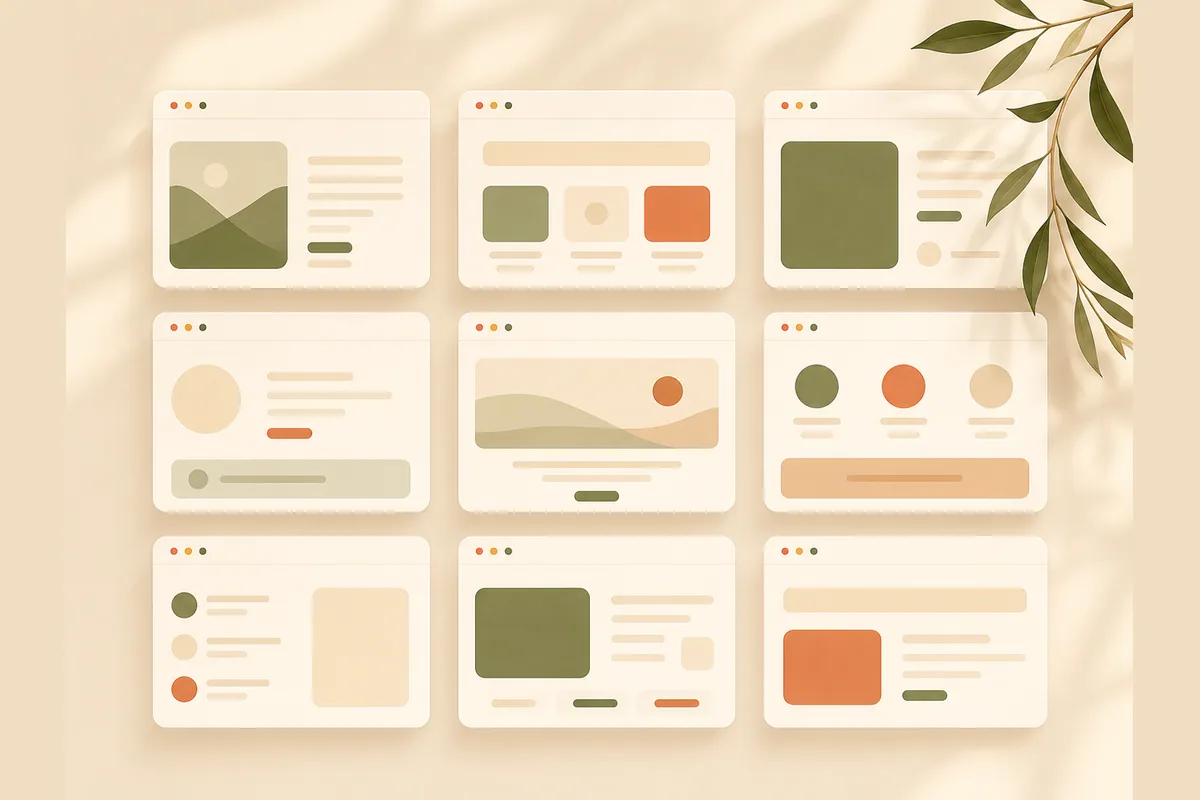
Rather than invent brand names, here are ten real patterns by business type. Take the one closest to yours, then copy the structure, not the colors.
- Contractors and construction. A home page led by big project photos, a services page per type of work, and a portfolio that shows scale. Worth copying: label each project with its size or contract value to convey capacity.
- Distributors and suppliers. Built around a product catalog, coverage area, and partnership terms. Worth copying: a clear "Become a Partner" page so resellers know how to join.
- Consultants and agencies. Lead with client results and a method. Worth copying: short case studies in a problem, action, result format.
- Manufacturers. Emphasize production capacity, certifications, and quality standards. Worth copying: a separate certifications page, because B2B buyers look for it.
- Clinics and health services. Practitioner profiles, a services list, and hours. Worth copying: a booking button that follows visitors on every page.
- Law and professional firms. Practice areas, partner profiles, and educational articles. Worth copying: a calm, reassuring tone without heavy jargon.
- Software and tech companies. Explain the product in benefit language, not technical features. Worth copying: a demo or trial page that is easy to find.
- Travel and tour operators. Packages, a gallery, and trip testimonials. Worth copying: transparent pricing so you don't waste time on unqualified leads.
- Schools and training providers. Curriculum, instructors, and an enrollment flow. Worth copying: a class calendar that stays current.
- Small and local businesses. A trimmed version of everything above: five pages, one contact number, and just enough social proof. Worth copying: simplicity that still looks professional.
The thread across all ten examples is obvious: they prove something, then make it easy to reach out. Everything else is garnish.
Note: Copying structure is healthy, copying claims is dangerous. Never borrow numbers or testimonials from an example you admire. Fabricated proof destroys trust faster than a plain but honest site ever could.
Company profile site vs a full company website
People treat these as the same, but the goals differ. A company profile site tells your identity: history, mission, org structure, and credentials. That matters for tenders, partnerships, or any time you need to look established.
But a profile alone rarely produces sales. A site that stops at "we're an experienced company since such-and-such year" gives a visitor no reason to act now. A full company website layers action on top of the profile: a services page with clear outcomes, pricing or a cost range, and a contact path that stands out.
Here is my contrarian take: most companies over-invest in a grand company profile and forget to build a site that sells. A twenty-page profile nobody reads loses badly to five focused pages that turn visitors into inquiries. If you are weighing building it yourself against hiring out, our take on small business website essentials covers what actually earns its place.
Common company website mistakes
After looking at a lot of sites, the mistakes rhyme. These are the ones that most often sink a company website.
- Hidden contact info. Your phone and chat details should appear everywhere, not tucked away on a single page.
- Slow loading from heavy images. Many visitors open your site on a phone with a shaky signal. A bloated site loses them before the content shows.
- Corporate jargon. "Integrated synergy solutions" explains nothing. Say plainly what you do and for whom.
- No proof at all. Claims with no portfolio, client logos, or testimonials read like an empty flyer.
- Left to rot. The address moves, the services change, but the site goes years without an update. A stale site is worse than none.
That last one stings most because it is avoidable. A company website should be easy to update, not a project that needs a vendor call for every small change. If updating your opening hours requires a support ticket, sooner or later your site falls out of date.
Build it yourself, hire out, or use AI
The choice used to be two options: build it yourself on a platform with a steep learning curve, or hire out with real cost and wait time. Now there is a third path that changes the math.
With an AI website builder like Forgelo, you describe your business in one sentence and get a publish-ready company website in a few minutes. Need to swap a headline, add a services page, or move the contact form? You just type the change, no coding and no waiting on someone else's calendar. Lead forms route straight to your WhatsApp, basic SEO is built in, and you can publish to a free subdomain or your own custom domain.
Running an agency or building sites for clients? There is an Agency plan too, with full white label on the roadmap. And on cost, plans start well below the price of hiring out a comparable site. Compare the details on our pricing page.
To get the most out of it, make sure your site captures leads properly. Our guide on turning visitors into WhatsApp leads shows how to write calls to action people actually click.
The takeaway
An effective company website does not need twenty pages and fancy animation. It needs a clear structure: a home page that explains fast, an about page that builds trust, services that promise real outcomes, a portfolio that proves it, and contact details that stand out. Copy the pattern from the example that fits your business type, avoid the classic mistakes of hiding contact and letting the site rot, and focus on one thing: making it easy for people to reach you.
If you want it live this week instead of next month, start with something fast that you can change yourself anytime. A site that is live and working always beats a perfect one that is still just a plan.