Search for a Carrd one page website and you will hit the same story on every forum: a simple builder, a famously low yearly price, and a lot of very happy people using it for link-in-bio pages, portfolios, and quick landings. Most of that praise is deserved. Carrd does one thing, a single well-designed page, and it does it cheaply and cleanly. This review looks at where a Carrd one page website genuinely earns its fans, where the one-page model quietly caps you, and when an AI-generated site is the smarter starting point.
Quick position before the details. If you need one focused page and you like arranging things yourself, Carrd is hard to argue with on price and polish. If you expect to grow past a single page, want inquiries landing in WhatsApp, or would rather describe your site than build it by hand, an AI website builder tends to fit better. Both are valid. Let's walk through both sides honestly.
What a Carrd one page website actually is
Carrd is a builder for single-page sites. You start from a template or a blank canvas, then arrange elements yourself: a heading, some text, a button, an image, a form. Everything lives on one scrolling page. That constraint is the whole idea. Instead of managing a site with menus and subpages, you focus on getting one page exactly right.
It shines for a specific set of jobs. A link-in-bio page for social media, a personal profile or resume, a portfolio for a photographer or designer, a coming-soon or waitlist page, a simple event or product landing. For any of those, a Carrd one page website is genuinely well matched. You are not fighting the tool to do something it was never meant to do.

One thing to be clear about: Carrd is not an AI builder. You make the design decisions. That is a strength if you enjoy fine-tuning a single page, and a cost if you would rather answer a few questions and get a full draft back. Keep that distinction in mind, because it is the fault line the rest of this review runs along.
Where Carrd genuinely earns its fans
Credit where it is due. A few things about Carrd are legitimately excellent, and pretending otherwise would be dishonest.
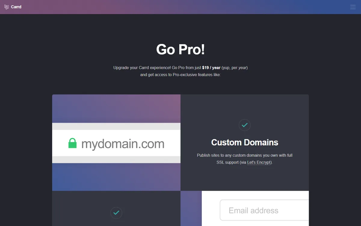
The price is the headline for a reason. Carrd has a free tier for basic sites on a carrd.co subdomain, and its most popular Pro tier sits around 19 dollars a year. Not per month. Per year. For a working page with a custom domain, forms, and no builder branding, that is roughly the cost of two coffees for twelve months. Pricing can change, so check current numbers, but the low annual figure is the reason Carrd spread by word of mouth.
The output is clean and fast. Because a Carrd page is small and simple, it loads quickly and looks tidy on mobile. There is no plugin bloat and no sprawling theme. For a single page, that lightness is a real advantage.
The editor is approachable. You do not need to code. Elements snap into a sensible layout, and the learning curve for one page is short. Someone non-technical can get a decent link-in-bio live in an evening.
It respects the small job. Not every project needs a full website. Carrd is refreshingly honest about being a one-page tool, and it does not try to upsell you into a bloated platform. If your need really is one page, that focus is a feature.
Tip: Judge any builder on the job you actually have. If you truly need one page and nothing more, a Carrd one page website is tough to beat on cost. The trouble starts only when "one page" turns out to be a floor you outgrow, not a ceiling you chose.
The honest limits of one page
Here is the part the glowing reviews tend to skip. The one-page model is a hard boundary, and businesses hit it more often than they expect.
Growth is the first wall. The day you want a separate page for each service, a proper about section, a contact page, and maybe a blog, you are no longer doing what Carrd is built for. You can link between multiple Carrd sites, but that is a workaround, not a real multi-page structure with shared navigation.
Search visibility is the second. Clear, separate pages for distinct topics help both readers and search engines understand what you offer. Squeezing every service, testimonial, and FAQ into one long scroll can blur that signal. A single page can rank for one focused thing, but it struggles to compete for the range of terms a growing business wants to be found for. Our primer on website SEO basics walks through why structure matters.
Functionality is the third. Carrd forms are fine for a simple signup or contact, but they generally route to email. If your customers reach you on WhatsApp, that is an extra step you have to bridge yourself. And anything beyond a basic form, a real catalog, memberships, deeper integrations, sits outside the one-page world.
Finally, everything is manual. Every tweak, every new section, every rewrite is your hands on the editor. For one page that is fine. For a page you update often, the small edits add up.
Carrd one page website vs an AI-generated alternative
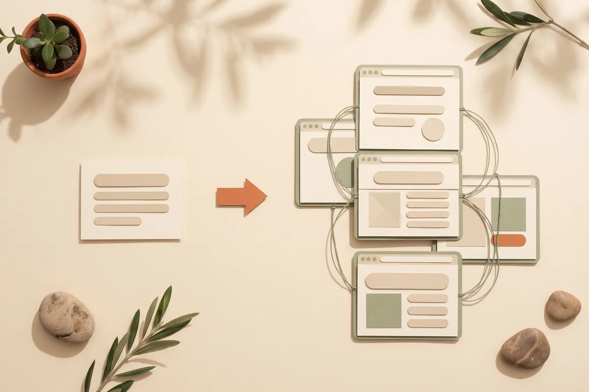
This is the comparison most people actually want. Not Carrd versus a heavyweight platform, but a manual one-page builder versus a tool that generates a full site from a description. Here is the honest side-by-side.
| Factor | Carrd one page website | AI website builder |
|---|---|---|
| How you build | Arrange elements yourself | Describe your business, get a full site |
| Pages | One page by design | Multiple pages as needed |
| Editing | Manual, element by element | Type the change in plain language |
| Time to first draft | Fast for one page | A working site in minutes |
| Leads | Forms, usually to email | Lead forms straight to WhatsApp |
| Best fit | Link-in-bio, portfolio, single landing | A real multi-page business site |
| Price shape | Very low yearly fee | Low monthly subscription |
Neither column is the automatic winner. If your entire need is a single, static page and you enjoy building it, Carrd's price is genuinely hard to top. If you want a full site that can grow, and you would rather not assemble it by hand, the AI route saves you both the building time and the migration later. A tool like Forgelo generates your site in a few minutes, then lets you refine it by typing what you want changed.
Here is my honestly contrarian take. Most people who choose Carrd purely for the price are not really saving money, they are deferring a decision. The 19 dollars a year is real, but so is the hour you spend hand-building the page, and so is the second tool you buy in eight months when one page stops being enough. Cheap upfront is not the same as cheap over a year.
What a one-page site needs to actually convert
Whether you build it on Carrd or generate it with AI, a single page only works if it is ruthless about order. Visitors scroll once, from top to bottom, so every block has to earn its spot.
- A headline that names the outcome. Say what you do and for whom in one line. A visitor who has to guess usually leaves before the second section.
- Proof right under it. A short review, a recognisable client, or a photo of real work. One strong piece beats five weak ones.
- What you offer, in plain terms. The main service or product, what it includes, and who it suits. Keep it short enough to read on a phone without zooming.
- One action, repeated. The same button or contact link near the top and again at the bottom. Two different calls to action on one page tend to split attention.
- A way to reach you that you actually check. If inquiries land in an inbox you open twice a day, a quick reply channel such as WhatsApp will usually win more conversations.
If the page still feels crowded after this, that is a signal you have outgrown one page, not that you need a cleverer layout.
Who should stick with Carrd, and who should look further
Let me be fair to Carrd, because it deserves it. Stick with a Carrd one page website if:
- Your need is honestly one page: a link-in-bio, a personal profile, a portfolio, a coming-soon page.
- You like arranging a page yourself and want tight control over that single canvas.
- Budget is your top constraint and email-based forms are fine for you.
- You are testing a tiny idea and want the lowest possible commitment.
Look further if any of these ring true:
- You expect to add services, an about page, or a blog within the year.
- Your customers message you, so you want leads landing in WhatsApp instead of an inbox you check twice a day.
- You would rather describe your site and have it built than place every element by hand.
- You want a portfolio that can grow into a full site later without a rebuild. Our guide to a free portfolio website covers both paths.
There is no shame in either answer. It is just a match of tool to need, and the wrong match is what costs you, not the tool itself.
How an AI builder like Forgelo changes the math
If you land in the "look further" camp, here is what the AI approach actually feels like. You describe your business in a sentence or two. In a few minutes you get a full, publish-ready site, not a single page you then have to flesh out. Editing is by prompt: "make the headline shorter," "add a pricing section," "move the contact form up." No blocks to drag, no manual layout wrestling.
The lead handling is the other real difference. With Forgelo, form submissions go straight to your WhatsApp, so inquiries arrive where you already reply instead of an email you might miss. SEO basics come built in, you publish free on a subdomain or connect a custom domain, and agencies get an Agency plan for client work, with full white label on the roadmap. Plans run 9, 19, or 39 dollars a month, so it is a monthly subscription rather than a yearly one, which is the honest trade for getting a full site instead of one page. If you are comparing options broadly, our roundup of the best AI website builder tools puts them side by side.
None of this makes Carrd bad. It makes it a different tool for a different job. Carrd wins the one-page contest. An AI builder wins the "I need a real site that can grow" contest.
The bottom line
A Carrd one page website is a genuinely great answer to a genuinely small question: how do I get one clean, cheap, fast page online. For a link-in-bio, a portfolio, or a simple landing, it is tough to beat, and you should not feel bad about using it.
The catch is that most businesses do not stay one page for long. The moment you want separate pages, leads in WhatsApp, or a site you can describe instead of hand-build, the one-page model becomes a wall. If you can already see that day coming, starting with an AI builder saves you the rebuild. Match the tool to where your business is heading, not just where it is today, and either choice becomes the right one. You can see the full picture on our pricing page and decide from there.