
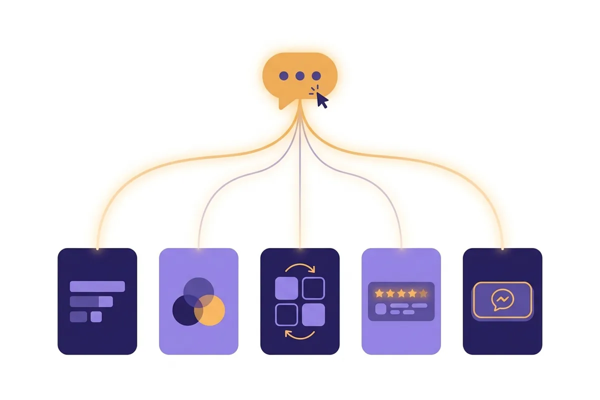
The short answer: with a platform that supports editing a website section by section, one sentence is enough to change the hero headline, the color scheme, the layout, the content, and even the call-to-action button. You write the change you want in everyday language, and only the section you name gets rebuilt. No coding, no dragging elements around a canvas, and no waiting for someone else to do the revision.
This article breaks down the five most common changes you can request in one sentence, with example instructions you can copy straight away. At the end there is a short comparison of why changing one section at a time is much safer than rebuilding the whole page, plus answers to the questions people ask most. If you want to know how to keep an existing site up to date over time, that is covered in our guide to editing a website with AI, and the craft of wording a good instruction is covered in editing a website by prompt. This one focuses on what you can actually change.
1. The headline and opening line in the hero
The hero is the first screen visitors see: a big headline, a supporting sentence or two, and usually a button. This is where first impressions form, and this is where a one-sentence change has the most visible effect.
Example instructions you can type:
- "Change the hero headline to focus on online ordering, not just an introduction."
- "Make the opening line mention our Austin location and free local delivery."
- "The headline is too long, cut it to eight words at most."
What is interesting about changing things by prompt is that you do not need to know the design terms. You do not have to say "set the heading font-size to 48px". Just explain the intent, for example "make the headline feel more convincing to someone hearing about my brand for the first time", and the system decides on the words and emphasis. From the patterns we see, users actually get the best results when the instruction talks about the business goal, not the technical look.
One thing that rarely gets discussed: the hero headline is the part that gets rewritten most often. That is natural, because finding the right sentence takes a few attempts. That is exactly why changing it needs to be easy. If every attempt means editing by hand or waiting for an agency revision, you will stop experimenting after the second try.
2. The colors and mood of a section
The second most common request is about feel: the colors are too busy, one section feels dark, or the mood does not suit the character of the business. This also takes one sentence.
A few examples you can use:
- "The testimonials section feels too dark, make it lighter and warmer."
- "Change the accent color to dark green so it feels more natural, to suit my coffee business."
- "The pricing section is too plain, give it a soft background so it stands out from the other sections."
Notice that none of the examples above include a color code. You can mention a hex code if you have brand guidelines, but for most small business owners, words like "warmer", "more premium", or "more playful" are understood well enough. The system translates that direction into a color combination that stays consistent with the rest of the page.
To be honest, this is where canvas editors often trip up beginners. The freedom to set the color of every element one by one sounds nice, until the result becomes a patchwork: a green button in one section, a blue one in another, and three shades of gray that differ by accident. A change made by sentence works at the level of a whole section's mood, so the result stays coherent without you needing to understand color theory.
3. The arrangement and layout of content within a section
Besides text and color, structure can also be changed with a plain instruction. Structure here means things like the order of content, the number of columns, or where the image sits relative to the text.
Common example instructions:
- "The services section has three columns now, change it to two columns with bigger icons."
- "Move the photo to the right and the text to the left."
- "The list of benefits runs too far down the page, arrange it as side-by-side cards."
Layout changes are usually the scary part in other tools. In a drag-and-drop editor, moving one block often breaks the spacing and alignment of the blocks around it, and the next half hour goes into tidying up the side effects. And if you use an agency, structural changes almost always count as a major revision that waits longer in the queue.
With section editing, the sentence "change it to two columns" rebuilds only that section. The sections above and below are not touched at all. In our view, this is the strongest reason the section-by-section approach suits business owners who run their own websites: you can experiment with structure without fear of breaking a finished page.
4. Section contents: testimonials, pricing, and FAQ
One sentence can also change what a section contains, not just how it looks. That includes adding a section that did not exist before, or removing one that is no longer relevant.
Examples business owners use often:
- "Add an FAQ section with the five questions catering customers ask most."
- "Replace the testimonials with these three reviews: ..." and then paste real reviews from your customers.
- "In the pricing section, add a third package for a monthly subscription."
- "Remove the gallery section and replace it with a three-step how-to-order section."
What often gets overlooked is that content like this decides whether your website is trusted or not. Real testimonials, clear pricing, and an FAQ that answers genuine doubts matter far more to prospective buyers than fancy animation. If changing content feels heavy, business owners tend to leave placeholder content up for months, and visitors notice.
We suggest one simple habit: every time a customer leaves a good review or asks a new question by message, turn it into a one-sentence instruction to your website that same day. "Add Sarah's review about fast delivery" takes less than a minute, and your website always feels alive. The full workflow is covered in our guide to editing a website with AI.
5. The call-to-action button and where it leads (CTA)
The fifth change, and the one most directly tied to revenue, is the call-to-action button, or CTA (the button that asks visitors to do something, such as contact you). One sentence can change the button text, where it goes, and even where it sits.
For example:
- "Change the button text from 'Learn More' to 'Order on WhatsApp'."
- "Point every contact button to my new WhatsApp number."
- "Add a WhatsApp button at the bottom of the page too, after the FAQ."
It sounds trivial, but from our experience working with many small business websites in Indonesia, a button that opens WhatsApp almost always outperforms an email form in that market. People there close deals in conversation, not in an email inbox. That is why a change like "point the button to WhatsApp" is one of the highest-impact instructions compared with the effort, which is just one sentence. In your market, the equivalent might be a call button, a booking link, or a text message; the principle is to send people to the channel they already use.
Also worth trying: matching the CTA to the context of each section. The button in the hero can invite people to "See the menu", while the button after the testimonials fits better as "Order now", because the reader is more convinced by then. A change this subtle is usually only made by experienced agencies, but by prompt, you can ask for it yourself any time.
Why edit a website section by section, not rebuild the whole page
All five changes above could also be made another way: editing by hand in a canvas editor, asking a website design service to revise it, or pressing the regenerate button in an older-style AI builder. The problem lies in the side effects of each route.
The table below sums up the comparison:
| Aspect | Section editing by prompt | Regenerating the whole page | Manual editing on a canvas | Revision through an agency |
|---|---|---|---|---|
| Scope of the change | Only the section you name | The whole page changes too | Element by element | Per the brief, wait your turn |
| Risk of breaking other parts | Almost none | High, the result is a lottery | Medium, layout shifts easily | Low, but slow |
| Speed | Seconds | Seconds, but often repeated | Minutes to hours | Days |
| Skill needed | None, everyday language is enough | None | A sense of design | None, but paid per revision |
One-way generators have a weakness you feel quickly: once the first result is not quite right, your only choices are to accept it or start over from scratch. Sections that were already good get wiped every time you try again. A canvas editor gives full control, but demands time and a sense of design you may not have. A deeper discussion of these approaches is in our AI website builder article.
The section-by-section approach takes the middle path that we think makes the most sense for business owners: the speed of AI, with the control of a conversation. At Forgelo, the workflow was designed this way from the start. Your first website comes from one sentence describing your business, and every refinement after that is also a sentence, section by section. You can see the flow on the how Forgelo works page, and try it directly without a credit card on the free plan.
Conclusion
One sentence can change the five most important things on your website: the hero headline and text, the colors and mood, the layout, content such as testimonials and pricing, and the call-to-action button. The key is not the sentence itself but a platform that supports editing a website section by section, so each instruction rebuilds only the section you mean without disturbing the rest.
If your website has rarely been updated because changing it felt like a chore, this approach is worth a try. Start with one sentence describing your business, let Forgelo build a complete draft in a few minutes, then shape each section through conversation until it truly feels like yours. For a guide from the initial build side, continue to how to build a website for your business.