Good landing page design is not about building the prettiest page. It is about building the page that makes a visitor understand your offer and act on it in the shortest possible time. Plenty of small business owners spend weeks agonizing over colors and animations, then wonder why traffic arrives but nobody fills in the form. The problem is almost always the same: the page is beautiful, and the message is fuzzy.
This guide covers the 9 design principles that genuinely move conversion, the mistakes that quietly drive visitors away, and how to apply all of it even if you have never designed anything in your life.
What a landing page is and why its design is different
A landing page exists for one specific job: collect leads, sell one product, or get people to sign up. Visitors usually arrive from an ad, a link in a social bio, or a message you sent them. They are not browsing your site for fun. They clicked because one promise caught their attention, and your page has one job: deliver on that promise fast.
That is why landing page design plays by different rules than regular website design. A homepage can have a full menu, a dozen sections, and ten exits. A landing page works the opposite way: fewer choices, better results. Any element that does not push the visitor toward the one main action deserves to be questioned, and usually deleted.
If you want to see what effective pages look like before diving into principles, browse a few landing page examples across different business types first.
9 landing page design principles that actually sell
These principles hold up across almost every kind of business, from a mobile car detailer to an online course.
1. One page, one goal
Decide the single action you want: a message, a form fill, or a purchase. Every headline, image, and button should point there. If you want visitors to do three different things, build three pages.
2. A headline that answers "what is this and who is it for"
Visitors decide to stay or leave within seconds. The best headlines name the outcome, not your product. "Same-day lawn care, booked in two minutes" beats "Welcome to GreenPro Services" every single time.
3. A call to action that is obvious and repeated
Your main button should be high contrast, easy to find, and use a specific verb. "Get My Free Quote" outsells "Submit". Repeat the same button at several points down the page, especially right after your most convincing sections.
4. A structure that follows how buyers think
The sequence that almost always works: main promise (hero), the problem they feel, your solution, proof (testimonials, results, portfolio), the offer and price, then a closing call to action. People need to be convinced in steps, not shoved at a buy button.
5. Social proof with specifics
"Trusted by 100+ clients" is weak. "Maria, who runs a bakery in Austin, went from 5 to 22 weekly orders after switching to our packaging" is strong. Testimonials with a name, a business type, and a concrete result beat logos and inflated numbers.
6. Speed over spectacle
A page that takes more than a few seconds to open on a phone loses a chunk of its visitors before a single word gets read. Autoplay videos, heavy animations, and oversized images are conversion killers disguised as "premium design".
7. Design for mobile first, not as an afterthought
For most small businesses, the majority of paid and social traffic arrives on phones. Check your page on a small screen first: can the headline be read without zooming, is the button within easy thumb reach, is the form short.
8. Remove the exits
Full navigation menus, social media icons, and banners for other promos only give people reasons to leave. Serious landing pages usually keep just the logo, the content, and the call to action.
9. Keep forms short, or skip them for chat
Every extra field on a form lowers the number of people who complete it. For many businesses, the highest-converting move is to skip the long form entirely and route visitors straight into a chat conversation, because that is where real questions get asked and deals get closed. We cover the setup in our guide on turning visitors into WhatsApp leads.
Tip: Before you think about colors or fonts, write your headline, three core benefits, your best testimonial, and the call-to-action sentence in a plain note. If that text is strong, the visual design just needs to stay out of its way. If the text is weak, no amount of design will rescue it.
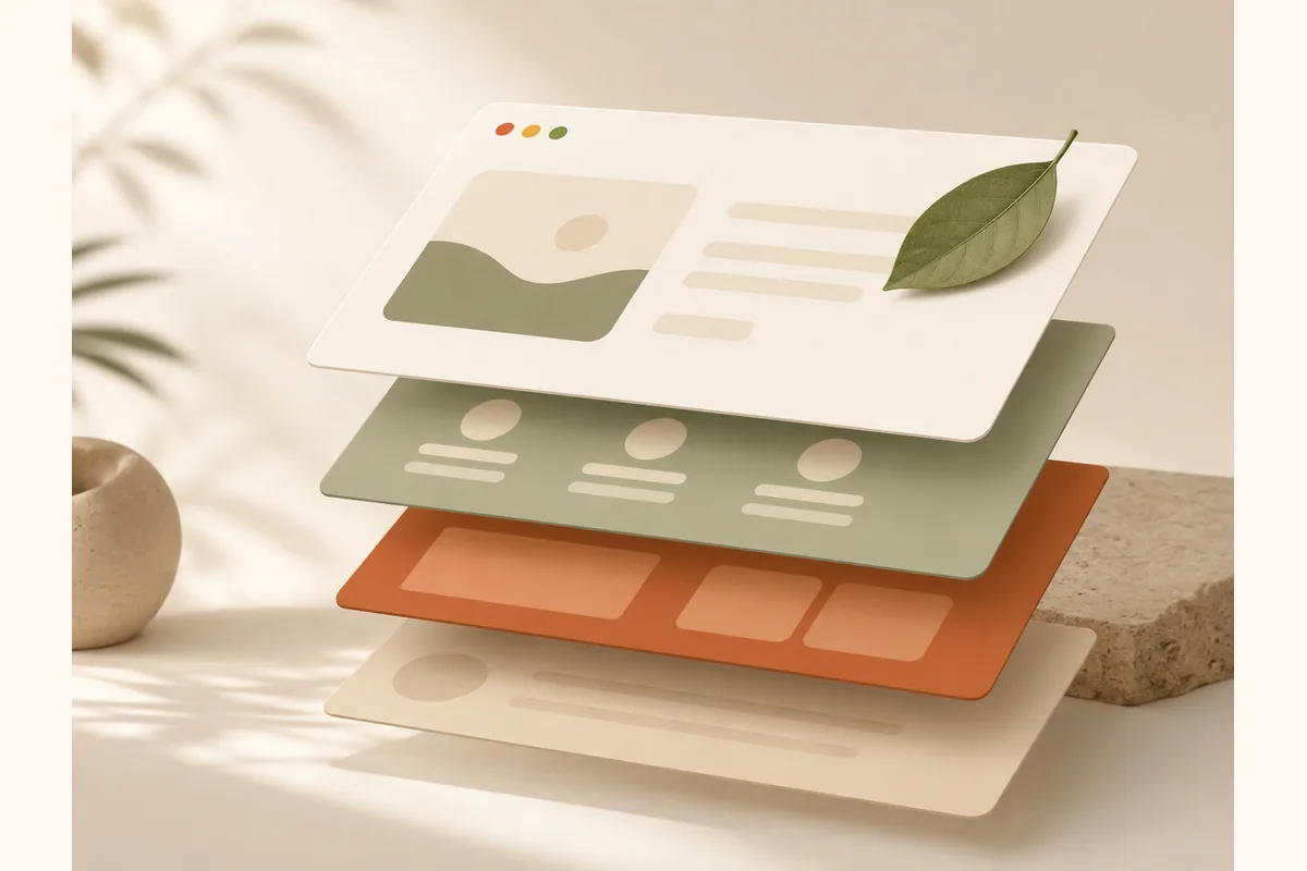
Landing page anatomy: elements, jobs, and common failures
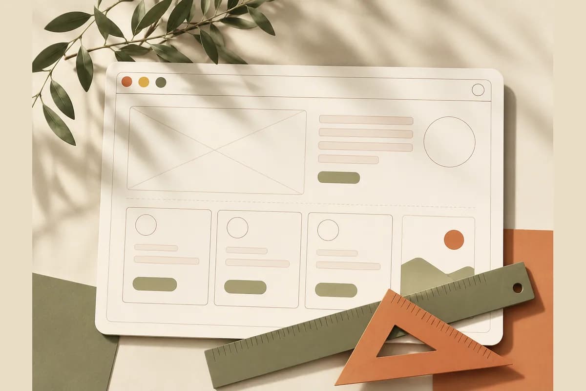
To make this practical, here is the page broken down section by section.
| Element | Its job | The common failure |
|---|---|---|
| Hero (first screen) | Explain the offer in 5 seconds | Poetic but vague headline, no CTA |
| Problem section | Make the visitor feel understood | Jumping straight to the pitch |
| Solution section | Show how you deliver | Listing technical features, not benefits |
| Social proof | Build trust | Generic quotes with no name or context |
| Offer and pricing | Remove the last doubts | Hidden prices, unclear terms |
| Closing CTA | Seal the decision | Passive buttons like "Send" or "Info" |
| Footer | Legitimacy (address, contact) | Stuffed with distracting links |
You do not need every element on every page. A simple offer can launch with just a hero, three benefits, one testimonial, and a call to action. What you do need is an order that makes sense.
Landing page design mistakes that make visitors leave
Most landing pages fail not because they lack features, but because the same basic mistakes keep repeating.
First, the page message does not match the ad. If your ad promises "50% off your first detailing" but the page opens with your company history, visitors feel misled and close the tab. The promise in the ad should be the first sentence on the page.
Second, too many choices. Three different CTAs, a full menu, plus a newsletter pop-up. Confused visitors do not pick one option, they pick the back button.
Third, pages made heavy in the name of looking expensive. Image sliders, background videos, and scroll animations look impressive on a designer's laptop and miserable on a phone with a weak connection.
Fourth, no address, no contact number, no human face anywhere. For a small business, the signals that say "this is a real operation" matter enormously. A photo of the owner, a real location, and a phone number that gets answered often convince people more than any security badge.
Fifth, publishing once and never touching it again. A landing page is a hypothesis. If a week goes by with no inquiries, change the headline, sharpen the offer, or clarify the CTA, then watch what happens.
Note: Here is the contrarian take you probably need to hear: landing pages that look "too simple" beat decorated pages almost every time. A single-column page with a clear headline, five honest paragraphs, and one button can outsell an animated page that cost thousands to build. Buyers are not grading your aesthetics, they are looking for a reason to trust you.
Real examples for small businesses
Let us make this concrete.
A mobile car detailing service: the hero says "We come to your driveway. Showroom shine in 90 minutes" with a booking button. Below that, clear package prices, photos of actual work (not stock images), three customer quotes from the neighborhoods served, and a satisfaction guarantee. Done. No "Our Mission" section needed.
An online sourdough baking course: the hero names the outcome ("Bake bakery-quality sourdough at home in 30 days, starting from zero"), followed by the founder's short story, a peek at the lessons, student photos of their actual loaves, two pricing tiers, and an enrollment CTA.
A daily office catering service: because the buyer is a busy office manager, the page goes straight to the weekly menu, per-person pricing, minimum order size, and a "Request a Quote" button that opens a chat.
The same pattern runs through all three: specific, honest, fast, and ending in a conversation or a checkout. If you would rather start from proven structures, our roundup of landing page templates can cut your setup time dramatically.
Design it yourself, hire a pro, or use AI?
There are three routes to putting these principles into practice, and the right one depends on your situation.
Hiring a professional designer makes sense when you need a highly distinctive brand or complex functionality, and you have a budget in the hundreds or thousands of dollars plus a few weeks to wait.
Designing it yourself with a traditional drag-and-drop builder is cheap, but honestly, the learning curve is real. You will spend evenings nudging blocks around and equalizing padding, time that should go into serving customers.
The third route, and the one more small business owners are choosing, is an AI website builder. With Forgelo, you describe your business in one sentence and a complete page is ready to publish in a few minutes, structured along the exact principles in this article. Want to change something? Just type the change, like "make the headline more specific for mobile detailing" or "move the testimonials above the pricing". Lead forms route straight to your WhatsApp, basic SEO is handled out of the box, and you can publish to a free subdomain or your own custom domain.
Tip: Whatever tool you pick, do not wait for perfect before you launch. A 70% page that is live today and improved weekly will always beat the "perfect" page that never ships. Conversion gets fixed with real visitor behavior, not with another internal review.
The pre-publish checklist
Before you hit publish, run this quick check:
- The headline names a specific outcome and matches wherever the traffic comes from (ad, bio link, message).
- There is one main action, and its button appears at least twice.
- At least one piece of social proof includes a real name and context.
- The price, or the way to get a price, is easy to find.
- The page opens fast and reads comfortably on a phone.
- The contact channel you list is monitored and answered.
- No links pull visitors away from the page.
These seven points filter out most of the problems that make visitors leave.
The bottom line
Landing page design that sells is built on clarity, not decoration. One goal per page, a headline that answers "what is this and who is it for", proof with specifics, speed on mobile, and the shortest possible path to a conversation or a purchase. The biggest mistake is not picking the wrong color, it is making people think too hard.
You can start today without a designer and without writing code. Describe your business, let the AI assemble the page, then polish it by typing the changes you want. Forgelo plans start at $9 per month, with details on the pricing page. Ship your first version this week, and let real visitors tell you what to fix next.