A SaaS landing page has exactly one job: turn a curious visitor into a signup, a trial, or a booked demo. Everything else is decoration. The best SaaS landing pages feel almost boring in how directly they do this, one clear promise, one obvious next step, and just enough proof to make you believe it. The pages that struggle usually try to do too much at once, and the visitor leaves without deciding anything.
This is a walkthrough of the anatomy to build and test. We'll go section by section, look at what product pages can teach you, name the mistakes that make signup harder, and cover how to build one without writing code. Whether you're launching a small tool or a full platform, the same skeleton applies. These are design recommendations, not a promised conversion rate.
What makes a SaaS landing page different
A SaaS landing page is not a homepage and not a brochure. A homepage tries to serve everyone at once: current users, investors, people looking for a job, and the occasional curious browser. A landing page serves one person with one goal. That difference changes everything about how you build it.
Because software is intangible, you can't hand someone the product to try in their hands. So the page has to do the work of explaining, showing, and reassuring all at once. Your visitor is asking three quiet questions in the first few seconds: what is this, is it for me, and can I trust it. A SaaS landing page that answers those fast earns the next click. One that makes people hunt for answers loses them.
The other difference is the ask. Physical products often want a purchase. SaaS usually wants a smaller, lower-risk step: start a free trial, book a demo, or send a message. That's good news, because a smaller ask is easier to design around. Your whole page can point at one calm, obvious button instead of shouting "buy now."
Define the campaign before you choose a layout. Write down the audience, the problem that brought them here, and what happens after the button. A trial that needs a payment card is a different commitment from an email-only waitlist. Match the ad or email promise to the headline, and disclose that commitment beside the CTA. If you're comparing build methods, our AI landing page builder guide explains the workflow; it does not replace deciding which customer problem your page should solve.
The anatomy of a SaaS landing page that converts
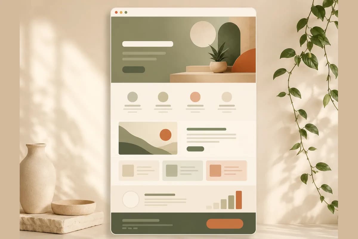
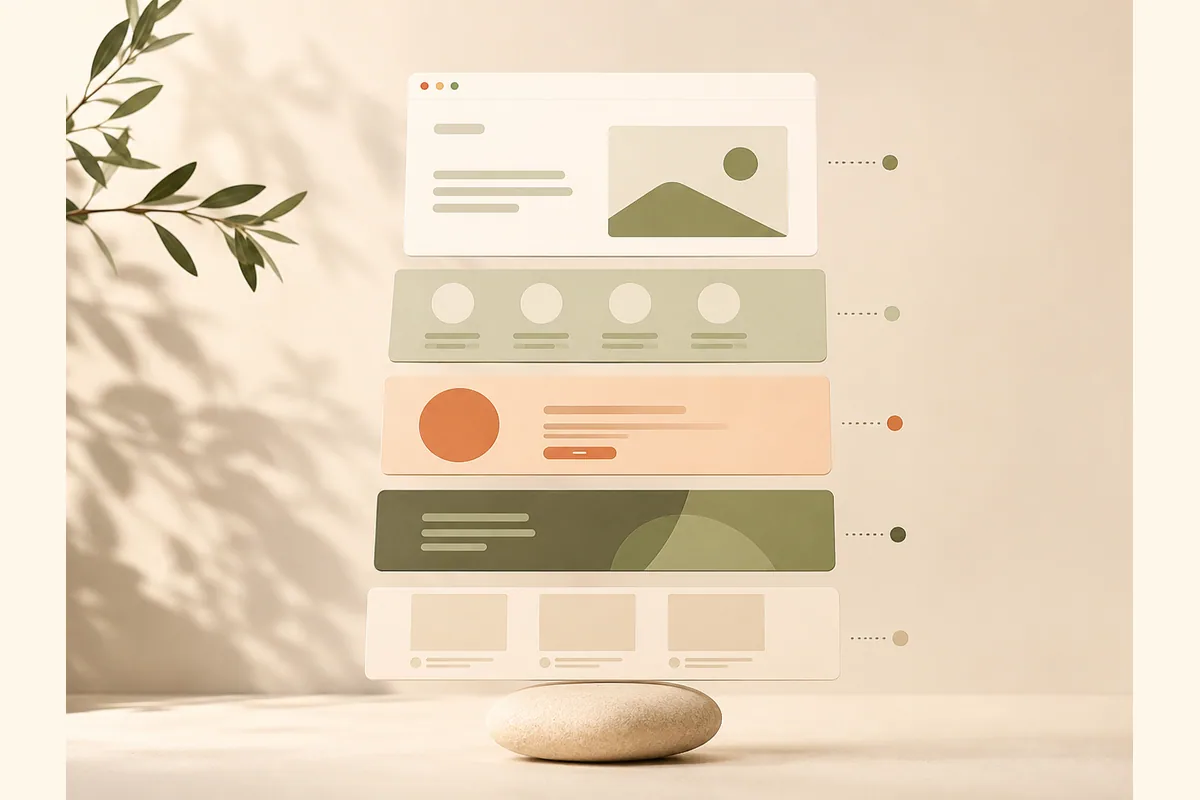
Here is the skeleton to start with: a clear promise, product evidence, a short explanation, pricing context, and one next step. You don't need every part, and the order can flex. Keep a section only when it answers a question your intended visitor needs resolved before taking that step.
Start with the hero. One headline that states the outcome, not the feature. "Get paid faster" beats "Automated invoicing engine." Add a one-line subheadline that clarifies who it's for, a single primary button, and a clean visual of the product in use. Nothing else competes here.
Make the promise specific enough to check. For a hypothetical invoicing tool, "Send invoices and follow up on unpaid bills from one place" describes a workflow without promising faster payment you haven't measured. Our website copywriting guide shows how to replace generic headlines with concrete wording. Use the same language on the destination screen so the signup feels like a continuation, not a different offer.
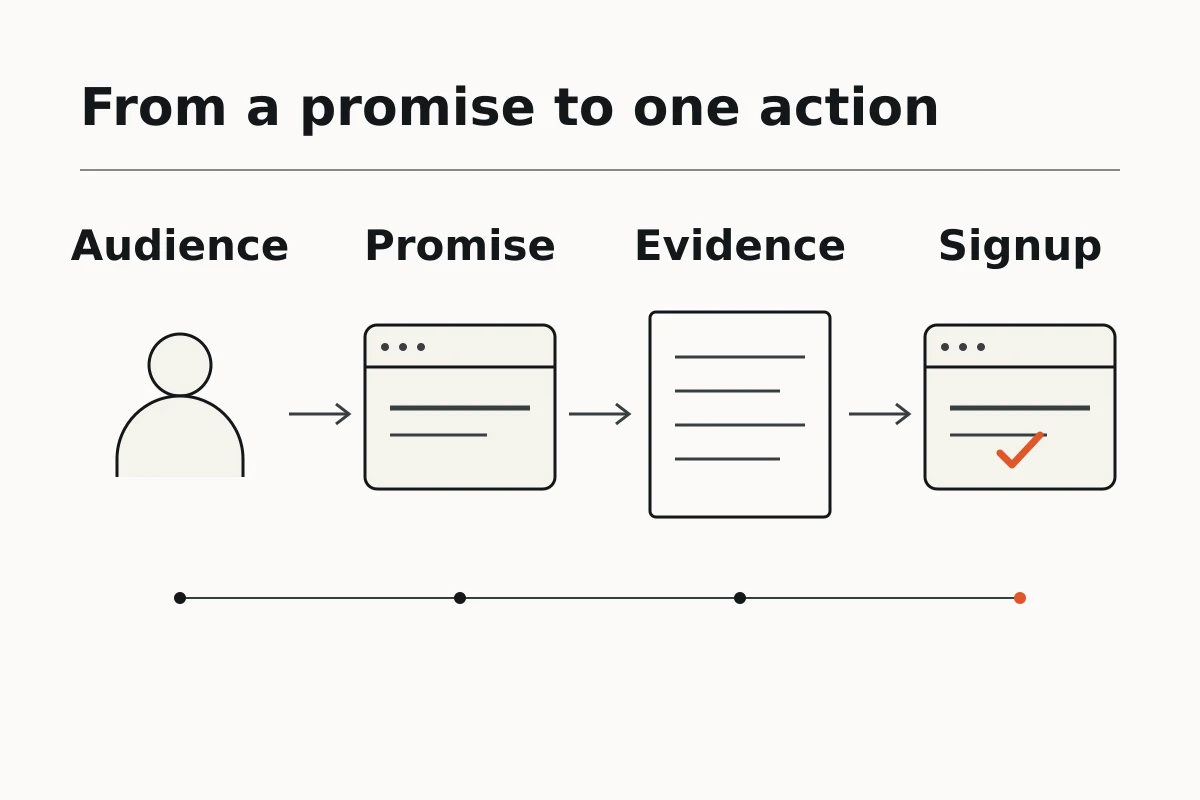
Below that, show the problem and the promise. Name the pain your visitor actually feels, then state plainly how your product removes it. This is where you earn attention for the rest of the page.
Then comes proof. Logos of recognizable customers, a specific result, a short testimonial with a real name, or a number you can stand behind. Vague claims like "trusted by thousands" do less work than one concrete story.
After proof, walk through how it works in three or four simple steps. People buy software they can picture themselves using. Keep it visual and short.
Close with pricing clarity and a final call to action. Even if full pricing lives on another page, hint at the cost or the free option so nobody feels tricked. Then repeat your primary button.
Tip: If you can only review one section first, start with the hero. Ask a person from your intended audience to explain the offer and next step after reading it. If they can't, revise the wording before polishing the footer. This checks comprehension, not whether the page will convert.
Section-by-section breakdown
Here's the anatomy as a checklist: give each section one job and make its heading describe that job. The W3C WAI headings tutorial recommends logical heading ranks and avoiding skipped levels. Use meaningful headings in the page markup, not large text that only looks like a heading.
| Section | Its one job | Common mistake |
|---|---|---|
| Hero headline | Say the outcome in plain words | Leading with a feature or a slogan |
| Subheadline | Clarify who it's for | Repeating the headline in fancier words |
| Primary CTA | Give one obvious next step | Three competing buttons |
| Problem and promise | Make the visitor feel understood | Talking about you instead of them |
| Social proof | Make the promise believable | Logos nobody recognizes, no specifics |
| How it works | Help people picture using it | Listing every feature at once |
| Pricing hint | Remove the fear of a hidden cost | Hiding price entirely |
| Final CTA | Repeat the one action | A new, different ask at the end |
Notice that every row points at the same destination. A landing page that converts is not a pile of good sections. It's a series of nudges toward one action.
Use our landing page design principles to review hierarchy, spacing, and mobile readability after the content order is settled. Keep the full offer visible without requiring a hover. Don't shrink important terms to fit a card. Our step-by-step landing page guide covers assembling the sections; for SaaS, add the account setup requirements, compatibility limits, and cancellation terms that affect the decision.
What successful products get right
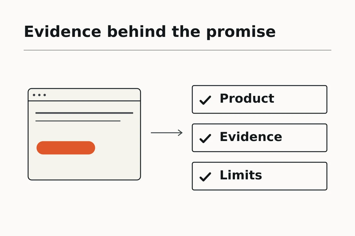
Learn from product pages by examining the promise, evidence, and next step, not by assuming their layout caused their results. When reviewing Stripe, Notion, or Linear, ask what the opening screen explains and what it leaves for later. These are review prompts, not conversion evidence or claims about their current homepages.
They also respect the visitor's time. The strongest pages assume you're busy and skeptical. They answer the obvious objection before you raise it, they keep sentences short, and they make the button impossible to miss. You never wonder what to do next.
And they show the product, not just describe it. A clean screenshot, a short loop of the interface, or a simple before-and-after does more than three paragraphs of adjectives. Software is easier to trust when you can see it working.
For an early product without customer testimonials, demonstrate a real task instead. Show the input, the output, and the limitation a buyer should know. Label sample data and concept mockups, remove private customer information, and obtain permission before using customer names or logos. A screenshot proves what the interface looks like; it doesn't prove a revenue or time-saving claim. Compare the evidence types in our landing page examples rather than borrowing somebody else's customer story.
Note: Copying a famous company's layout won't copy their results. Borrow the structure if you like, but write your own honest headline. A polished template wrapped around a vague message still leaves the visitor's main question unanswered.
Common mistakes that kill conversions
Check message clarity, competing actions, evidence, and the signup process before adding more decoration. A visitor needs to understand the offer and complete the next step, including on mobile or with a keyboard. Treat each suspected problem as something to inspect and test, not a diagnosis based only on a low conversion rate.
The biggest one is describing the product instead of the outcome. Visitors don't care that you have "AI-powered workflow automation." They care that they'll stop losing an hour every morning. Lead with what changes for them.
The second is too many choices. Five buttons, a newsletter popup, a chat bubble, and a navigation bar full of links can pull in different directions. Question each extra option against the one action you actually want. Keep necessary privacy, accessibility, and support links rather than removing information people need.
The third is proof that proves nothing. "Loved by teams everywhere" is filler. A named customer, a real screenshot, or a specific number carries weight that a generic badge never will.
Here's the contrarian part: adding more sections isn't automatically helpful. Teams panic when a page doesn't convert and bolt on another testimonial block, another feature grid, another banner. A longer page isn't a clearer page. Review what can be cut without losing an answer the visitor needs. Keep the essential path visible instead of giving every capability equal prominence.
The W3C WAI forms tutorial recommends requesting only information needed for the process, associating controls with labels, and explaining errors and successful completion. For a demo request, justify every required field. Test the empty-field error, keyboard focus, confirmation message, and real destination. A button click is not a completed signup, and an unreceived submission is not a lead.
Measure the experience and the completed action
Separate usability from conversion. Google's Web Vitals guidance covers loading, responsiveness, and visual stability through LCP, INP, and CLS. Its recommended good thresholds are LCP within 2,500 milliseconds, INP at most 200 milliseconds, and CLS at most 0.1, assessed at the 75th percentile and segmented by mobile and desktop. These measure page experience, not how long Forgelo takes to build a website or a guaranteed signup improvement.
Record page visits, primary-button clicks, successful submissions, and the business outcome you actually care about. Keep the measurement definitions consistent, exclude your own test submissions, and respect the site's analytics consent settings. Compare similar traffic sources and device groups before crediting a change. If your new page lacks enough real-user performance data, report that gap rather than presenting a lab test as field evidence. Our website SEO basics explains discovery checks alongside this experience review.
How to build one without a designer
You don't need to hire anyone or write code to get a SaaS landing page draft ready for review. You still need a clear brief, accurate product facts, and a working signup destination. A designer can help with complex requirements, but a small team can start with a focused draft and decide where outside help is needed.
An AI website builder can generate a complete landing page from a short description of your product. You type what it does, who it's for, and the action you want, and Forgelo produces a ready-to-publish website in minutes. Then you review it and refine individual sections by describing changes in plain words. "Make the headline shorter." "Add a pricing section with three plans." "Move the demo button above the testimonials." No code or design software is required for that editing workflow.
That workflow changes how you work. Instead of guessing your way to a perfect page before launch, you prepare a focused version and improve it based on how real visitors behave. If people drop off before the CTA, review the promise and signup path before requesting a hero change. With Forgelo, WhatsApp lead forms are available on Starter and higher plans; Free does not include them. You can compare the current features and limits on our pricing page.
A few habits make the difference here. Learn how to build a website with AI so your first draft starts strong. Treat the signup or contact moment as the whole point, which is why it's worth reading how to turn visitors into leads instead of just traffic. A lead form supports a conversation; it is not automatically a SaaS account registration system.
Use our website prompt examples to specify audience, sections, tone, and CTA. Include only verified prices and features in the brief, and tell the builder not to invent testimonials. Then edit the website by prompt one section at a time, with an instruction such as "Keep the CTA destination and replace the hero paragraph with this approved text." Recheck the destination, mobile layout, and submitted data after each change. Do not assume the builder has created your application's authentication, subscription billing, or onboarding.
The bottom line
A SaaS landing page earns its keep by doing one thing well: guiding a skeptical, busy visitor to a single clear action. State the outcome, prove it, show the product, remove the fear around price, and repeat your one button. Cut everything that doesn't serve that path.
You don't need a big budget or a long timeline to get there. Ship a focused page now, watch how people move through it, and refine the parts that leak. A live page that converts a little beats a perfect page that never launches. Start with the hero, keep the ask simple, and let the results tell you what to fix next.