A website hero section is the large block at the top of a page that a visitor sees before scrolling. It usually holds a headline, a short supporting line, a button, and an image. In a few seconds it has to answer two questions for a stranger: what is this, and what should I do next? If it fails, many visitors leave before they ever see the rest of your page.
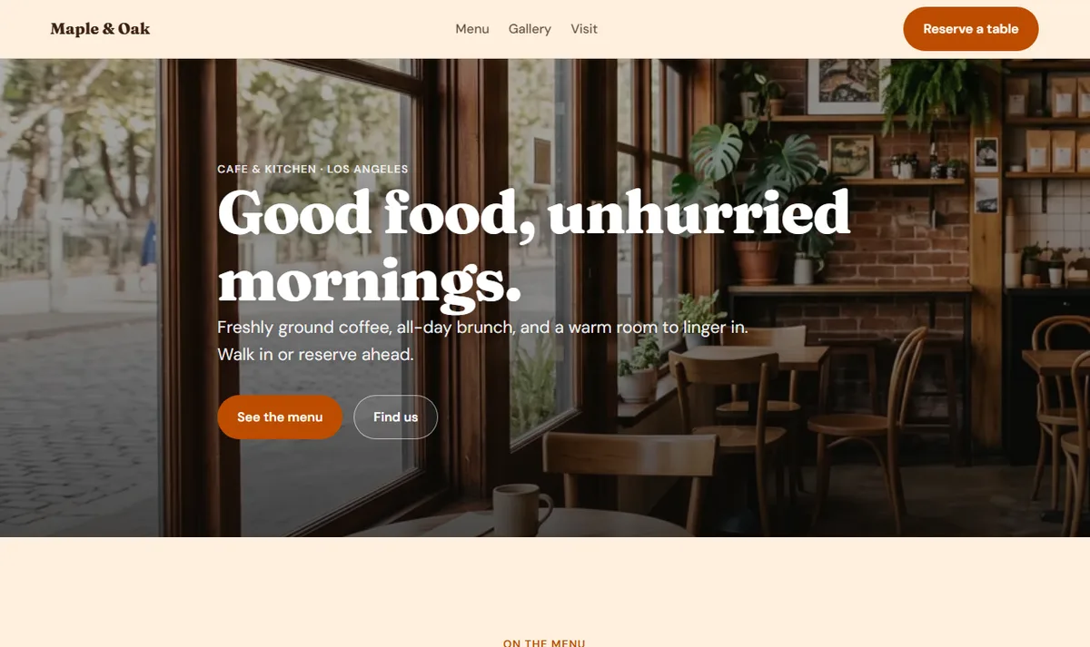
This guide explains what a hero section is, the parts every hero needs, how to write the headline and button, which layout suits which business, and how to keep the hero fast and readable on phones. Every example image is a real screenshot of a Forgelo template, so you can open the same template and try the changes yourself. If you are building your first site, our guide on how to build a website with AI covers the full process around it.
What is a hero section?
The term comes from print and web design: the hero is the "star" of the page, the first and largest message. On most websites it sits directly under the navigation bar and fills much of the first screen. On a phone it may fill the whole screen.
People often use "above the fold" to describe the same area. The fold is the bottom edge of the first screen, before any scrolling. Since screen sizes vary, there is no single fold line, but the idea holds: what appears first gets the most attention, and the hero is where you decide what that will be.
A hero is not the same as a banner or a slider. A rotating slider shows several messages in turn, which means each visitor sees only one of them, often not the most important one. A hero commits to one message and one main action. For a small business site, that focus is almost always the better choice.
The five parts of a good hero section
Most effective hero sections are built from the same five parts. You do not need all five on every page, but you should decide deliberately about each one.
| Part | What it does | Example from a template |
|---|---|---|
| Eyebrow label | Adds context such as category or location | Cafe and kitchen, Los Angeles |
| Headline | States the offer or outcome in plain words | Good food, unhurried mornings. |
| Supporting line | Adds who it is for, what is included, or why it is different | Freshly ground coffee, all-day brunch, and a warm room to linger in. |
| Primary button | The single most important next step | See the menu |
| Visual | Shows the product, place, people, or result | Photo of the cafe interior |
A secondary button, such as "Find us" or "Our practice", is optional. Use it when visitors arrive with two clearly different intents. Keep it visually quieter than the primary button so the main action stays obvious.
The order matters too. Visitors read the headline first, then the supporting line, then look for a button. If the button sits far away from the text, or below a large image on mobile, many people will not find it.
How to write a hero headline that works
The headline carries most of the weight. A useful test is to show the hero to someone who has never heard of your business for five seconds, then ask what you offer. If they cannot say, the headline is too vague.
Some practical rules:
- Name the offer or the outcome. "After-school tutoring in Yogyakarta" is clearer than "Empowering young minds". "Clear counsel for complex decisions" works for a law firm because it names the benefit a client wants.
- Use the words your customers use. If people search for "wedding photographer in Bali", those words belong in the headline or supporting line, not "visual storytelling solutions".
- Keep it short. One sentence, ideally readable in a single glance on a phone. Move extra detail into the supporting line.
- Avoid stacking adjectives. "Fast, modern, affordable, reliable" says nothing specific. Pick the one claim you can back up.
- Make the supporting line concrete. Add who it is for, what is included, or a specific reason to trust you, such as opening hours, location, or the kind of clients you serve.
For more on writing the words on your pages, see our guide to website copywriting. Once your hero is live, it is worth reviewing it against your search keywords as well, which our website SEO basics guide explains.

Choosing the call-to-action button
The button is where the hero turns attention into action, so its label matters as much as its color. Good button labels start with a verb and describe what happens next: "Reserve a table", "Request a consultation", "Start free", "Daftar PPDB". Vague labels such as "Submit", "Click here", or "Learn more" give visitors no reason to click.
Match the button to what a first-time visitor is ready to do. Someone who just found a cafe is ready to see the menu, not to sign up for a loyalty program. Someone visiting a law firm may want to understand the practice areas before booking. When you are unsure, look at what most of your enquiries ask for, and make that the primary button.
If most of your customers reach you by chat, the primary button can open WhatsApp directly. Our guide on how to turn visitors into WhatsApp leads explains the setup and the wording that tends to get replies.
Hero layouts: cover, split, and centered
Layouts change how the hero feels and how easy it is to read. Forgelo templates use three main hero layouts.
| Layout | How it looks | Best for | Watch out for |
|---|---|---|---|
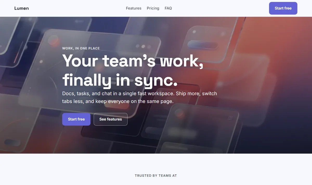
| Cover | Full-width photo behind the text, with a dark overlay | Cafes, hotels, studios, events, where atmosphere sells | Text contrast over busy photos, heavy image files |
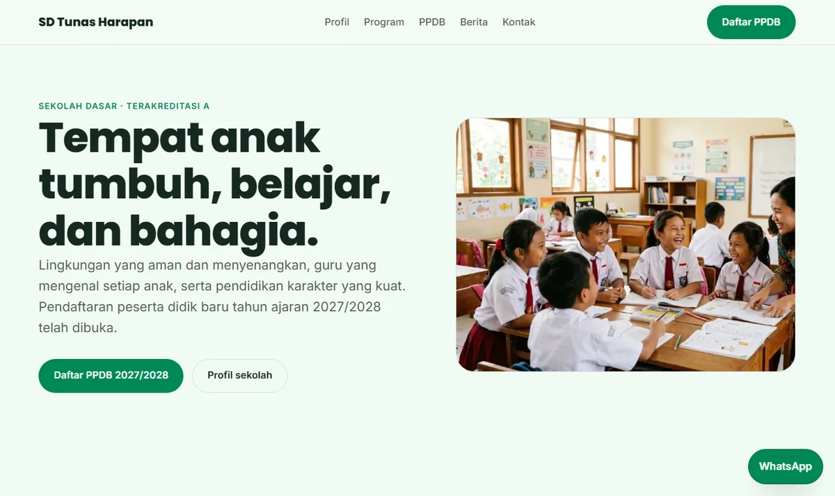
| Split | Text on one side, image on the other | Services, schools, clinics, software | Image dropping far below the button on mobile |
| Centered | Text and buttons centered, little or no image | Simple offers, launches, one-page sites | Feeling empty without a strong headline |
The cover layout creates mood quickly, which is why the Cafe and restaurant, Hotel and resort, and Photography studio templates use it. The trade-off is readability: white text over a bright photo can disappear. The templates handle this with a dark gradient overlay, and you should keep it if you swap in your own photo.
The split layout is calmer and easier to scan. The text stays on a plain background, so contrast is rarely a problem, and the image can show your real place or product without being covered by words.
Choosing the hero image
The visual should support the headline, not compete with it. A few guidelines help:
- Show the real thing where you can. Your actual shop, team, product, or work builds more trust than generic stock photos. Visitors recognise overused stock images quickly.
- Leave room for text. For a cover layout, pick a photo with a calm area where the headline can sit, or rely on the overlay.
- Crop for phones. On a narrow screen, a wide photo is cropped to its center. Check that the important part survives.
- Avoid text inside the image. Words baked into a picture cannot be read by search engines or screen readers, and they become blurry on small screens.
- Write useful alt text. Describe what the image shows in a sentence, which helps visitors who use screen readers.
If you do not have good photos yet, a clean split or centered layout with a strong headline is better than a stretched, low-quality image. You can replace it later when you have real photos.
Keep the hero fast and readable on phones
Because the hero loads first, it has an outsized effect on how fast your page feels. Google's web.dev guide to Largest Contentful Paint describes LCP as the time until the largest image or text block in the viewport is rendered, and treats 2.5 seconds or less as good. On many pages, the hero image or the hero headline is that largest element.
A few habits keep the hero fast:
- Compress the hero image and serve a modern format such as WebP.
- Size it for the layout. A 4,000-pixel photo shown at 1,200 pixels wide wastes bandwidth.
- Do not lazy-load the hero image. Lazy loading is for images further down the page; the hero should start loading immediately.
- Limit web fonts to the weights you actually use.
Readability matters just as much. The WCAG 2.2 contrast requirement asks for a contrast ratio of at least 4.5:1 for normal text and 3:1 for large text. White text over a photo usually needs a dark overlay to meet it. Check your hero on a real phone in daylight before publishing. Our guide to a mobile-friendly website covers more checks.
Hero section examples by business type
The right hero depends on what your visitors came for. The table below shows how the same five parts change across business types, using Forgelo templates as reference points.
| Business | Headline focus | Primary button | Layout that fits |
|---|---|---|---|
| Cafe or restaurant | Food, mood, and place | See the menu or Reserve a table | Cover with interior or dish photo |
| Law firm or consultant | The outcome clients want | Request a consultation | Cover with calm photo, or split |
| School | Values and enrollment | Register now | Split with real classroom photo |
| Software product | The problem it solves | Start free | Cover with product visual, or centered |
| Freelancer | What you make and for whom | See my work or Get in touch | Cover or split with portfolio image |
For more page ideas beyond the hero, browse our small business website ideas. If you are building a page whose only job is one campaign, the advice in our SaaS landing page guide applies as well.
Common hero section mistakes
A clever headline nobody understands. Wordplay can work for a well-known brand. For a new business, clarity wins.
Too many buttons. Three or four buttons in the hero force the visitor to choose before they understand the offer. Keep one primary and at most one secondary.
Low contrast text. White text on a bright photo, or gray text on a light background, makes the most important words hard to read.
A slider instead of a message. Auto-rotating slides split attention and often hide the message you care about most.
A heavy, slow image. An uncompressed photo can delay the whole first screen. Compress it and check the speed on a phone connection.
Forgetting mobile. A hero that looks balanced on a laptop can push the button below the first screen on a phone. Always check both.
How to build or edit a hero section without code
You do not need to design a hero from scratch. With an AI website builder, the hero is generated with the rest of the page, and you refine it by describing what you want.
- Describe your business in one sentence, including what you offer and where, so the first draft of the headline is specific.
- Or start from a template whose hero layout fits your business. The start from a template guide shows the steps, and the template gallery lets you compare hero layouts side by side.
- Edit by typing. Ask for changes such as "make the headline about weekend brunch", "change the main button to Book a table", or "use a split layout with the photo on the right". The guide to editing your site with prompts has more examples.
- Swap in your own photo and keep the overlay if the text sits on top of it.
- Check on a phone, then publish. A short pre-launch list such as our website go-live checklist helps catch the rest.
Forgelo's Free plan publishes one site on a Forgelo subdomain, and paid plans start at $9 per month for a custom domain, as listed on the pricing page.
Bottom line
A good website hero section says what you offer in one clear headline, adds one concrete supporting line, gives one obvious next step, and shows a visual that supports the message. Pick a layout that keeps the text readable on every screen, keep the hero image light, and test it on a phone. If you want to see the patterns in practice, open the Cafe and restaurant template or the SD school template and edit the hero by typing.