
A good website for consultants does one thing well: it turns a referral or a search into a booked discovery call. Buyers of consulting rarely purchase on the spot. They check you first, often after a colleague mentions your name, and they decide within a few minutes whether you understand their problem. Your website is where that decision happens.
This guide covers the pages a consulting website needs, how to present services and proof so a cautious buyer feels safe, what it costs, and how to build one quickly without code. It applies to management, marketing, IT, HR, finance, and operations consultants, whether you work alone or with a few associates. If you are still choosing tools as a solo operator, our guide to the best website builder for a one-person business is a useful companion.
Why consultants need their own website
Many consultants get their first clients through their network, so a website can feel optional. It stops being optional the moment someone you have never met hears your name and looks you up.
Consulting is a trust purchase. The buyer is paying for judgment they cannot inspect in advance, often with a budget they have to defend to someone else. Before they reply to an introduction, they want answers to three questions: does this person understand my kind of problem, have they solved it before, and what happens if I get in touch? A professional profile on a social network answers part of that. A website answers all of it, in the order you choose.
A website also works when you are busy delivering. It can rank in search for phrases like "supply chain consultant for food manufacturers", it holds an enquiry form that collects the details you need before a call, and it gives every referral a credible place to land. Our article on small business website ideas shows how other service businesses use the same pattern.
You do not need a large site. You need a short, specific one that a skeptical buyer can scan in two minutes.
The pages a consulting website needs
Most consultants need five pages. Each answers one buyer question and points to the same next step: a short call.
| Page | Buyer question it answers | What to include | Next step |
|---|---|---|---|
| Home | Is this consultant for a business like mine? | The client you serve, the problem you solve, one line of proof | Request a call |
| Services | What exactly would we buy? | Two to four engagements, scope, typical length, how you price | Request a call about this service |
| Proof | Has this worked before? | Case studies, testimonials with names and roles, results | Request a call |
| About | Can I trust this person's judgment? | Background, method, credentials, a real photo | See services |
| Contact | How do we start? | A short form or booking link, what happens on the first call | Submit or book |
On a very small site, these can be sections of one page. As you add services, give each its own page so it can rank for the searches your buyers use.

Start from a layout built for professional services
You do not have to invent the structure. A template made for professional services gives you a formal look, a clear services list, and an enquiry form in the right places, so you only change the words.
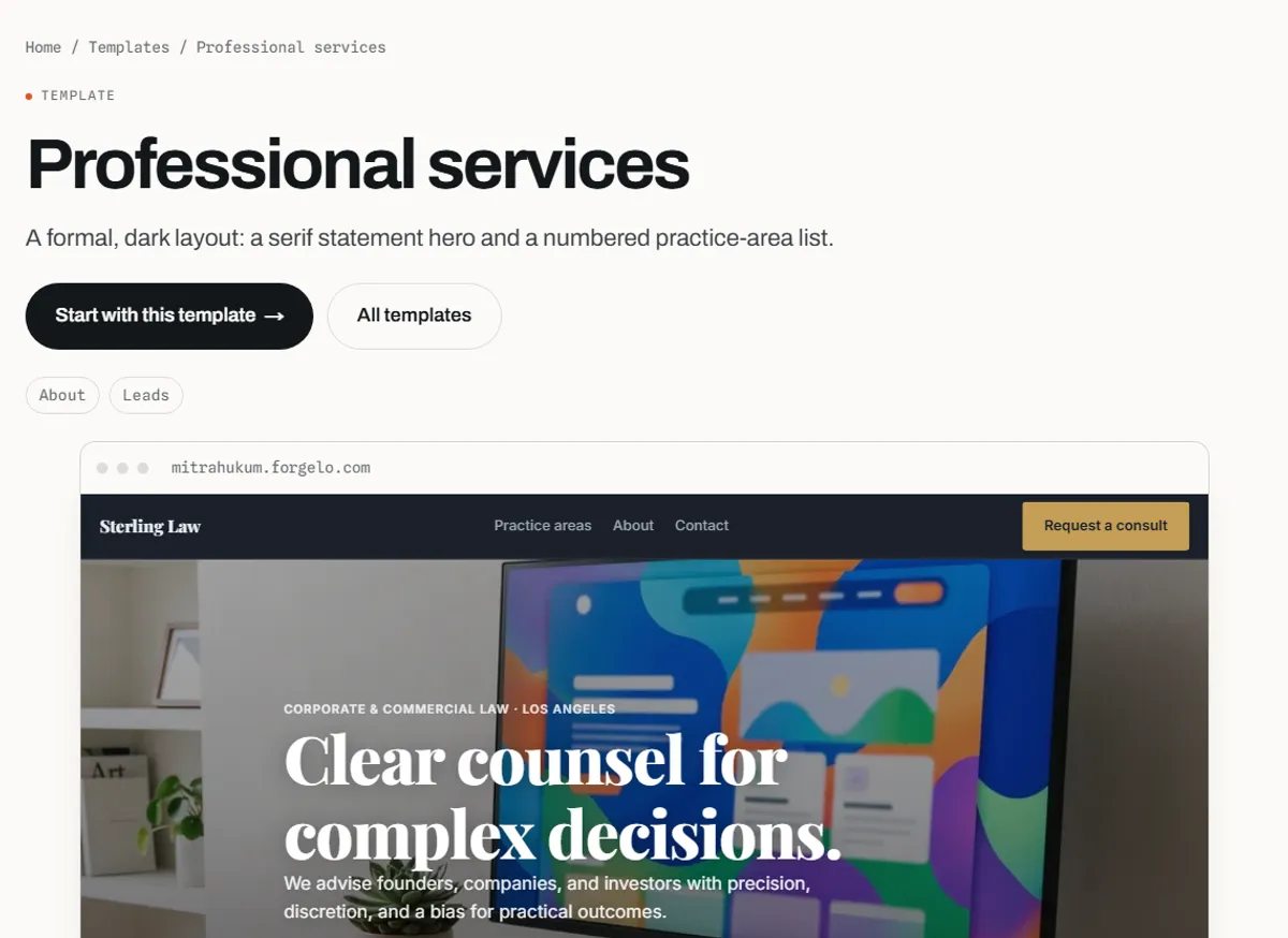
Forgelo's Professional services template is described on its page as a formal, dark layout with a serif statement hero and a practice-area list. The demo is a law firm, but the structure suits any advisory business: replace the practice areas with your engagements, the firm story with your own, and the consultation form with the questions you need answered before a call.
What to write on your home page
The home page has one job: make the right buyer think "this person understands my situation" within seconds. Put three things above the fold.
First, a headline that names the client and the outcome. "I help regional manufacturers cut inventory costs without slowing delivery" beats "Strategic solutions for growth", because a buyer instantly knows whether it is about them. Second, a supporting line about how you work, for example "fixed-scope projects of six to twelve weeks, on site or remote". Third, one clear button, such as "Request a 20-minute call".
Below the fold, add a short list of the problems you solve, one or two proof points with names, a brief introduction with your photo, and the same button again. Resist the urge to list every capability. Consultants who try to look able to do everything look like they specialise in nothing.
A useful test: show the page to someone outside your field for five seconds and ask who it is for. If they cannot say, the headline is too general.
Present services as clear engagements
Buyers struggle to purchase "consulting". They find it much easier to purchase a defined engagement with a start, an end, and a result. Turn your expertise into two to four named offers.
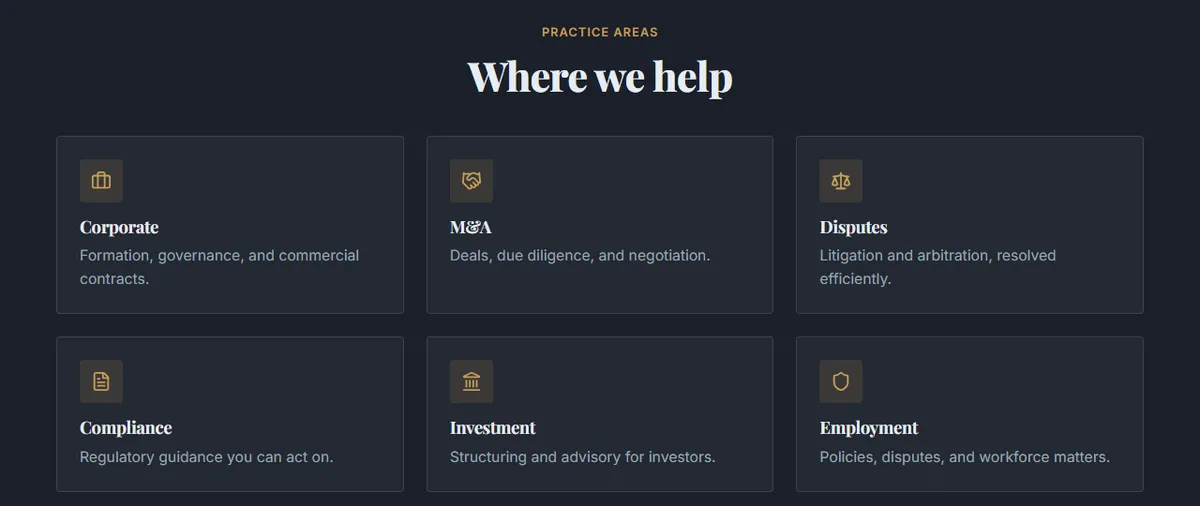
For each engagement, write:
- A plain name, such as "Pricing review" or "Operations audit", not a clever brand phrase.
- Who it is for and the situation that triggers it.
- What is included, in a short list of deliverables.
- Typical length and how you work, for example remote, on site, or a mix.
- How you price it, whether that is a fixed fee, a starting figure, a retainer, or a day rate.
A common structure is an entry engagement, such as a diagnostic or audit, a main implementation project, and an ongoing retainer. The entry offer lowers the risk for a new client and gives you a natural way to start working together.
Proof that persuades cautious buyers
Proof is where consulting websites win or lose. Buyers want evidence that you have solved a problem like theirs, and they discount vague praise.
The strongest format is a short case study: the client type, the starting problem, what you did, and what changed. Keep each one to a few paragraphs. If clients cannot be named, describe them precisely ("a 40-person logistics company") and ask permission to quote a person by role.
| Proof type | Strength | How to use it well |
|---|---|---|
| Case study with an outcome | Very strong | Problem, approach, result, and a quote from the client |
| Testimonial with name and role | Strong | Two or three sentences about the specific change, not general praise |
| Client logos | Medium | Only with permission, and only if buyers recognise them |
| Credentials and certifications | Medium | List the ones your buyers actually ask about |
| Articles, talks, and guides | Medium | Show how you think, and help you rank in search |
| Years of experience alone | Weak | Pair it with what the experience produced |
If you are early in your consulting career, use results from previous employment, described honestly as such, and ask your first clients for a testimonial as soon as the engagement ends.
The contact page and the first call
Everything on the site leads here, so make this page easy. A short form beats a long one. Ask for the essentials: name, email or phone, company, and a sentence about the problem.
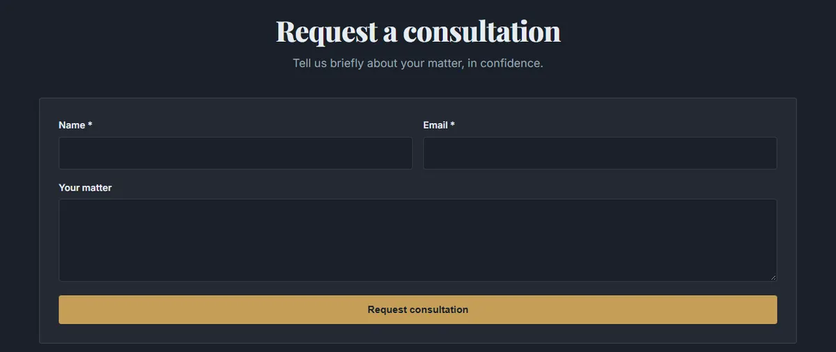
Underneath the form, explain what happens next: how quickly you reply, how long the first call lasts, and that it is free and without obligation if that is how you work. That small paragraph removes a lot of hesitation.
Many consultants, especially in markets where clients prefer chat, get faster replies by sending enquiries straight to WhatsApp. On Forgelo, lead forms and contact buttons can send submissions to WhatsApp, which the help article explains step by step.
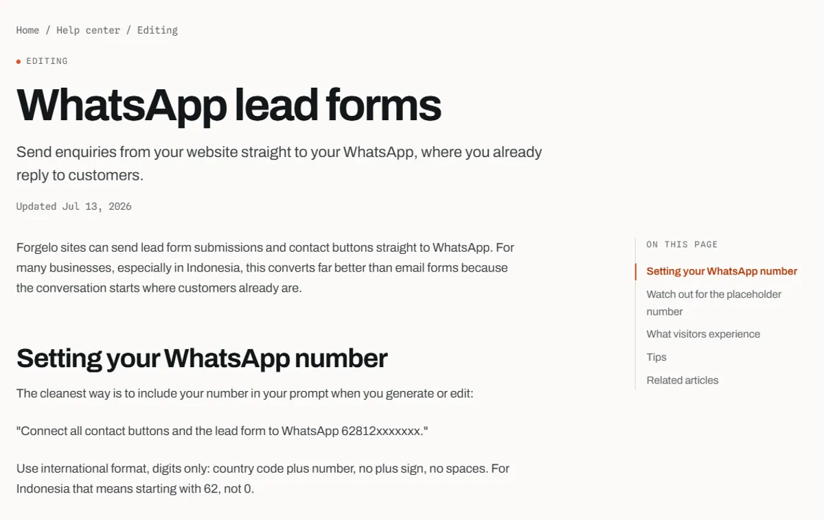
The WhatsApp lead forms guide shows how to set your number by including it in a prompt. For a broader view of chat-based enquiries, see our guide on how to turn visitors into WhatsApp leads.
How to build a consulting website without code
There are three common routes. The right one depends on your budget, how often you will change the site, and how much time you want to spend on it.
| Option | Upfront effort | Ongoing cost | Best for |
|---|---|---|---|
| Hire a designer or agency | Low for you, but weeks of briefs and reviews | Project fee plus hosting and paid edits | Established firms with a set brand and budget |
| Drag-and-drop builder | You place and style every block yourself | Monthly plan | Consultants who enjoy design and have time to learn an editor |
| AI website builder | Describe your practice, then review the draft | Monthly plan, often with a free tier | Consultants who want to launch fast and update often |
With an AI builder like Forgelo, the process is short:
- Describe your practice in one sentence, including who you serve and what you solve, for example "Independent HR consultant helping startups set up hiring and onboarding".
- Review the generated draft. It includes pages, structure, and copy you can edit.
- Edit by typing. Ask for changes such as "add a pricing review service with a starting fee" or "make the headline about startups with 10 to 50 employees".
- Connect your enquiry path, such as email or WhatsApp.
- Publish on a free subdomain or connect your own domain.
If you want a deeper walk-through of the AI route, read how to build a website with AI.
What a consulting website costs
The real cost has three parts: building it, running it, and your time.
A designer or agency charges a project fee, and later edits usually cost extra. A website builder replaces the project fee with a monthly plan. On Forgelo, the Free plan is $0 and publishes one site on a Forgelo subdomain, Starter is $9 per month, Pro is $19 per month, and Business is $39 per month, as listed on the pricing page. A custom domain is bought separately from a domain registrar.
Your time is the hidden cost. The slow part of a consulting site is rarely the design. It is deciding on your engagements, writing case studies, and collecting testimonials. Do those first, and the build itself takes an afternoon. For a broader comparison of routes and budgets, see how much a website costs.
If your advisory work is in property, the listings and viewing flow matter more than case studies. Our guide to a real estate website builder covers that setup.
Get found: search basics for consultants
Referrals bring buyers to your name. Search brings buyers who do not know you yet. A few basics make a large difference:
- One page per service, each with a clear title such as "Pricing strategy consultant for SaaS companies".
- Your location on the contact page and in the footer if you serve a region.
- Case studies with real detail, because specific pages match specific searches.
- Short articles or guides that answer questions your buyers ask before hiring.
- A fast, mobile-friendly site, since many first visits happen on a phone.
Our guide to website SEO basics covers titles, descriptions, and structure in more detail.
Common mistakes consultants make with their websites
Writing for peers instead of buyers. Jargon impresses other consultants, not the operations director deciding whether to call you. Describe problems in the buyer's words.
Listing every capability. A long list of services reads as a generalist. Lead with the two or three things you most want to be hired for.
Hiding the next step. If the contact link sits only in the menu, many visitors will leave. Put the call-to-action on every page.
Proof without detail. "Great to work with" persuades nobody. Ask clients what changed and quote that.
Letting the site go stale. Outdated case studies and old dates make buyers wonder if you are still active. Update the proof page every few months.
If you also coach individuals, our guide to a website for coaches covers the program and booking pages that suit one-to-one work.
Bottom line
A website for consultants is not a brochure. It is a short, specific path from "who is this?" to "let's talk". Name the client and the problem on the home page, turn your expertise into clear engagements, back it with detailed proof, and make the first call easy to request. Start from a professional services layout, write in your buyer's words, and you can publish a credible site the same week. If you want to try the AI route, you can start with the Professional services template and edit it by typing.