
A nonprofit website builder lets a small team publish a professional site for a cause without hiring a developer. For a charity, foundation, community group, or school committee, the website is often the first thing a potential donor, volunteer, or grant officer checks. If it looks abandoned or does not explain where the money goes, many will quietly move on.
This guide explains what a nonprofit site needs, how to choose a builder, how to present impact and handle donations honestly, what it costs, and how to launch in an afternoon. It is written for organisations with little or no technical staff, where the person updating the website is often a volunteer with another job. If you are new to building sites, our overview of a no-code website builder is a useful starting point.
Why a nonprofit needs its own website
Social media pages are useful for announcements, but they are a weak home base for a cause. Posts scroll away, the layout is controlled by the platform, and visitors who are not logged in may see little. A website gives you one stable address where people can understand the mission in a minute and act on it.
Three audiences visit a nonprofit site, and each wants something different:
- Donors want to know what you do, whether it works, and how their gift is used.
- Volunteers want to know what help you need, when, and how to sign up.
- Partners and funders want to see governance, results, and a way to reach a real person.
A good site answers all three without making anyone dig. It also works while your team is busy in the field: it can appear in search for phrases like "food bank volunteer in my city", it collects enquiries, and it gives every social post or printed flyer a credible place to point to.
What to look for in a nonprofit website builder
Builders differ more in day-to-day editing than in looks. Before you choose, picture the volunteer who will update the site in six months and ask whether they could do it alone.
| Feature | Why it matters for a nonprofit | What to check |
|---|---|---|
| Ready nonprofit layout | Saves days of structure decisions | A donate hero, impact section, and program cards out of the box |
| Easy editing | Volunteers change often | Can a non-designer change text, photos, and sections safely? |
| Donate call-to-action | The main conversion on the site | Buttons that can point to your giving page in several places |
| Mobile-friendly pages | Many supporters arrive from a phone | Responsive layouts by default, no separate mobile build |
| Built-in SEO basics | People search for causes locally | Page titles, descriptions, sitemap, and schema handled for you |
| Custom domain | Trust on appeals and grant forms | Plan level needed, and how DNS setup is explained |
| Version history | Mistakes happen | A way to restore an earlier version quickly |
| Predictable cost | Boards approve budgets yearly | A clear monthly price and a free option to start |
Price matters, but the bigger cost for most small organisations is time. A builder that saves a volunteer two hours every month is worth more than a slightly cheaper one that nobody can use.
Start from a nonprofit layout instead of a blank page
You do not need to design the structure yourself. A template made for charities puts the pieces in the order donors expect, so your work is mostly writing and choosing photos.
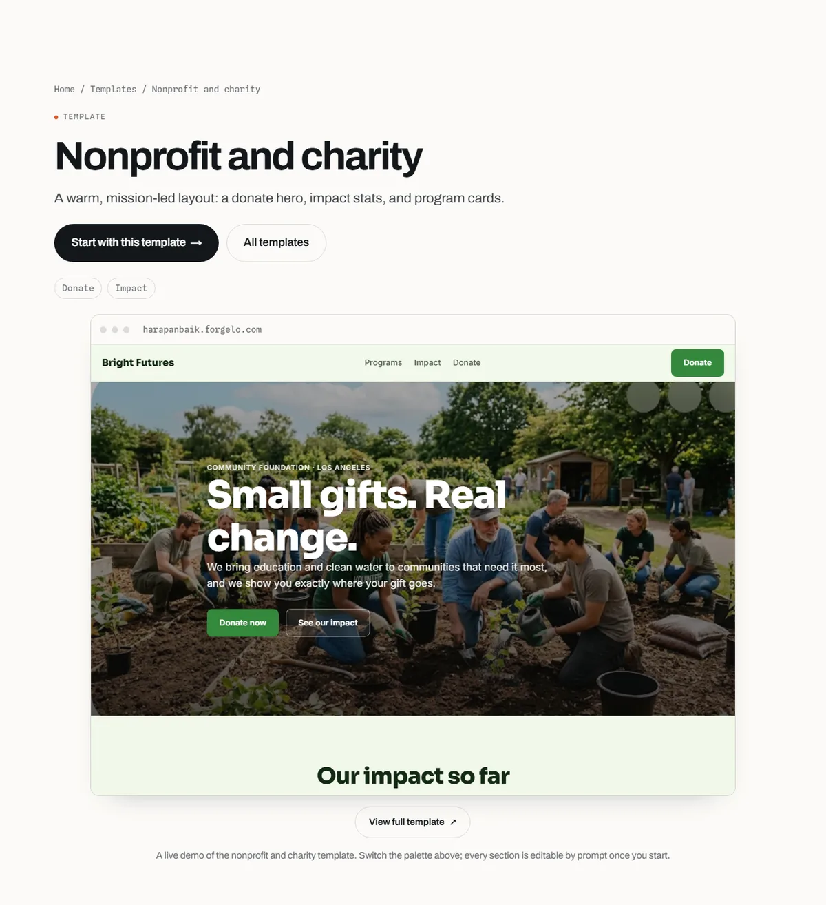
Forgelo's Nonprofit and charity template is described on its page as a warm, mission-led layout with a donate hero, impact stats, and program cards. The demo organisation, Bright Futures, is fictional, so you replace its name, programs, photos, and figures with your own. The start from a template guide explains the steps: pick the template, apply it, then customise it with prompts such as "replace the organisation name with Rumah Belajar Sore and rewrite the programs for after-school tutoring".
The pages a nonprofit website needs
Most small nonprofits need five pages. Each answers one visitor question and points to a clear next step.
| Page | Visitor question it answers | What to include | Main next step |
|---|---|---|---|
| Home | What is this cause and why should I care? | Mission in one sentence, one strong photo, key results, donate button | Donate |
| Programs | What exactly do you do? | Two to four programs with who they serve and what they deliver | Donate or volunteer |
| Impact | Does it work? | Dated numbers with sources, short stories, annual report link | Donate |
| About | Can I trust this organisation? | Founders, team, board, legal status, contact details | Get in touch |
| Get involved | How can I help besides money? | Volunteer roles, partnership options, events, a short form | Sign up or contact |
On a very small site, these can be sections on a single page with a menu that jumps to each one. As you add programs, give each its own page so it can be found in search and shared on its own.
Write a home page that explains the cause in seconds
The home page has one job: help a stranger understand the mission and the next step before they scroll away. Put three things above the fold.
First, a headline that names who you help and how. "After-school tutoring for children in Kampung Sukamaju" is clearer than "Empowering futures together". Second, one sentence about how gifts are used, for example "Every donation buys books, snacks, and transport for our volunteer tutors". Third, one clear button, usually "Donate", with a secondary option such as "Volunteer" for people who cannot give money.
Below the fold, add your key results, the main programs, a short story, and the donate button again. Use real photos of your work where you have consent from the people shown, especially for children. If you do not have good photos yet, it is better to use fewer images than staged stock photos that donors can recognise.
A quick test: show the page to someone outside your organisation for five seconds and ask what you do. If they cannot say, the headline is too vague.
Show impact honestly with numbers and stories
Donors give to results they can believe. The strongest impact sections combine a few numbers with one or two human stories.
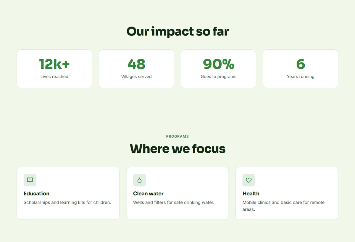
The template's layout shows four stat cards followed by program cards. That pattern works, as long as every number is real. Some practical rules:
- Date every figure, for example "children tutored in 2026", so it does not go stale silently.
- Say how you counted. "Families who received at least one food package" is clearer than "lives touched".
- Pair numbers with a story. One paragraph about a named person, used with permission, makes the numbers feel real.
- Link to proof such as an annual report, audited accounts, or a financial summary if you publish one.
- Avoid percentages you cannot defend. A claim like "90% goes to programs" needs a source in your own accounts.
Specific, checkable claims build more trust than large round numbers. If you are early and have little data, describe what you did this year in plain words and add numbers as you collect them.
Make donating easy and trustworthy
The donate button is the most important element on the site. Two principles matter more than design: make it easy to find, and make the giving path feel safe.
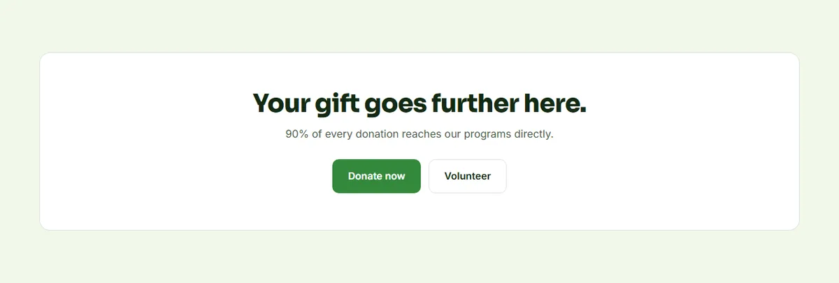
It helps to be clear about what a website builder does here. Forgelo builds and hosts the site; it is not a payment processor for donations. The usual setup is to keep using the giving page or fundraising provider your organisation already trusts, and point every Donate button to it. If supporters in your community usually give by bank transfer, show the account name, bank, and number on a dedicated donate section, along with a contact for receipts.
Whatever route you use, add a short paragraph near the button that explains where the money goes, how donors get a receipt, and who to contact with questions. That small paragraph removes a lot of hesitation, especially for first-time donors.
Turn visitors into volunteers and partners
Not everyone who cares can give money. A clear "Get involved" section turns that goodwill into hours, skills, and partnerships. List specific roles, such as weekend tutors, drivers, or a volunteer bookkeeper, with the time commitment for each.
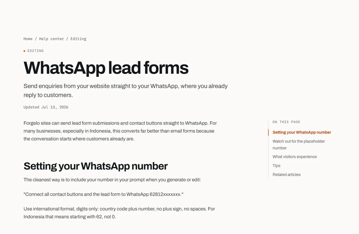
Many community organisations coordinate volunteers by chat, so sending sign-ups straight to WhatsApp can get faster replies than an email inbox nobody checks. The WhatsApp lead forms guide shows how to set your number by including it in a prompt, and warns you to replace the placeholder number before you share the site. WhatsApp lead forms are listed from the Starter plan on the pricing page. For more ideas on chat-based enquiries, see how to turn visitors into WhatsApp leads.
Keep the form short: name, phone or email, the role they are interested in, and when they are available. Then reply quickly. A volunteer who waits two weeks for an answer rarely stays.
How to build a nonprofit website without code
There are three common routes. The right one depends on your budget, how often the site changes, and who will maintain it.
| Option | Upfront effort | Ongoing cost | Best for |
|---|---|---|---|
| Agency or freelance designer | Low for you, but weeks of briefs and reviews | Project fee plus hosting and paid edits | Larger charities with a set brand and budget |
| Drag-and-drop builder | Someone places and styles every block | Monthly plan | Teams with a volunteer who enjoys design |
| AI website builder | Describe the cause, then review the draft | Monthly plan, often with a free tier | Small teams that need to launch fast and update often |
With an AI builder like Forgelo, the process is short:
- Describe your organisation in one sentence, including who you help and where, for example "Community foundation running after-school tutoring for children in Yogyakarta".
- Or start from the Nonprofit and charity template and apply it to a new project.
- Edit by typing. Ask for changes such as "add a volunteer section with three roles" or "make the headline about after-school tutoring". The guide to editing with prompts has examples.
- Point every Donate button to your giving page and set the WhatsApp number for enquiries.
- Publish on a free subdomain, then connect your own domain when you are ready.
For a deeper walk-through of the AI route, read how to build a website with AI.
What a nonprofit website costs
The real cost has three parts: building the site, running it, and volunteer time.
An agency or freelancer charges a project fee, and later edits often cost extra. A website builder replaces that with a monthly plan. On Forgelo, the Free plan is $0 and publishes one site on a Forgelo subdomain with a small badge, Starter is $9 per month with one custom domain and no badge, Pro is $19 per month, and Business is $39 per month, as listed on the pricing page. A domain name is bought separately from a registrar. For a broader comparison of routes and budgets, see how much a website costs.
Volunteer time is the hidden cost. The slow part is rarely the design. It is agreeing on the mission sentence, collecting consented photos, and checking the numbers. Do those first and the build itself can take an afternoon.
Get found: search and grants for nonprofits
People search for causes, often with a place name: "animal shelter in Bandung", "volunteer tutoring Jakarta". A few basics help your site show up:
- One page or section per program, with a clear title that uses the words people search for.
- Your location and service area in the text, contact section, and footer.
- Regular updates, such as a short news item after each event, so the site does not look abandoned.
- Technical basics handled for you. Forgelo sites include page titles, meta descriptions, schema, a sitemap, and robots.txt, as described in the built-in SEO features article.
Some registered nonprofits can also get free search advertising. Google's Ad Grants program describes up to $10,000 USD per month of free search ads for eligible nonprofits, and those ads need a website to send people to. Eligibility depends on your country and registration, so check the program page before you plan around it. Our guide to website SEO basics covers titles, descriptions, and structure in more detail.
Common mistakes on nonprofit websites
Leading with history instead of the mission. Your founding story matters, but put it on the About page. The home page should say what you do now.
Hiding the donate button. If it only lives in the footer, most visitors will never see it. Put it in the header, the hero, and after each impact section.
Impact without evidence. Big numbers without dates or sources make careful donors suspicious. Show how you counted.
Using photos without consent. Images of beneficiaries, especially children, need permission. When in doubt, show the work, not faces.
Letting the site go stale. An events page from two years ago suggests the organisation is no longer active. Set a monthly reminder for a ten-minute update, and use a pre-launch list such as our website go-live checklist before each major change.
Bottom line
A nonprofit website builder should help a small team say three things clearly: what the cause is, what it has achieved, and how someone can help today. Start from a layout made for charities, write a specific mission headline, show dated and honest impact, point every Donate button to a trusted giving page, and give volunteers a short way to sign up. If you want to try the AI route, you can start with the Nonprofit and charity template and edit it by typing.