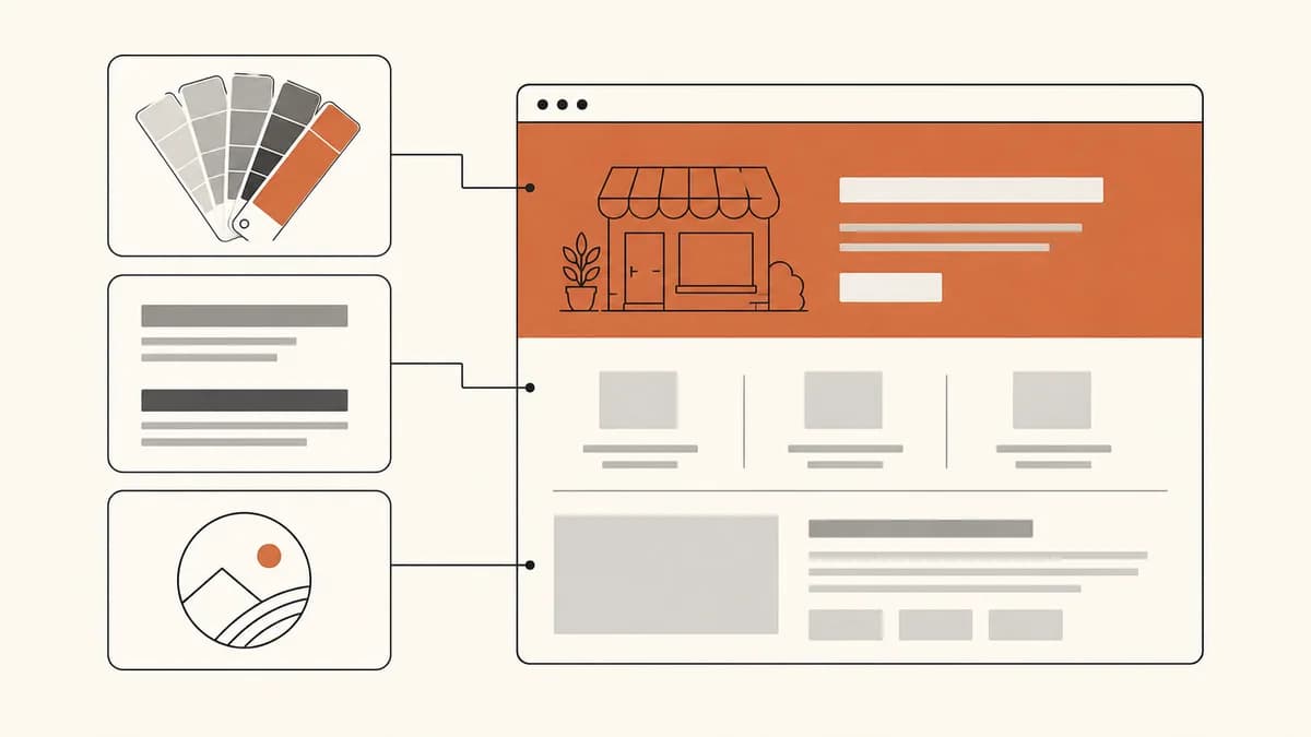
Business website branding is often imagined as a big project: long discussions, a moodboard, then a designer's invoice. For a small business, the reality is much simpler. Branding on a website comes down to three concrete decisions you make once and then stick to: which color is your main color, which typefaces you use, and how your logo appears. Everything else is the discipline of repeating those three decisions on every page.
This guide covers all three in practical terms, with numbers you can use straight away: how many colors are safe, the minimum contrast ratio that keeps text readable, text sizes that do not punish readers, and a realistic logo for a business without a design team. You can decide all of it in one afternoon.
What visitors actually judge in your website branding
Visitors are not judging your taste in design. They are judging one thing: does this business look serious enough to trust with their money?
That judgment happens before they read a single sentence. What registers first is the overall impression: does the page look tidy or crowded, do the colors feel intentional or random, is the text comfortable to read or do they have to zoom? Nielsen Norman Group, citing research by Gitte Lindgaard and colleagues, writes that judgments about a site's aesthetics form in roughly the first 50 milliseconds of a visit, and rarely change even when visitors are given more time. That is faster than a blink, and far faster than the time it takes to read your offer. Good branding for a small business is not the most creative branding. It is the most consistent, because consistency is the cheapest signal that someone is actually looking after this business.
One distinction is worth making up front. Branding for a large company deals with meaning, positioning, and a long-term story. Branding for a small business website deals with recognition and trust within seconds. You are not building ten years of brand equity. You are making sure the person who just tapped the link you shared in a chat does not close the page immediately.
So the priority order looks like this:
- Readability first. Text that cannot be read cancels out every other design effort.
- Consistency second. Uniform pages look more professional than beautiful pages whose style keeps changing.
- Distinctiveness last. Colors and shapes that set you apart from the shop next door only help once the first two are in place.
If you have not sketched your page structure at all yet, the guide on how to build a website for your business walks through a sensible section order for a small business, and this guide covers the visual side.
Color: lock in one main color, then control its share
The most common color mistake on small business websites is not picking the wrong color. It is using too many colors at once, so none of them stands out and visitors do not know where to look.
Three colors are enough
A minimal palette that works has three roles:
- Brand color (just one). Use it for the main button, accent lines, and one or two important elements. It takes up the least space, but it is the one people remember.
- Text color. A dark neutral. Pure black is rarely the best choice, because the contrast feels harsh on bright screens; a very dark gray or near-black is usually easier to read for longer stretches.
- Background color. A light neutral. Clean white, or a slightly warm white if you want the page to feel softer.
A long-standing rule of thumb used by interior designers and web designers alike is 60-30-10: about 60 percent light neutral background, 30 percent dark neutral for text and structural elements, and 10 percent brand color. The numbers are not a law, but the rule works because it forces your brand color to stay rare. A rare color feels intentional. A color that is everywhere feels like an accident.
Contrast: the one number you must check
This is the part most often skipped and the cheapest to fix. The WCAG 2.1 accessibility standard, in success criterion 1.4.3 Contrast (Minimum) at level AA, asks for a contrast ratio of at least 4.5:1 between text and its background. For large text, meaning at least 18 point, or 14 point if bold, the minimum drops to 3:1.
The two combinations that fail most often on small business websites:
- Light gray text on a white background. It looks elegant on a designer's laptop and nearly disappears on a phone used outdoors at midday.
- White text on a bright brand color. Yellow, light orange, lime green, and cyan almost always fail with white text. The fix is not to change your brand color, but to put dark text on it, or to use that color only as a small accent rather than as a background for text.
There is one interesting exception that is often misunderstood. The same WCAG document says text that is part of a logo or brand name has no contrast requirement. So your logo can use a color that technically has low contrast. Your paragraphs, button labels, and navigation menu cannot.
That exception has limits. Criterion 1.4.11 Non-text Contrast asks user interface components and graphical objects to have at least 3:1 contrast against adjacent colors, and its explanation makes clear that logos are only exempt when the low contrast is actually set by brand guidelines. If the pale color is just a design choice made later, it no longer qualifies. For a small business whose brand guidelines were written this week, the safest route is to keep the logo readable.
Choosing a brand color without overthinking it
If you are stuck, these three shortcuts are usually enough:
- Take it from your product. Packaging, materials, uniforms. It is the most honest choice and the easiest to keep.
- Look at what competitors use, then step away. If your five local competitors are all blue, dark green or terracotta will stand out immediately in search results and in social feeds.
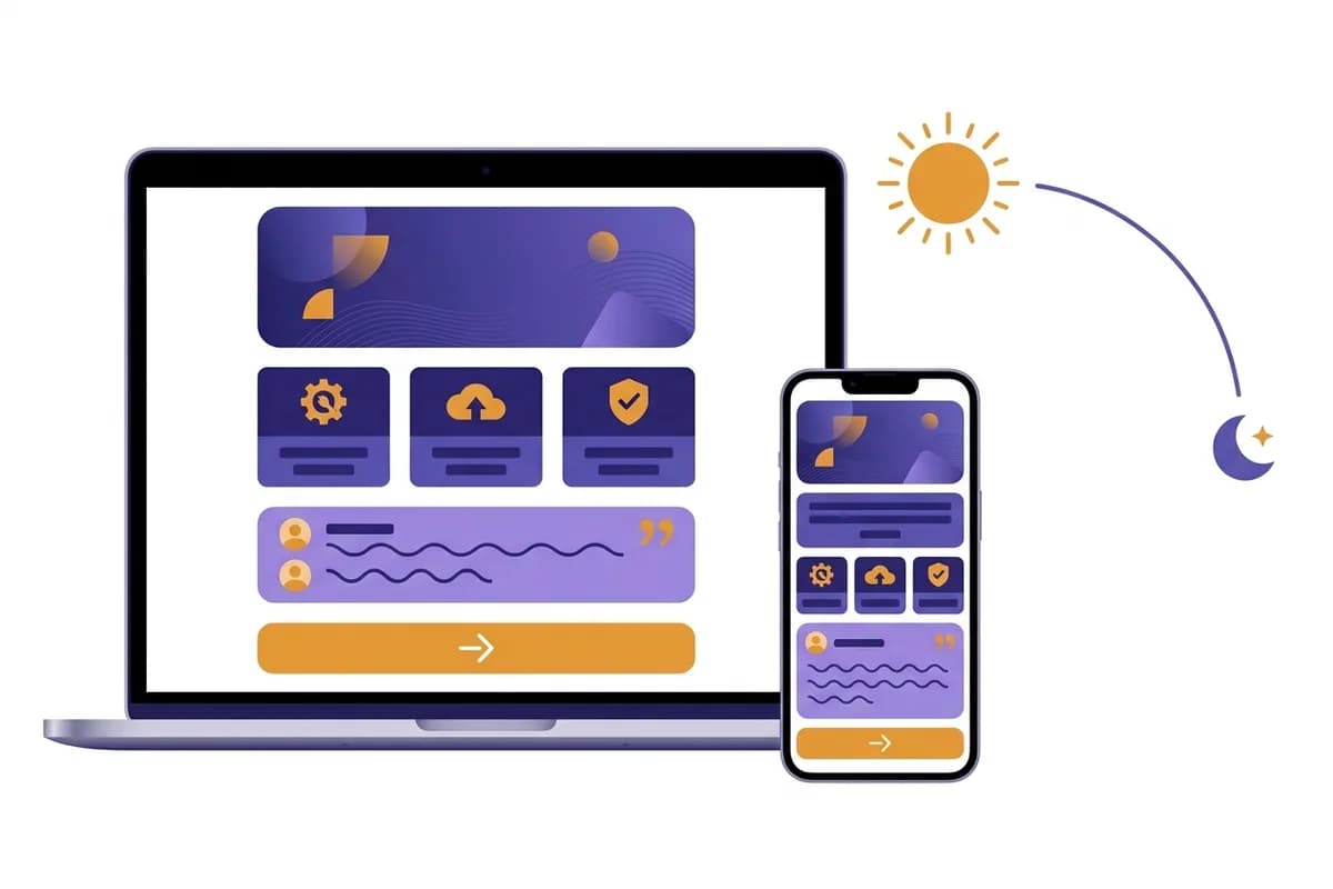
- Pick one that holds up in two conditions. Test your color on a phone at low brightness and in direct sunlight. A color that only looks good in one of them will keep causing you trouble.
Once the color is set, write down its hex code. Not "dark blue", but the exact value. A color described by name drifts a little every time you add a page, and six months later your site has four versions of blue that are similar but not the same.
Fonts: two typefaces are more than enough
Typography is the part of branding with the biggest effect that visitors notice least. A page that is pleasant to read rarely gets praised. A page that is tiring to read gets abandoned without explanation.
Safe pairing rules
Limit yourself to two typefaces: one for headings, one for body text. You can also use a single typeface in two weights, which is actually the safest option for beginners.
Pairings that are hard to get wrong:
- Sans-serif for headings, the same sans-serif for body, separated by weight and size. The most neutral option and the hardest to break.
- Serif for headings, sans-serif for body. Feels more mature and editorial. A good fit for professional services, consultants, caterers, or handmade products.
- Sans-serif for headings, serif for body. Less common, but good for long articles.
What to avoid: pairing two fonts that both have strong personalities, because they will compete for attention. Also avoid decorative or handwritten fonts for anything other than a logo. They slow reading down, often break at small sizes, and almost always make a page look more amateur, not more personal.
Sizes and spacing that decide comfort
- Body text at least 16 pixels on phones, and 17 to 18 pixels if your paragraphs are long. This is the default almost every desktop browser uses for standard text, so using it means you are not fighting your readers' habits.
- Line height at least 1.5 times the font size for paragraphs. This is not a matter of taste. WCAG 2.1 criterion 1.4.12 Text Spacing requires your page to stay intact when a reader sets line height to 1.5 times the font size, paragraph spacing to 2 times, letter spacing to 0.12 times, and word spacing to 0.16 times. If you use those values from the start, you are compliant and easier to read.
- Line length of 50 to 75 characters on wide screens. On phones this happens automatically, but on desktop, text that stretches the full width of the screen is exhausting.
- No more than three heading sizes. Page title, section title, subheading. Beyond that, the hierarchy gets blurry.
One thing to check directly on a phone: open your website and read a full paragraph while walking. If you have to stop walking to read it, your text is too small. We cover fuller testing in mobile friendly websites.
Web fonts and page speed
Fonts downloaded from the internet have a cost. The best practices for fonts guide on web.dev explains that font-display: block hides text for roughly 2 to 3 seconds while the font has not finished loading, while font-display: swap cuts that period to zero and shows text in a fallback font right away before swapping it.
The problem is that this setting is still often skipped. The fonts chapter of the Web Almanac 2025 reports that font-display: swap is used on only about 50 percent of pages, and preload, which the previous edition called the single most effective way to speed up font loading, is used on only about 12 percent of pages. Font files are not small either: the median is around 35 KB, and at the 90th percentile it passes 115 KB. Load four weights at once and that number multiplies.
For a small business, the practical translation is simple:
- Use two typefaces at most, with only two or three weights. Every extra weight is one more file your visitors have to download.
- Make sure text stays visible while fonts load, instead of disappearing first.
- If many of your visitors are on slow connections, system fonts are a perfectly legitimate choice. They are free, need zero downloads, and look normal on every device.
Logo: a small business almost always gets by with a wordmark
The logo is the number one reason small business websites launch late. The owner waits for the logo, the logo never gets finished, and the website never exists. That is the wrong order.
A wordmark is enough, and often better
A wordmark is your business name set neatly in one strong font, perhaps with one small detail as a marker. That is all. For a business that is still small, a wordmark has real advantages over a symbol logo:
- Always readable. An abstract symbol needs time and repetition before people connect it with you. A name does not.
- Never pixelates. Text stays sharp at any size.
- Easy to revise. If you want to add a symbol later, the wordmark still works.
If you still want a symbol, make one you could redraw from memory in ten seconds. Simple shapes last; detailed illustrations with gradients and shadows will cause problems every time you need to print them, turn them into stickers, or put them on a receipt.
The formats and sizes you actually need
You need fewer files than you think:
- One main version for the website header, on a transparent background (PNG or SVG).
- One light version for dark backgrounds, if your logo is dark.
- One square favicon, the small icon that appears in the browser tab. Usually your initials or symbol are enough, because a full name will not be readable at that size.
- One square version for profile pictures on WhatsApp Business, Instagram, and Google Business Profile.
Test your logo the harsh way: shrink it to the width of a fingernail, then look at it on a phone. If it is no longer readable or turns into a blob, simplify it. Almost every problematic small business logo fails this test.
A warning about AI-generated logos
Generating a logo with an AI image tool sounds convenient, but the results often go wrong exactly where it matters: the letters. Image models tend to slip when rendering text, so your business name can come out with oddly shaped letters, uneven spacing, or a subtle misspelling you only notice after printing. For a wordmark, typing your business name in a good font almost always gives a cleaner result than generating it as an image.
Put it together: a one-page brand kit
None of the decisions above help if they live only in your head. Write them in one place, and open it every time you touch the website.
The minimum contents of a small business brand kit:
| Section | What to record |
|---|---|
| Brand color | The exact hex code, for example #C2612F, plus notes on where it is used |
| Text color | Hex codes for primary and secondary text |
| Background color | Hex codes for the light and dark backgrounds |
| Heading font | Font name and the weights you use |
| Body font | Font name, weight, base size |
| Logo | File name for each version and the minimum clear space around it |
| Tone of voice | Three adjectives, plus one example sentence that is right and one that is wrong |
The last row often gets forgotten, even though branding is not only visual. How you write is part of the same brand, which we cover separately in website copywriting. The same goes for your photo style, covered in business website visuals. Consistent colors paired with photos whose style keeps changing still look messy.
The most common branding mistakes, and how to fix them
- Too many colors. Fix: pick one brand color and turn the rest into neutrals. This single change has the most visible effect.
- Text on photos without a dark overlay. Fix: add a semi-transparent dark layer between the photo and the text, or move the text beside the photo.
- Low-resolution logo. Fix: ask whoever made it for the original file, or temporarily replace it with a retyped wordmark. A pixelated logo damages trust more than no logo at all.
- Style changing halfway through. Fix: open your brand kit and bring old pages in line with new ones, one at a time. Start with the home page and the contact page.
- Branding only on the home page. Fix: check the pages owners rarely look at but buyers often do: product pages, the contact page, and how your link looks when it is shared in a messaging app.
- Delaying launch for perfect branding. Fix: launch with a temporary color and font that already pass the contrast requirement, then refine once you have real visitors you can ask.
Before launch, it is worth going through the wider list in the website go-live checklist so branding is not the only thing you check.
From one sentence to a branded website
The hardest part of business website branding is not choosing the color. It is applying that decision consistently to every part of the page, then keeping it consistent every time something changes. That is where manual work usually runs out of steam.
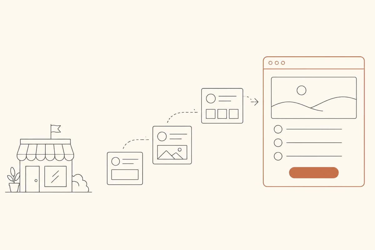
With Forgelo, the starting point is much shorter. You describe your business in one sentence. The site is built in the background and is usually ready within minutes (the production latency we measured is about 4.5 minutes), then it can go live on a free subdomain the same day. What you get is not a blank page, but a page structure that already has a consistent palette, type hierarchy, and logo placement from the start.
Adjusting the branding does not have to be a separate project either. You just describe the change you want, for example "change the main color to terracotta and make the buttons bolder" or "use a serif font for all headings", and only that part is rebuilt. We cover how section-by-section editing works in more depth in editing a website section by section. If you later move from the free subdomain to your own domain, the trade-offs are in custom domain vs free subdomain, and plan details plus daily AI generation and edit quotas are on the pricing page.
A realistic order for this week: set one brand color and write down its hex code, choose one font pairing, retype your business name as a wordmark, check that your main text passes 4.5:1 contrast, then launch. Good business website branding is not the result of one big design session. It is the result of four small decisions you write down once and keep following, and you can finish that today.