Business website visuals are often treated as the last task, yet they are the first thing a visitor judges. Before someone reads a single sentence on your page, their eyes have already concluded something from the photos: is this business serious, does the product match expectations, is it safe to send money here. The good news is that you do not need an expensive camera or a photographer to pass that test. What you need is the right light, honest photo choices, and files light enough that your page does not crawl.
This guide covers the practical side. How to shoot products with a phone, when stock photos are still fine and when they backfire, what file sizes are safe, and how to write alt text properly. You can do all of it yourself in one afternoon.
Why visuals decide whether visitors stay or leave
Images are not decoration on a business website. They do three jobs at once: they explain the product faster than a paragraph, they build trust through visual proof, and they steer the eye toward the button you want clicked.
For a small business, trust is the heaviest part. Visitors do not know you, have never been to your place, and cannot tell whether the goods match the photos. Real photos you took yourself answer that doubt much faster than any written promise. Photos that look borrowed from the internet add a new doubt instead.
Here is the minimum set of visuals a small business website needs, and what each one does:
- An opening photo on the first screen. Answers "what is this business" in one glance. It can be a featured product, the feel of your shop, or your work in progress.
- Product or service photos. One clean photo per item, consistent angles, a uniform background. This is what makes your catalog look tidy even with only eight products.
- Social proof. Screenshots of happy customer messages, photos of parcels ready to ship, photos of customers using your product (with permission). This is the section most often left empty and the most valuable.
- Human faces. A photo of the owner or team, even just one. Small businesses win precisely because there are visible people behind them, not because they look like a corporation.
- Explainer images. Sizes, color variants, the ordering flow, or a location map. One simple image often saves ten lines of text.
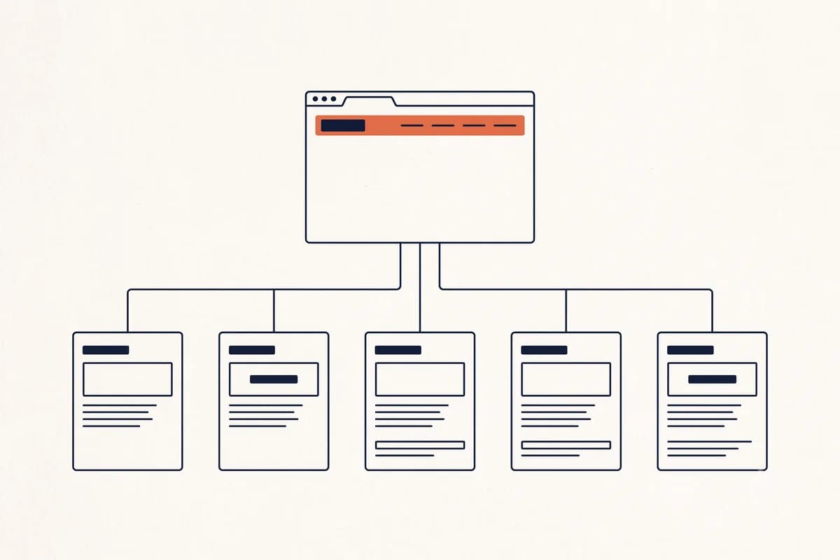
If you are still sketching the page structure, our guide on how to build a website for your business covers a sensible section order for small businesses.
How to shoot product photos with a phone that are good enough to publish
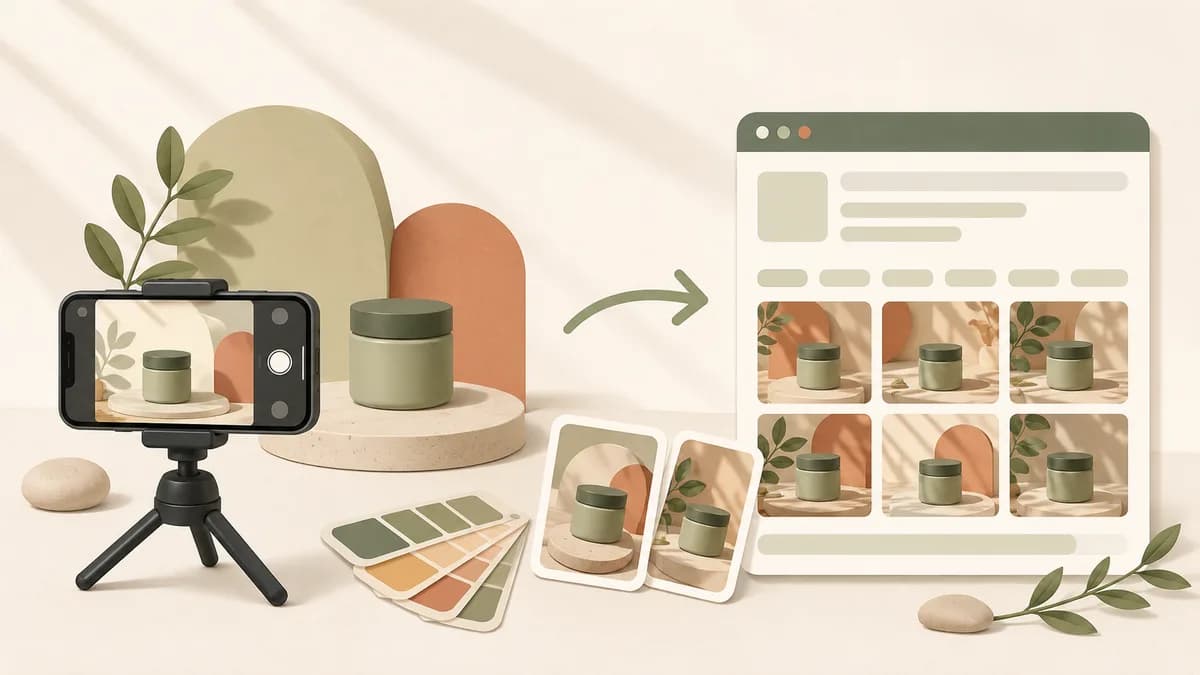
Phone cameras are more than enough now. The difference between a good photo and a mediocre one is almost never the device, it is light and tidiness. Here is a sequence you can follow without extra gear.
Shoot by a window, not under room lights. Indirect daylight from a window is a free studio light. The best times are morning until about ten, or late afternoon from around four. Avoid harsh direct sun, because the shadows are hard and colors wash out.
Switch off warm indoor lights. Mixing bluish window light with yellow bulbs makes product colors messy and hard to correct. One light source gives a cleaner result.
Bounce light into the dark side. Put a sheet of white printer paper, a piece of foam board, or a shoebox lid covered in white paper on the side opposite the window. Shadows on the product soften immediately. It is the cheapest trick with the most visible payoff.
Use a plain background. A large sheet of white paper, plain fabric, or a clean wooden table. A busy background makes the product disappear. Lock one background for every catalog photo so your pages look consistent.
Do not use digital zoom. Move the phone closer instead of pinching the screen. Digital zoom only crops pixels, and the result breaks up when shown large.
Lock focus and lower exposure slightly. Tap the screen right on the product, then slide the brightness control down a little. A slightly dark photo can still be brightened; an overexposed one loses detail for good.
Take three angles per product. Front, three-quarter, and one close detail (texture, stitching, filling). For a website, three photos per product is more than enough.
Include a size reference. A hand holding it, or the product next to an everyday object. This cuts a lot of "how big is it" questions that usually arrive by message.
If you want to do the whole process from your phone, including uploading and arranging the page, we cover that separately in how to build a website on your phone.
Tip: Shoot ten products in one session with exactly the same background and position. A consistent catalog looks far more professional than a collection of good photos in different styles.
When stock photos are fine and when they damage trust
Stock photos are not forbidden. They become a problem when they stand in for something that should be real.
Safe uses: mood backgrounds, concept illustrations in blog posts, icons and decorative elements, or supporting photos that clearly make no claim about your business.
Trust-damaging uses: the products you sell, your team's faces, your premises, your kitchen or workshop, customer photos, and photos of finished work. These are the ones most often spotted. Shoppers browse marketplace listings and Instagram every day, and they quickly recognize a glossy stock model on a small home catering page. Once one photo feels fake, the whole page becomes suspect, including prices and testimonials.
There is a middle path that often works for service businesses with no decent photos: use explainer graphics instead of photos. A service flow diagram, a neatly laid out list of packages, or a map of your service area is more honest and more useful than a borrowed office photo that is obviously not your office.
Note: If you have to use a stock photo at the top of the page, do not add a caption claiming it shows your business. A false claim that gets caught hurts far more than an honest, imperfect photo.
Heavy photos slow your site, and that hurts both SEO and conversion
This is the part small business owners overlook most. A photo straight from a phone can now weigh 4 to 8 MB per file. Upload ten of those to one page, and a visitor on an ordinary mobile connection will stare at a blank screen long enough to decide to leave.
These numbers are not guesses. According to the 2024 Web Almanac from HTTP Archive, 68 percent of mobile pages have an image as their Largest Contentful Paint element, meaning the image decides when the page feels "loaded". Meanwhile Google's LCP documentation says a good score is 2.5 seconds or less, measured at the 75th percentile of visits. The conclusion is simple: if your photos are heavy, your speed metrics are heavy too, and photos are the one part fully under your control.
The damage is layered. A slow page weakens page experience signals for search engines, but the loss you feel sooner is in conversion. Visitors arriving from an ad or a shared link have no special patience for you. They close the tab, and you never know it happened.
The encouraging part is that fixing this is usually easier than fixing other technical issues. Shrinking ten photos from 5 MB to 150 KB is ten minutes of work with an immediate effect. Other basics worth sorting out are summarized in our website SEO basics guide, and how new pages get indexed is covered in how to get your website on Google.
Technical image checklist: format, file size, and dimensions
You do not need to get technical. These four points solve most problems.
Pick the right format.
| Need | Format | Why |
|---|---|---|
| Product photos, mood photos | WebP | Lightest option for photos. According to Google's documentation, lossy WebP is 25 to 34 percent smaller than JPEG at equivalent quality |
| Photos, when WebP is not available | JPEG | Universal support, good compression for photos |
| Logos, icons, images with text | SVG or PNG | Lines stay sharp, transparent background |
| Short animations | MP4 video, not GIF | GIFs are much larger for the same result |
Source for the WebP figures: Google's WebP documentation, which also says lossless WebP is about 26 percent smaller than PNG.
Shrink before uploading, not after. A safe benchmark: the opening photo under 200 KB, catalog product photos under 100 KB, logos and icons under 30 KB. Try to keep all the images on one page under 1 MB total.
Match dimensions to where the image appears. A 4000 pixel photo displayed 800 pixels wide wastes bandwidth without adding any sharpness. For an opening photo, 1600 pixels wide is plenty. For catalog photos, 800 to 1000 pixels.
Do not delay loading the top image. Lazy loading is useful for images far down the page, but applying it to the opening image slows the first impression. The Web Almanac notes this mistake still happens on nearly one in ten pages where an image is the largest element.
Alt text and file names: small details most people skip
Alt text is a short description of what an image shows. Screen readers read it aloud for blind visitors, and search engines use it to understand your images. It is also what appears when an image fails to load, which happens fairly often on mobile connections.
2024 Web Almanac data shows only 55 percent of images on the web have non-empty alt text, which means the other 45 percent have none. For a small business this is a cheap opportunity: writing alt text properly takes a few seconds per image and immediately puts your page ahead of nearly half the web.
How to write it:
- Describe what is visible, briefly. "Chocolate banana chips in a 250 gram pouch on a wooden table" is far more useful than "product image".
- Do not stuff keywords. "cheap banana chips best banana chips tasty banana chips" reads as spam to machines and makes no sense when read aloud.
- Leave alt empty for decorative images. Divider lines and ornaments do not need to be read out. An empty alt is the right choice for them.
- Do not start with "image of" or "photo of". The screen reader already announces that it is an image.
- Clean up file names before uploading.
chocolate-banana-chips-250g.webpadds context;IMG_20260723_113045.jpgadds nothing.
One helpful habit: write the alt text while you shoot, not while you upload. Keep a short note per product on your phone. When it is time to fill in the website, you just copy it.
Start with one sentence, tidy the visuals as you go
The most common mistake is not bad photos, it is postponing launch until the photos are perfect. A website that goes live this week with ten bright phone photos is far more useful than a professional shoot plan that never happens.
A realistic order: shoot ten basic photos in one session by a window, shrink the files, then build the page. With Forgelo, you describe your business in one sentence. You type it in a few minutes, the site is built in the background and is usually ready within minutes, and it can go live on a free subdomain the same day. The page structure, starter copy, and spots for your photos are there from the start.
After that, tidying the visuals does not need to be a separate project. You describe the change you want, for example "replace the top photo with our best-selling product" or "add a testimonials section with three message screenshots", and only that section is rebuilt. We explain how section-by-section editing works in edit your website section by section. Plan details and the daily AI generation and edit allowances are on the pricing page.
Schedule a reshoot whenever you add a new product, and replace the three most decisive spots first: the top photo on your home page, your best-seller photo, and the image that appears when your link is shared in a chat app. If your website is meant to take orders, the guide on how to build a website that sells covers the ordering side.
Good business website visuals are not the result of one big day of work. They come from small habits: shoot by a window, compress before uploading, write alt text, replace the worst photo every month. In three months the difference will be obvious, and you will not have needed to hire anyone to get there.