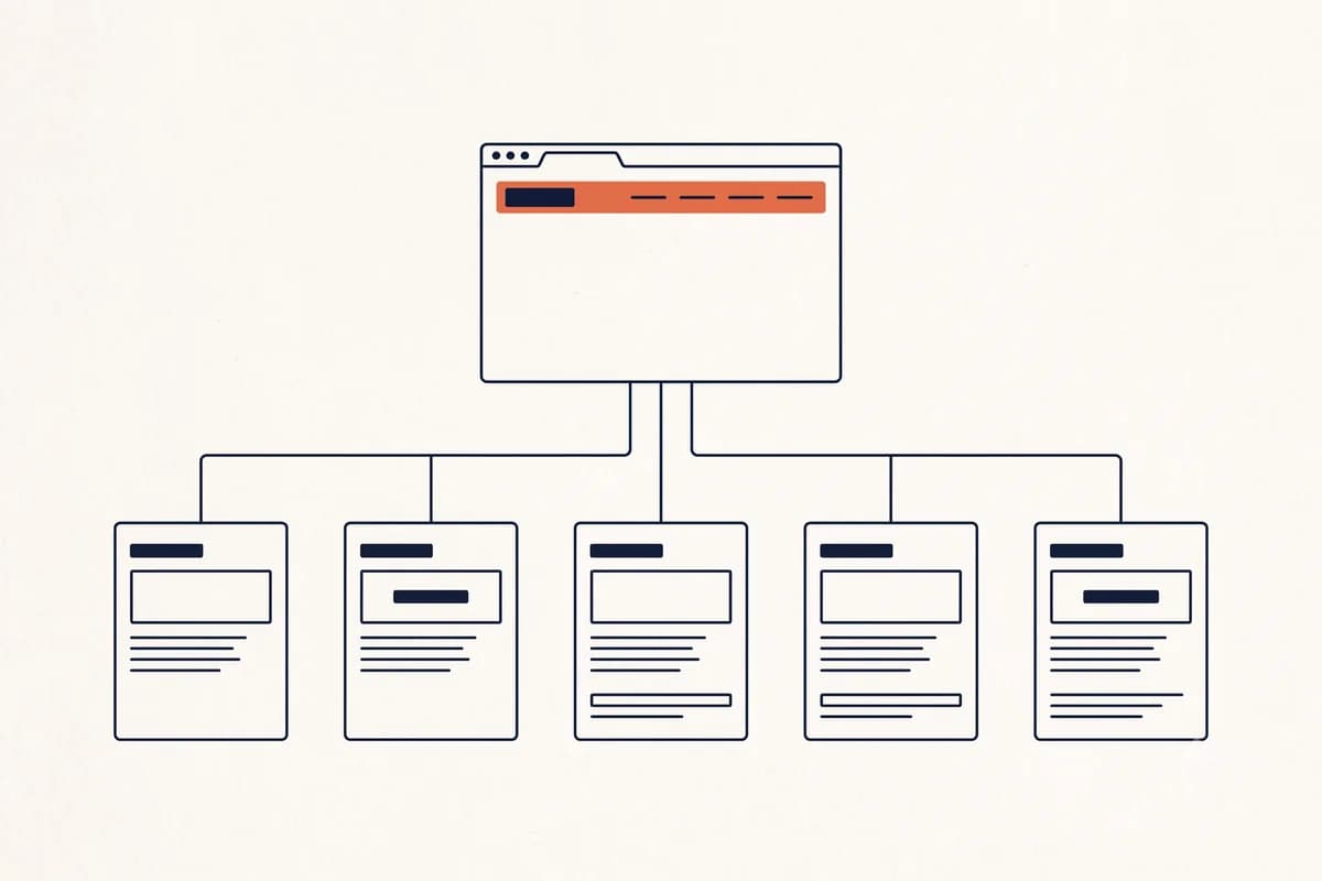
A small business website needs five pages: home, services or products, about, proof, and contact. If you have a single offer, all five can even be combined into one long page. The ideal structure really is not complicated: five core pages, one menu that fits on a single line, and a section order that follows how prospective customers make decisions. What makes so many websites feel messy is not the number of pages but the order. Important information sits at the bottom, rarely opened pages sit in the main menu, and the way to contact the business is the hardest thing to find.
This guide covers two layers of structure that often get mixed up. The first layer is the map between pages: which pages exist and how they link to each other. The second layer is the order of sections within a single page. A website that is pleasant to use needs both to be right. If the page map is tidy but the section order is random, visitors are still confused.
How many pages does a small business website need?
The direct answer: five pages for most small businesses, one page if you have a single offer, and eight to twelve pages only if you genuinely have several distinct service lines. Beyond that, adding pages usually adds maintenance work without adding customers.
What people often get wrong about this question is treating the page count as a target, when it is actually a result. You do not decide "I want ten pages" and then look for content to fill them. You list the questions prospective customers actually ask, and the number of pages reveals itself.
These three levels cover almost every case:
| Number of pages | Best for | Trigger to move up a level |
|---|---|---|
| 1 page | One main offer and one type of buyer: a freelancer, a single service, a single product, an ad campaign page | A second offer appears with a different buyer |
| 5 pages | Most small businesses: home, services, about, proof, contact | A service needs its own explanation, or you start targeting searches by city |
| 8 to 12 pages | Several service lines, several service areas, or a product catalog | Rarely needed. If the menu needs nested dropdowns, stop and merge |
Look at the last column. What decides moving up a level is not the age of the business or the size of its revenue, but the appearance of questions or searches that the existing pages cannot hold.
One exception worth mentioning: online stores. Product pages are not counted the same way because their number follows how many items you sell, not a structural decision. A store with two hundred products still has five core pages you need to design, and the other two hundred are a catalog that is published to match your stock. The full discussion is in our guide to building an online store website.
What does an ideal website page structure look like?
The short answer: shallow, not deep. One flat level of five to seven pages that can all be reached from the main menu, not a multi-level tree that makes visitors dig three levels down.
The reason is simple. A small business does not have enough content to fill a deep hierarchy. Every extra level adds one more chance for a visitor to give up. If someone has to click three times to find the price, most of them stop at the second click.
As a guide, here is the role of each core page:
| Page | Its job | What must be on it |
|---|---|---|
| Home | Explain who you help and with what | Headline, offer summary, brief proof, one main CTA |
| Services or products | Answer "what exactly do I get" | Offer details, scope of work, a price indication or range |
| About | Prove there are real people and a real business behind it | A short story, real photos, credentials or experience |
| Proof | Ease doubts | Portfolio, testimonials, case studies, results in numbers |
| Contact | Turn interest into a conversation | A short form, phone or messaging number, opening hours, location |
Notice that each page has one job. This is the difference between a structure that works and a structure that only looks complete. If you cannot state a page's job in one sentence, that page most likely needs to be merged into another page or deleted.
Which pages must a business website have?
The five in the table above are the baseline. Beyond that, some pages are often treated as mandatory when they are not.
Pages genuinely worth adding when the situation fits:
- Pricing. If your offer can be packaged, a separate pricing page captures searches from people who are ready to buy. If your pricing is always custom, put a range on the services page instead of making an empty page that just says "contact us".
- FAQ. Useful if you get the same questions over and over. Fill it from conversations that actually happened with customers, not from guesses.
- Blog. Only if you intend to write regularly. A blog with three articles from two years ago makes a business look abandoned, and that does more harm than having no blog at all.
- Privacy policy and terms of service. Required if you collect data through a form or process payments.
Pages that can usually wait: a team page (if your team is two people, put it on the About page), a careers page (if you are not hiring), a company news page (almost nobody reads it), and a photo gallery with no context.
One opinion that may not be popular: for a business with one main offer, five separate pages often lose to one complete long page. One page forces you to build your argument in order, and no visitor gets lost on a half-finished page. This pattern is covered in more depth in our guide on how to make a landing page, including when you should split it into several pages. For an overview of building a business website from scratch, start with our pillar guide on how to build a website for your business.
What order should sections go in on a single page?
This is the part that gets ignored most often, even though it has the biggest effect. The structure between pages decides whether people can find something. The order of sections decides whether they are willing to act.
Nielsen Norman Group research concludes that visitors often leave web pages within the first 10 to 20 seconds, and the pages that hold attention longer are the ones that communicate their value proposition clearly within the first 10 seconds. That means the first section is not the place for small talk.
The order that works most consistently for a business home page:
- Hero. One sentence that says who you help and with what, plus one button. Not "Welcome to our website". Better: "Same-day air conditioning repair for homes and offices in Phoenix."
- Offer. Three to five main services or products, each with a one-line explanation. Put the long details on their own pages.
- Proof. Testimonials with real names, photos of your work, the number of customers you have served. Two or three real pieces of proof are stronger than ten that look made up.
- How it works. Three to four steps from first contact to completion. This section eases the anxiety of people who have never used a service like yours.
- Objections. Price, warranty, service area, turnaround time. Answer them here before visitors have a chance to close the tab.
- Call to action. One path only. If a WhatsApp button, a form button, a phone button, and an Instagram button sit side by side, that is not choice, that is confusion.
Note: A page should have one main goal. If you want visitors to contact you on WhatsApp, do not split their attention with five different buttons. How to tidy up this path is covered in our guide on turning visitors into WhatsApp leads.
For a company profile website, the order shifts slightly: credibility moves up, because visitors are often comparing vendors. You can see an example in our discussion of building a company profile website.
How deep should a website structure be?
The practical rule we use: every important page should be reachable within two clicks of the home page. Three clicks is still acceptable for supporting pages such as old blog articles. Any deeper than that, and the page practically does not exist.
This is not only about visitor convenience. Google finds new pages by following links between pages, so a page that is not linked from anywhere is very hard to find. Google's SEO starter guide also recommends descriptive URLs and grouping similar pages into one directory, for example all articles under /blog/ and all services under /services/.
A few practical rules that follow from this:
- Main menu: four to six items. If a small business needs nested dropdowns, the problem is usually not the navigation but too many thin pages that could be merged.
- The footer as a safety net. Put your contact details, opening hours, address, and policy links there. The footer is where people look when the menu does not answer their question.
- URLs humans can read.
/services/ac-repairbeats/page-id-4471. The SEO effect is small but real, and the effect on trust when the link is shared in a chat is much bigger. - One page, one main keyword. Two pages targeting the same keyword will eat into each other's chances. The basics are in our website SEO guide and our guide on how to get your website to show up on Google.
Are more pages better for SEO?
No. This is the belief that most often makes small business websites bloat without results.
Where it comes from is understandable. Big sites do have many pages, so people conclude that many pages are what make a site big. The order is backwards. Those sites are big because they have many different things worth explaining, and the pages come afterwards.
The following three points come from Google's own documentation.
Extra pages are not automatically considered valuable. Google's guidance on helpful content asks you to judge each page with questions like "does the content provide substantial value when compared to other pages in search results". Pages that fail that question add nothing but more items to maintain.
Producing pages for the sake of volume has a name in Google's policies. Google's spam policies call it scaled content abuse: producing many pages whose main purpose is to manipulate rankings rather than help users. The examples it names explicitly include using AI to generate many pages without adding value for readers. This is not a gray area, it is a written category of violation.
Small sites do not have a crawl budget problem. Google's guide to managing crawl budget opens with a note that if your site does not have many pages that change rapidly, or if your pages seem to be crawled the same day they are published, you do not need to read the guide at all. That means holding back the number of pages is not an SEO strategy either. What decides the outcome is still the quality of each page.
The practical conclusion: what raises your chances of showing up on Google is not the number of pages but whether each page answers one real question thoroughly. Five pages that answer thoroughly beat twenty pages of three paragraphs each.
When to add a page, and when a section is enough
The rule we use is simple: create a new page if people search for that thing separately on Google. If they do not, a new section on an existing page is enough.
Here is a concrete example. If customers often ask "is there a warranty", that is a section on the services page, not a separate Warranty page. Nobody types "warranty" into Google hoping to find your business. But if you start serving a neighboring city like Mesa and people genuinely search for "AC repair Mesa", that deserves its own page because there is standalone search demand.
Three quick questions before adding a page:
- Does anyone search for it? If nobody types it into Google, it is a section, not a page.
- Is there enough content? If you can only write three sentences, it is not a page yet. Thin pages hurt twice: they do not convince buyers and they do not attract searches.
- Does anything link to it? A page that is not linked from the menu or another page practically does not exist, for visitors or for Google.
If the answer to any one of these is no, merge it into a section. Combining two thin pages into one complete page almost always produces a stronger page than keeping both.
Example structures for three types of business
The ideal structure differs according to how people buy. These three patterns cover most small businesses.
Local services (repairs, clinics, catering, contractors). Home, Services, Service Areas, About, Contact. The Service Areas page is often underrated even though it is valuable: people search for "AC repair Mesa", not just "AC repair". Trust signals move up the page because buyers of local services are sensitive to the risk of picking the wrong tradesperson.
Online store. Home, Catalog, Product Page, How to Order, Contact. The key is the product page: real photos, a visible price, where it ships from, and a clear order button. The full considerations are in our guide to building an online store website.
Freelancer or creative studio. Home, Portfolio, Services, About, Contact. The portfolio moves up to second place because that is what clients are really looking for. The About page carries more weight here than for other business types, because clients are buying the person, not just the output. For photographers and videographers, the full layout is summarized in websites for photographers and creatives, including how to arrange a gallery so the work stays sharp without making the page heavy.
For a list of elements every business needs whatever its type, check 10 things every small business website needs. If you want to see finished structures by industry, the Forgelo templates page shows page layouts for restaurants, clinics, salons, portfolios, and more than a dozen other business types. If you want to start at no cost, the steps are in our guide to a free portfolio website.
Structure mistakes that drive visitors away
These five patterns come up again and again in the small business websites we audit.
A menu with twelve items. Usually the result of adding a page every time there is a new idea, without ever removing anything. Merge the similar ones, delete the ones without a clear job.
A home page that explains nothing. A big slider with a photo of a building and the words "The best solution for you" tells visitors nothing. If a stranger cannot say what your business sells after five seconds, your first section has failed.
Hidden contact details. The phone number only appears on the Contact page, not in the header, not in the footer. Every extra click before someone can reach you is a leak.
A services page with one paragraph. Thin pages do not convince buyers and do not attract searches. One complete services page is better than six pages of three sentences each.
A structure that never changes after launch. This is the most common one. The website is built once, then left alone even after the business changes direction. New services are not added because changing the structure feels like a hassle, and it really is when you have to wait for a vendor's schedule.
Tip: Open your website on your phone, then ask someone who does not know your business to open it and answer three questions within 30 seconds: what do you sell, who is it for, and how do they contact you. If any one of them goes unanswered, fix the first section before touching anything else.
Building this structure in minutes, not weeks
The tiring part of all this is not thinking through the structure, it is executing it. Putting together five pages and their section order by hand usually takes days if you do it yourself, or weeks if you are waiting on a vendor.
This is where the way Forgelo works is different. You describe your business in one sentence, for example "same-day air conditioning repair for homes and offices in Phoenix, book by text or WhatsApp", and within minutes you have a complete website: the page structure is in place, the section order makes sense, the copy is written, and the lead form already routes to WhatsApp. From prompt to ready to publish, not from brief to third revision.
What matters more for structure is what happens afterwards. If the section order is not quite right, you do not need to rebuild anything. Just type the change: "move the testimonials above the list of services", "add a service area section after the pricing section", "make the headline more specific to Mesa". Forgelo rebuilds only the section you name, and the rest is untouched. How it works is covered in editing a website section by section.
This is what makes website structure something alive, not a once-in-a-lifetime decision. Your business changes every few months. Your website structure should be able to follow in minutes, not wait in a revision queue.
Start with the simplest version: five pages, a one-line menu, and a section order that follows how people make decisions. Publish to a free subdomain first to test it, and Forgelo has a free plan for one site with a "Made with Forgelo" badge if you are not ready to subscribe. Paid plans start at $9 a month, with the details on the pricing page.
Then pay attention to the questions that come in during the first two weeks. Every question that repeats is a missing section, and adding it now takes just one sentence.